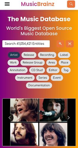
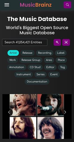
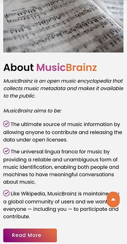
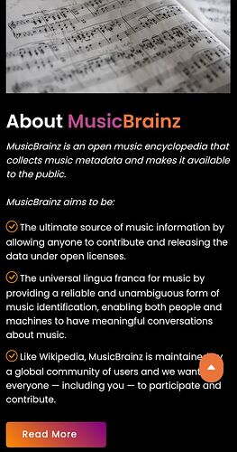
MusicBrainz Web Homepage 2021

Greetings, Everyone!

Link: https://musicbrainz-web.web.app

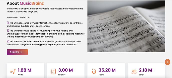
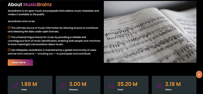
We have been working on revamping the MusicBrainz Web Interface to bring in a modern design, attract a broader audience, and make our services more accessible for everyone. This allows us to migrate our codebase to the latest practices and more importantly, make the website responsive in the mobile and implement additional features like theme changing to enhance the user experience in general.

I urge you to really look at it with an open mind considering that we are hitting 2022 soon and we do need to bring in people to use our projects and contribute to them more freely.


The concept is ready and regarding previous discussions, you can check out MusicBrainz Web Home Page Mock Ups and MusicBrainz Web Design Revamp? - #78 by akshaaatt

An effort has been made to introduce the purpose behind the project and showcase the legacy of MusicBrainz and the MetaBrainz Foundation.

For those interested to contribute to the project, review the code, or access the work, can check out GitHub - akshaaatt/musicbrainz-web: Web App of MusicBrainz

Thank you for your time and help!

9 Likes

A few quick notes

  • Explore us is missing MusicBrainz from the list.
  • Why loose the forum link to very bottom so it is even harder to find? Stick it on top menu.
  • A link to the bigger expanded search is needed. So much more can be found with that option and it should be promoted not lost. (i.e search by barcode cannot be done from this mock-up)
  • Youā€™ve kinda lost the blog. So this page will be static and never change? No where for news now?

I usually come to main page first, check for blog headlines, then go to forum and main site. This page makes me do a huge long scroll to find the forum link. Would be good to have it on the top menu otherwise Iā€™ll be setting up bookmarks to never see home page again.

Rest looks kinda pretty for new visitors and good to see. A good hook to pull new people in. Nice feel to it. Much more welcoming. May comment on that more tomorrow, but as a regular Iā€™ll look once and then head to my normal corners.

3 Likes

In search widget text input look same as select input. Donā€™t think it good idea. Also donā€™t think dark theme switcher should be in menu. And why browser dark mode setting ignored?
#hero block composition looks unharmony because of photo

3 Likes

So when I click on this I get:
You need to enable JavaScript to run this app.

I donā€™t know if this javascript requirement is a result of your design, or just a side-effect of the host youā€™re using there, but this seems like as good a time as any to bring up a main concern of mine:

Currently, I can browse 90-something% of musicbrainz (100% of the actual data, less than all of the meta-stuff) in my favorite non-javascript-configured browser. (I canā€™t edit with it; thatā€™s another story)
Iā€™m really hoping that wonā€™t change with the new version.

8 Likes

And, BTW, I wouldnā€™t mind terribly if I had to settle for using ā€œoldui.musicbrainz.orgā€ URLs or something like that.

(Ahhā€¦ the good old days whan prepending ā€œmobile.ā€ to almost any URL would get you a non-JS version of the websiteā€¦)

3 Likes

those apparently only work from localhost

XHR GET https://newsapi.org/v2/top-headlines?country=us&category=business&apiKey=8ee8c21b20d24b37856fc3ab1e22a1e5
[HTTP/2 426 Upgrade Required 173ms]

{
  "status": "error",
  "code": "corsNotAllowed",
  "message": "Requests from the browser are not allowed on the Developer plan, except from localhost."
}

i like the idea of records on shelves. @aerozolā€™s mockup had bookshelves, so basically that but music. the hard part will be finding an image that crops nicely on a ton of different sizes of viewports.

but i also think not using an image for the background could be a good idea. choosing a couple plain colors (dark/light mode) that are neutral enough to work with all the album art might be the move

it is fun! i donā€™t really know if ā€œexploreā€ is the best name for it. right now it feels more like an ā€œaboutā€ section with a link to the forums thrown in there.

none. iā€™m in the faqs are bad camp.

thoughts on code

the codebase is looking nice! the component js/css files are easy to understand with react+bootstrap, and itā€™s a solid base to build on.

codebase nitpicks/future todos:

  • might be worth looking into using scss/sass instead of plain css. using mixins can drastically reduce css copypasta
  • even though this is early stages, itā€™s worth getting the i18n patterns down now. react-intl/i18n-react/react-i18next

overall thoughts

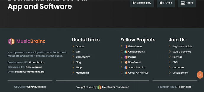
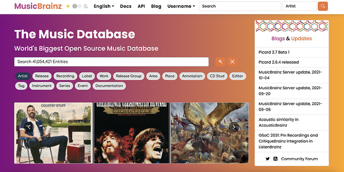
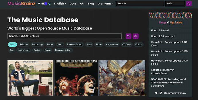
the components look nice (the header and footer look really nice in both light and dark mode!), but the page feels a bit too much like a resume or an ad for my taste. thereā€™s a lot to be scrolled through and itā€™s not clear why all of that is on the homepage. the current mb homepage is busy, but you donā€™t need to scroll down through 8 sections to find the footer links.

if a goal of this redesign is to attract more users, we should design the homepage to turn a first time visitor into a user.

we should encourage new users to interact and see for themselves why musicbrainz is cool, not just tell them a bunch of facts.

we could encourage exploring the database with a call to action, ā€œsearch for your favorite artist/album/song.ā€ we could even encourage that without an explicit call to action by putting search front and center.

on the search results we could have ā€œsomething missing? add an artist/album/song.ā€

but really i think we need user stories/user research. a solid understanding of how/why people are using mb will allow for meaningful and impactful changes in ux that help users new and old.
7 Likes

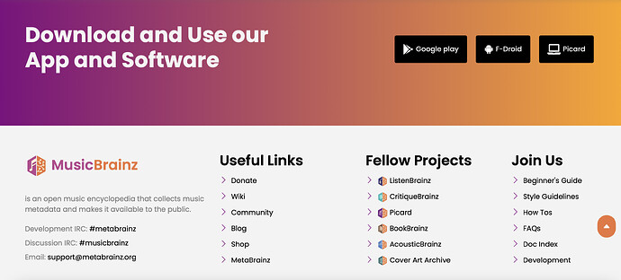
I would not ā€œhideā€ Picard in the Development section.
IMHO it belongs to the ā€œDownload and Useā€ section with at least a link to his own web page:
or direct links to
Picard for Windows
Picard for macOS
Picard for Linux
at the same list as Google Play or F-Droid.

6 Likes

I kinda like the ā€˜blandnessā€™ of the current site. It makes it seem like less of a toy. More of a database.
And I certainly donā€™t want to have to fight through a bunch of ads and ā€˜socialā€™ junk. It is a waste of my bandwidth.

3 Likes

I donā€™t see the language selector.
Maybe you put it in the settings, instead of on each page?
Why not, but then, we should do the same for the day/night theme switch.
Or if it follows the browser setting, we donā€™t even need it.

3 Likes

I think demoting search is a mistake. It is the search that can suck in new users. Make it accessible and more usable. This mock-up has removed the advanced search completely. If I arrive with CD in hand I want to search by Barcode number. This page makes me assume this is not possible.

A search will be use by both noobie and geeks. It opens up the power of the database. Lets people into the real data.

Stick an advanced button next to the basic search. And then revamp the search page. That is an example of a page too geeky that could do with some modernisation but not loosing the power and detail of the page.

I also agree with @briaguya that the FAQ does not need to take up space on the home page. Especially with such irrelevant sounding questions. Donā€™t tell them how to leave before they have even joined :smiley:

Make a more vibrant looking news \ blog section visible. Make me want to look at this page more than once. As nothing on this page will change after launch I donā€™t see why Iā€™d ever return to look at it a second time.

Good start as it is more vibrant that the currently old text page - donā€™t take our notes as negative.

10 Likes

The content of this homepage seems more suited for the ā€œAboutā€ section of the site. The home page should be more user-centered, providing search and browsing functionalities for information about artists and releases.

5 Likes

I donā€™t like the content in the first panel and the panel does imo not look very professional, but the rest looks good if the target audience is brand new visitors. I would probably combine panel 1 and panel 3 (the one with the statistics) into one panel. The link to the forum needs to be displayed more prominently, somewhere in the top menu. I would not include ā€œHow do I delete my accountā€ (and similar questions) in the FAQ, if the target audience is new users. These questions should instead be more noob-centred (ā€œhow do I start editingā€, ā€œhow do I add my own music to MBā€, etc).

Panel 1:

  • First of all you need to reduce the height of the first panel (or add more visual cues), because itā€™s not obvious that you can scroll further down. The only visual cue that shows that there is more content below is the scroll bar to the right.
  • I donā€™t understand why the search bar is placed here, when thereā€™s also one at the top of the screen.
  • The images in the cover art panel are way too big and they are rectangular (CAA thumbnails are square).
  • The twitter part is pretty useless since the info (news, etc) usually only gets posted on the blog.
2 Likes

There were not there this morningā€¦ page seems to be evolving. Likely to be why that panel has a ā€œthrown togetherā€ look now.

The twitter stuff is suppressed on my screen. Donā€™t see it. But then I kill a lot of tracking data. Replacing blog headlines with Twitter is shutting people out.

3 Likes

Also my Twitter measure MB accounts looks pretty abandoned. They can stay months without new posts. Bad message to newcomers

1 Like

re: search

the UX of selecting entity type from a dropdown before searching is pretty bad

imo ideally weā€™d have one search box that works for everything, with ways to refine it using keywords etc.

i know thatā€™s beyond the scope of moving the frontend to react, but itā€™d do wonders for new user discoverability

5 Likes

I like the redesign, however I am missing some of the usability features from the old one. These are my quick thoughts atm:

Iā€™m not sure why there is a Twitter feed instead of the latest posts from the MetaBrainz blog. Even though there is a link to the blog in the top menu, it was very useful to see if there were any updates for mb server or Picard right away on the main page without needing to go anywhere else. Twitter has way more useless stuff for me that I donā€™t really care about although I get that you probably want it for increasing of the engagement of people. Perhaps there could be a couple of widgets on the main page which could be configurable in user profile to allow the user to display which one(s) they want to see, similar way as it is done on Jira dashboard for example?

Apart from that, I am also missing the menu dropdowns for My Data, Search, Editing and Documentation. I am using all of them like all the time. The only ones I donā€™t really use are About Us (used very rarely for Statistics) and Products (I never used this one).

Thatā€™s pretty much it for now, other than these things it is a really good looking redesign so good job on that!

Edit: I just want to add that from the Search dropdown I only used the Search Edits option and from the Documentation dropdown I only used the Style Guidelines option (however I was using both of these very frequently). I am aware that the latter one is available after clicking on the Docs, but itā€™s now on another page and you need to search for it within that page instead of it being an option in the sub-menu, where it was available on as one of the top options directly on the main page.

As for My Data and Editing dropdowns, I was using (or can imagine myself using in the future) most of the stuff thatā€™s in there.

Additionally, I am not sure which of the dropdowns entries are being used by other users (perhaps you have some statistics for that?) but for example I would be completely ok with moving Search Edits from the Search dropdown into the Editing dropdown if you happen to find out that nobody has been using the other 3 entries in the Search dropdown at all. This way we could have only one instead of 2 dropdowns displayed and it would have all the entries that are being used by the users. The same could be said for Style Guidelines as well however Iā€™m not sure if it would be a good fit for the Editing menu. Also itā€™s very likely that other users are using way more options from the Search and Documentation dropdowns than me so this wouldnā€™t work anyway.

Perhaps we could go the same route as my suggestion for the MetaBrainz blog/Twitter widget and let users choose which menu entries they want to have displayed? :stuck_out_tongue: (Those would need to be located in the additional second row or something as there is currently no space available within the first row.)

9 Likes

Due to the fact that users dont scroll, adding in the same page search functionalities and ā€œcorporateā€ information is not useful and affects negatively the ranking of the page. ā€œCorporateā€ information should be moved in the ā€œAboutā€ section of the site.

As far as the searching funcionalities, the preselection of the query field (artist, release, ā€¦) is more DB oriented than user oriented; a free search (like in Sonemic or Discogs) with results categorized by artist, release, and so on is more natural and intiutive.

Moreover, in addition to search functionalities, browsing features should be added for users interested in discovering new music (by genre, country, year or combinations thereof); this ā€œnavigationā€ support also improves the indexing of the site in search engines.

6 Likes

Thanks a lot @IvanDobsky for the thoughts! :smiley:

Since it is MusicBrainz itself, I didnā€™t think about adding it to the Explore Us section.
I do agree on your thoughts about moving the forum link to top. Will make sure to add it :slight_smile:
Iā€™ll soon be making a component which facilitates the blog and removes the old twitter implementation right at the beginning!

1 Like

Thank you @MrClon for the update then. Iā€™ve fixed this. Will add the ability to default to system settings soon regarding the theme changing! :smiley:

1 Like

Thanks for raising this concern. I had a discussion regarding this with the team around IRC Logs for #metabrainz | MetaBrainz Chatlogs
Letā€™s see how we resolve this! :smiley: