Sounds reasonable. I think we might keep that for a while! 
if you want to use react and have it still work for people with js disabled you’ll want to look into server side rendering/static site generation (something like next or gatsby)
1 Like
Thanks a lot @briaguya ! 
The slider issue has been fixed as well as the background with a blurred feel to it looks nice I think now with the search bar.
I’ll surely look into the code recommendations, sounds nice!
I do agree with the interactions part, hence the page is showcasing all the amazing and important stuff. Other than the Explore MB section, everything is essential as discussed and tbh feel kinda nice. I think majority of my problem was solved as soon as I geared the first slide with the search. Let me know your thoughts again, if anything! Thanks!
Thanks @InvisibleMan78 this was really important and I’ve made this addition!
Thanks for the review @justcheckingitout .
We aren’t advertising anything, just letting people know that our projects exist in a spectrum and we’re looking for everyone to explore them as well.
Absolutely! Thanks for this suggestion. I’ll add it soon @jesus2099
1 Like
I worked on the search functionality after reading through your comments the other day. Thanks for the points @IvanDobsky ! Currently, I really like the implementations. Let me know your thoughts again if any
Thanks for the comment @PierPiero ! Agreed and worked upon
Thank you @joiletjake for the suggestions! I’ve fixed this andnow the first page looks good I think
We’ve been having a discussion regarding this on the irc channels and decided to be more active on twitter, I will be taking the lead to make sure we timely post. Plus there are more benefits to displaying twitter once we make sure we don’t add in any cookies!
Fixed the search UX problem I guess. Looks amazing now
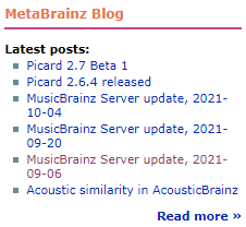
The Twitter control itself is a tracking tool for Twitter. It is not just “cookies”. I doubt I am the only one who suppresses the whole Twitter feed control. I have the EFF’s Privacy Badger addon in operation on most of my browsers. Please keep the blog headlines visible somewhere.
I understand your need for the Twitter adverts, but this is a different type of communication to the Blog updates about server changes and new Picard versions. Demoting the blog to behind a click now removes any summary of happenings as it just goes to the latest blog post and hard to find previous posts.
Search changes are friendly looking - but still missing the Advanced options. Searching for Barcodes and Catalogue numbers is common for an outsider. Especially as that outsider will not yet know what Works, Release Groups or CD Stubs are. @briaguya mentions the need for an “all in one” search box like Discogs, an idea solution, but this is lost in a Ticket somewhere.
I can see this web page is for sucking in new people, not us old hands. Search needs to work for them in their language.
In the “other projects” section the “checkout” word is confusing as it implies online shops to me. Why not make the logo clickable for each project? Or make the name clickable at the start of the paragraph?
I will be honest and say this current design will mean I will setup separate bookmarks to enter MB by the back door in future. Today I come to the front page to click on Forum, check Blog headlines, and login to my profile to go and check my edits or add something new. All of that I can reach on the single page without scrolling. This new page is great to look for new people, but will mean I need something different for me.
Looking good though - don’t take my straight talking in a negative way. It is just the way I talk ![]()
7 Likes
Actually, I don’t see Twitter on this mockup, maybe it’s blocked on my side.
But it is sure missing this simple blog titles widget:
6 Likes
Some quick opinions:
- I don’t know how I feel about the first thing people see being a photograph of a team. I can’t think of any other community-driven websites that do this on their home page. It seems like something that belongs on a “Team” page. (Most editors aren’t pictured or represented in that photo.)
- Similarly, I feel like the “Join Us” section and its links should be higher up, rather than at the very bottom left. I don’t know how to accomplish that, but some of the content on the home page may not be important enough to be on the home page, but rather linked from the home page.
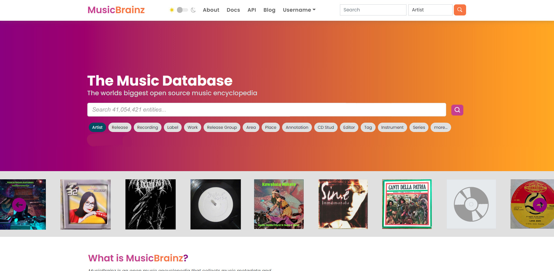
- For the search buttons shown in the top center of the page, I would show a subset of the items available in the top-right search dropdown menu. Many of these are either things that people won’t be searching for, things that will not lend themselves to someone following a relationship to relevant data, or things that normal users have no permission to edit.
First, I would at least place “Release” and “Release Group” next to each other, or maybe even drop “Release” entirely, since Release Group search is supposed to account for the names of each Release inside. Then, I would consider deleting the buttons for,- Area
- Annotation
- CD Stud (should be CD Stub)
- Editor
- Instrument
Some bugs/observations:
- After I use the Light/Dark mode toggle, the links at the bottom of the page are rendered in white text for Light mode.
7 Likes
1.) How can I contribute? Why should I contribute?
2.) How much does MusicBrainz cost?
3.) Can I do whatever I want to the information in the database?Are the collected/contributed data free to use for everyone?
4.) How do I delete my account?
5.) How long will my edit(s) take to be approved / applied?
→ Why are my changes/edits not applied immediately?
→ Answer: I would add the word “Peer Review” to the existing voting process description.
Homepage in general:
What about adding some informations about Birthdays from artists? Upcoming events? “Artist of the day” - “Release/Cover Art of the day” similar as on the wikipedia start page?
4 Likes
I’ve been away on a bit of a holiday, this is awesome to see! Great feedback too.
I have some feedback as always ![]()
Off the top of my head:
- What is the font used for ‘open source database’? Best to keep it simple and stick to the MetaBrainz family font-wise (does MetaBrainz have a styleguide?)
- Twitter is the most prominent thing on the screen upon visiting (even more so than search, because of its large box). Does user data back up this decision?
- Maybe I’m out of touch or something but what’s that search icon? I expected a magnifying glass

- I like the ‘What is’ and the stat boxes. Nice look! They are a bit of a long scroll on mobile though. I think you can drop the picture, unless there’s something specific you want to show there (a custom graphic?)
Edit: maybe a ‘quick links’ set of buttons could go where the picture is, containing the most common buttons used by regular editors/users? They don’t have to stand out, just be handy. - I quite like the ‘Explore’ sections actually - but ‘read more’ is not a appealing call to action for a user. More content on the homepage should go straight to doing something rather than reading about something.
- ‘Brainz projects’ is massive on desktop and mobile… I was imagining something more like how you have the MB stats at the top. Maybe a little arrow to expand the descriptions. An appealing button with a call to action (‘tag your music’) is probably all people need though if I think about it? They’re bright enough to figure out whether they’re interested based on that.
- Supporters is nice, but needs to be smaller on mobile. I find it annoying that they move when I mouse over them, but can’t click them or anything. I would just leave them static.
- I like the FAQs section! But I find the current FAQ’s there pretty lacklustre (edit: probably placeholders?) Might be an opportunity to look at some top music tagging/database questions that people ask on google/search engines?
- The download and footer sections are beautiful imo

- I am missing links to the forum and the blog (+1 for blog headlines somewhere)
- edit: Definitely needs a big ‘signup’ button somewhere prominent (maybe next to search?)
It’s already looking so much better than the current homepage <3
I’ve done a mockup re. making the home page a bit cleaner, as always take or leave at your leisure!
6 Likes
Two trifling concerns
- There should probably be a minimum native resolution for the cover reel. That way, those checking out the website for the first time do not see artifact covered JPEG upscales
- There was a thread a few months ago about improving page metadata for search engines. I do not know if it is too early to implement this or not, or if this was already doen
1 Like
I like the general design, but I think that the current mock-up has way too much information on that first page, which makes it too big and overwhelming.
For example, the first section says: “The Music Database: The worlds biggest open source music encyclopedia”. That’s already very expressive, so what does the the section What Is MusicBrainz? offer new users that they need, and especially, want to know? Similarly, I doubt more than a handful of first-time visitors to the website are interested in the project’s history. Does that really have to be on the front page? FAQ’s would be more suited for a separate page, with a link to it in the MusicBrainz header, etc.
If you look at the Discogs homepage, it’s almost completely dedicated to the music in the database, rather than going on about the database or the community itself. And I think that for new users, the draw of MusicBrainz is in the first place information about music, and only when they have used that information for a time, they’ll want to engage with the database (to edit) and the community (for discussions about editing).
I would extend the first section of the homepage with more exploring of the data itself, like the last added releases carousel, and maybe if the CAA starts supporting artist images and event posters, carousels for those. To save space, the page could load a random carousel on every page load (new releases now, next time events, or random releases etc.). After that section, I would add the bit about the apps, then other projects (but a bit more condensed than now) and finally the footer.
4 Likes
Some quick thoughts. Nice. But:
- major: Search - MusicBrainz is entirely lost. Until the whole search gets updated we need at least catalog, barcode, advanced and direct search accessible both to newcomers and veterans; why is basically the same search on the header and on the top of the home page at all?
- please put back the blog news feed instead of the twitter (a link to it somewhere is fine);
- too much is simply too much. Who loves scrolling a la facebook?
All in all what I would really like for logged in users is kind of a dashboard where you could choose what to show or hide.
5 Likes
Hi @akshaaatt!
Thanks for the mock-up – its nice to see things be more modern! I’ve read a lot of comments that have already been said (thanks all, good stuff!). A few comments from me:
- I think images are being over-used right now – the UNDERSTAND MUSICBRAINZ section in particular has two images that don’t really add much to the content of the page. I think we could do with fewer images.
- The supporters section conflates supporters and sponsors – I think we should only focus on supporters on the home page, but we should consider using grey versions of some of the supporter logos in order to not have too much clashing color on the page.
- Would like to see the logos of other projects higher up – the MusicBrainz home page is the most visible page we have currently and very few people know about our other projects. The logos are all designed to be visually catchy and to convey the sense of belonging to a family. If we could add even a small section that makes the other logos visible, I think it would help a lot to promote the other projects.
- I really like the What is MusicBrainz section!
- I want to add support to the “too much” comment – yes there is too much. I think we can lose a few sections and replace them with links – in fact the Useful Links and Explore Us sections may be sufficient and we can nuke some of the other sections.
I’m looking forward to the next iteration of this!
8 Likes