MusicBrainz Create Artist Page

Greetings, Everyone!!
Taking MusicBrainz Web Homepage 2021 forward, I have created some UI mock-ups for the Create Artist page.
The idea is to make the process in multiple steps instead of Filling out the whole form on the same page.
I urge you all to please check out the UI designs below and provide your feedback on them.


You can also check the prototype here.

Thanks!!

2 Likes

Thanks for the amazing work @amoggh !
While I like the work a lot, I will have to make a few points here:

  • We should make the process of adding an artist as easy as possible. Recently we were adding ways to do this through https://listenbrainz.org/profile/akshaaatt/missing-data/, so it would be worth thinking that how things would be set up in regards to such cases.
  • We follow Server-Side Rendering for most of what we do in musicbrainz.org, so it would be worth noting the UX in such a scenario where the user would have to interact with the website with multiple button clicks.

Great work though! Once we have more feedback and figure these things out, we can look to make the changes. Thanks!

2 Likes

Thanks for the feedback @akshaaatt !!
I think the first point would take some time and discussions to get a solution on how we handle this improvisation.
For the second one, I was thinking instead of rendering a new page for each step the button would just save the data filled in the state and only submit the data on the last click.
Check out this demo implementation for the working part. It has many UI issues but gives a gist of rendering.

1 Like

Well, as I said with the homepage, I am not a fan of pretty little graphics.
We aren’t a game, we aren’t made for children.

Outside of my overall opinion:
The relationship page and the more details page - I can see them being more confusing the new way than the old way.

4 Likes

I guess you don’t use the site yourself? An obvious issue I see is it is very common to need to add multiple relationships and URLs.

Assume this is to make the site “phone friendly”. As long as we can still edit the page as a full page I’ll refrain from commenting too much here as I am a full screen user and this would be a big headache in operation for me.

4 Likes

I don’t like the pagination. We have big screens! I prefer to submit in one page instead of having to go through multiple next… next… next…

8 Likes

Agreed, but I assumed that they got it covered. Either by a second box appearing when the first was filled in, or simply by requiring one to get to “artist created successfully” - and then the ‘edit artist’ page will allow for more.

1 Like

Yeah, I agree that this looks pretty bad. I’m not blind and my computer is not a cellphone. I’m pretty sure that every design that is aimed towards cellphone users rather than computer screen users will be rejected by the community. It would probably be better to improve the app and then tell the cellphone users to use that. Pagination is also a big no in general. Take for example the “add release” page. It already has 4 tabs, which with a design similar to yours would be like 10 pages…

1 Like

They asked for feedback, so I didn’t want to assume. There is a ( + ) on the Relationships, but not the URLS. Logically they lift the work that was done to the Add URL GUI for the releases. Especially in these streaming days it is common to need to link many many pages to an artist.

1 Like

I use MB, including editing, mostly on my smart phone.
It’s unfortunately but it’s the case.

But still, I prefer the current page:

It feels less tedious to type and submit all at once rather than having to browse through a multi-step wizard/assistant.

When you’re at page 2 or 3, you lose the context of what you are creating.
I am very easily distracted kind of person.

10 Likes

i think the design looks really good, but if it were ever implemented i definitely think the multi-page process would have to be toggleable for the same reason @jesus2099 said :0 this seems like it would be very distracting for me. but some pros of your design: i’m visually impaired, and a big problem i have editing in MB right now is that all the fields blend together. checking my edit history shows probably hundreds of “oops! i put this as the disambiguation instead of the sort name” mistakes hahah. this multi-column and multi-section design would probably minimize that.

one improvement for the multi-page system i’ll suggest is i definitely think a preview of all the information you’ve entered before you submit is extremely necessary. for already multi-page edits, like adding releases, i’ve caught a lot of silly mistakes this way.

hopefully you can make sense of everything i said haha… having trouble making sense today

7 Likes

I quite like how the pages look! the larger page elements make it easier to read, especially for new users and users with poor eyesight (and even me, even though I don’t fall into either category). I also like how this design makes it clear what relationships are, especially for new users.

I also think the pagination is a bit odd… I do see a benefit for artists that have about 5 billion links and relationships, but that’s probably a bit of an edge case.

I second this, if I had a nickel for every time I’ve caught a mistake this way, I’d have at least three nickels! :joy:

4 Likes

Wow! Love the look and so glad this is moving ahead.

Even if everyone isn’t a fan of things looking new and shiny, imo we need this if MB wants to attract editors/be a viable and competitive DB.

Personally I think a productive way to think about the feedback would be:

  • new users (not the current captive audience, which will stay regardless of look, unless you really derp it up) are your target audience for the look and feel
  • current users are then be-all and end-all when it comes to function. They have spent countless hours on MB and if you’re making them click more to do something they will signal the pain it will cause (including to new users)

Anyway, I would take the feedback re spreading these out over multiple pages seriously. It adds clicks to the workflow and doesn’t allow for a full overview.

How about a combination of the two? Mockup below.

btw I would recommend showing desktop friendly mockups before mobile mockups to avoid the MB community (justifiably) losing their sh*t :stuck_out_tongue:

note: there’s probably a really clever way to do guidelines and docs that I don’t know about. Clcik a button and then mousover elements to display the relevant section of the guidelines? There must be something that other sites are doing that is great!

note 2: oops I forgot to mention, if we are trying to make this new user friendly a very easy win is to point out ‘required fields’ in some way

12 Likes

I’ll put this into a separate post. This mockup might not be concerned with colours and font sizes etc but I still have to ask:

Do we have a style/guidelines for the overall look and feel of MB (and potentially other MetaBrainz sites) that is coming together? That this page is using?

We only need stuff like “what size is field title text for desktop and then mobile” worked out once. Are we using blue buttons across the whole site? What is the % width of main page elements?

It’s fun to bang out mockups but if anyone is being paid to do this/has the MB overhaul under their purview can they please do the work and define the site styles first.

7 Likes

I agree that this is needed, if there isn’t one already. If you don’t have a graphical profile you often end up wasting a lot of time. I know that the it feels slow and tedious in the beginning, and that you often feel like jumping ahead to the mockup stage, but you will save time in the long run if you do the graphical profile first.

The two things that you generally should start with when you are working with graphic design is to:

  1. Do research on the target audience (who they are, what are their needs, what they want, things that could cause problems in relation to the design, etc) and then this leads to:
  2. Create a graphical profile with font size, colours, the size of images, and all that other stuff. A few subsections might be needed perhaps “new user” (that has extra “look here symbols”, “info boxes” and that sort of thing), “old/standard/advanced users”, and users that differentiate from those catch-all groups in some other way. In this case I guess that would be how you are going to handle things like dyslexia, colour blindness and visual impairment.

Anyway, I remember that the previous community manager mentioned something about this, when they asked the community for suggestions for a new Twitter banner. There were a few that were rejected because they didn’t fit the MB profile (“grey colour” being one of them iirc).

4 Likes

I really think this design looks great! The idea is :fire:. Thanks for having shared this @aerozol !

1 Like

@aerozol we do have a design system in place where we aim to add these guidelines. Thanks for pointing about the style guidelines, I’ll most probably pick this up and document whatever I can and share it to fetch opinions on the same.
This would be a great thing to do since we have the docsprint ongoing. I’ll look to make this a priority.

3 Likes

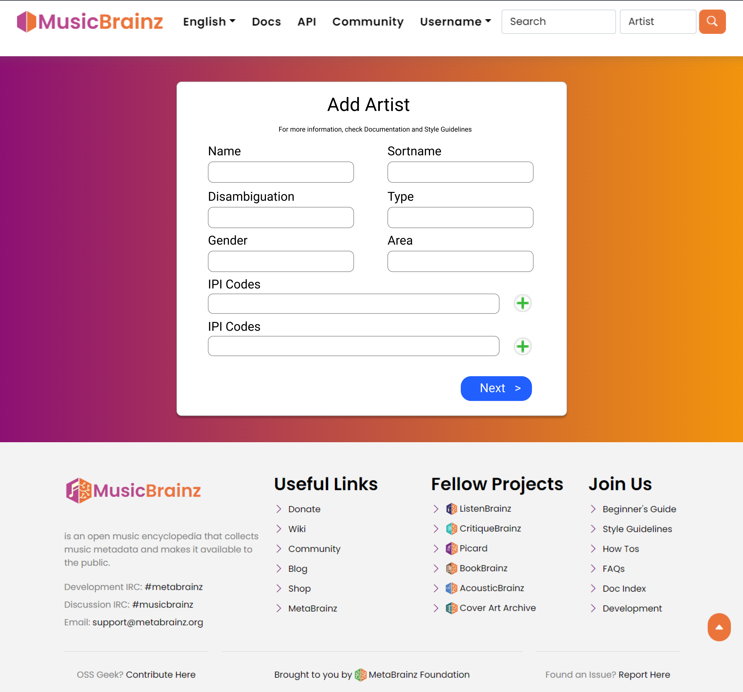
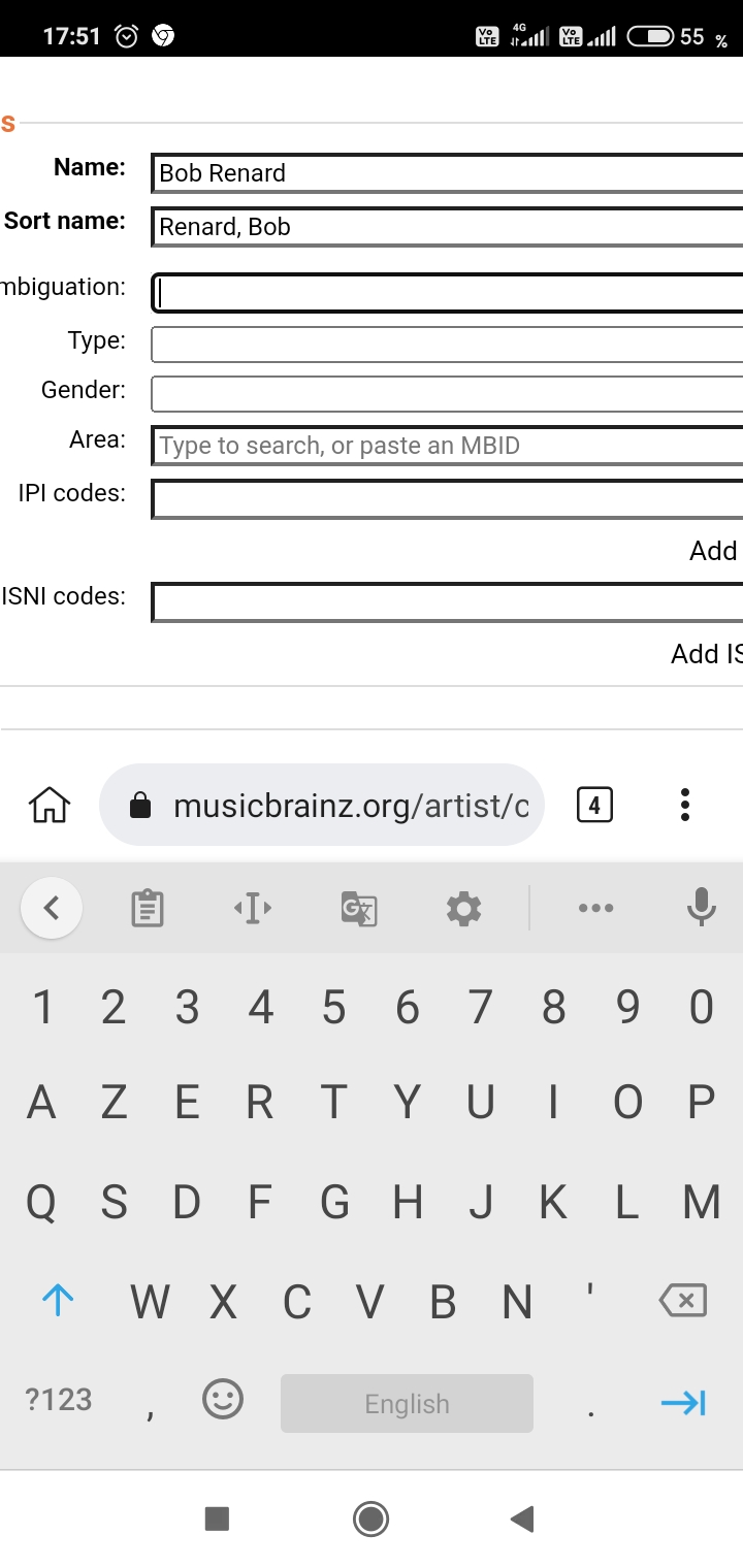
I would be delighted to have a better Create Artist page. But “better” implies “suited to certain requirements”, and this design doesn’t particularly address my requirements. I would like to put my desired features on the table.

My biggest obstacle to using MusicBrainz is that it takes too long to add a Release. The Releases I add most often are classical music releases by little-known local musicians. Thus the biggest time taken to add a Release is to add Artist entries for all the local musicians involved in a Release, who are usually not yet in MusicBrainz.

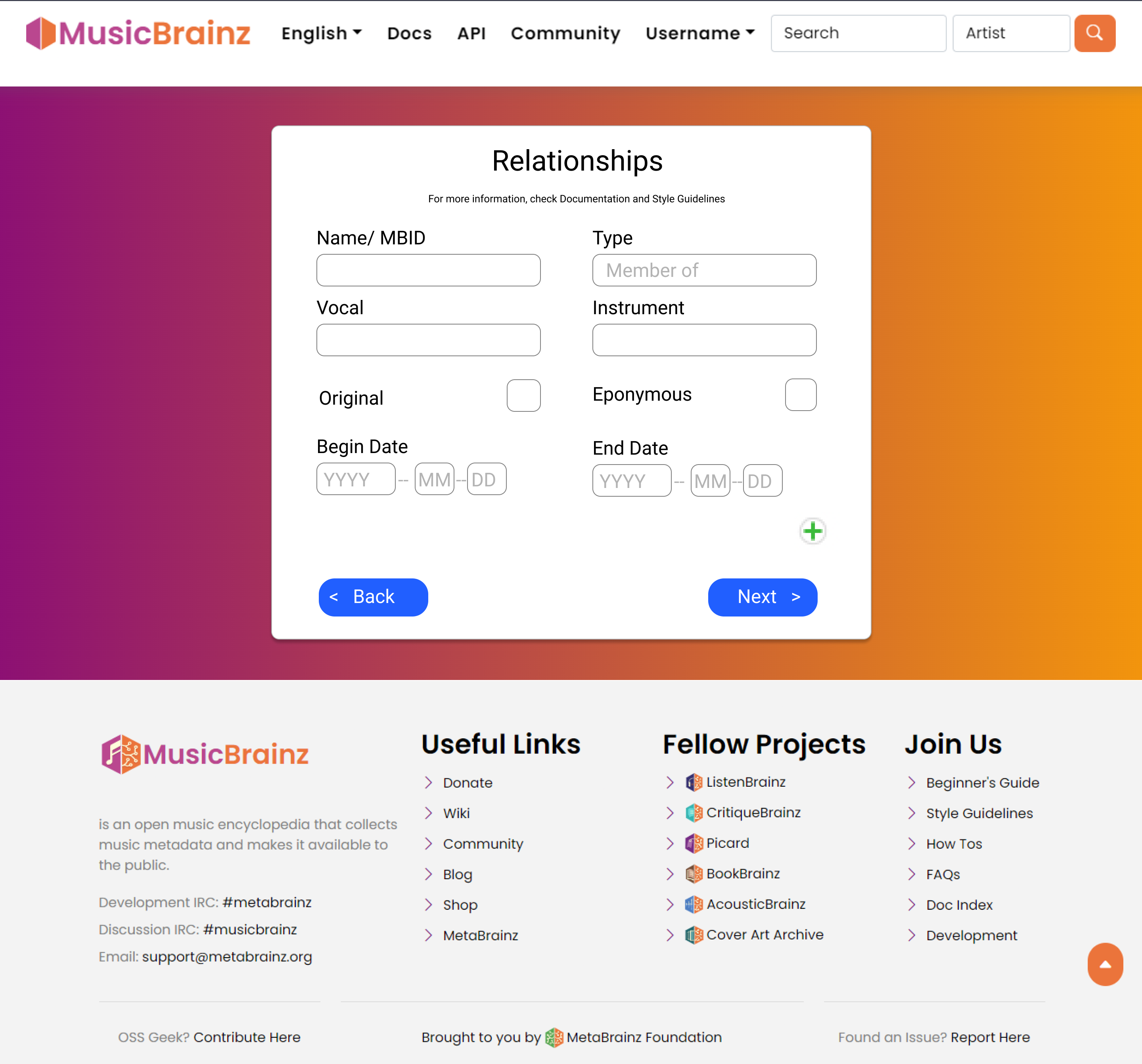
A common way Artist entries are unsatisfactory is that they are ambiguous. I see a “Mike Smith” on my Release, I see a “Mike Smith” in MusicBrainz; are they the same person? The most powerful way to disambiguate an Artist release is by Relationships: lots of Relationships, to external links (artist’s website, bios, Wikipedia entry) and to other Artists (groups in which the artist participates). Adding Relationships from musician to group has the added benefit that it protects the new Artist entry from being deleted automatically in a few days due to being unconnected.

Note that disambiguation strings are absolutely mandatory, in my humble personal style, but they are not sufficient. Relationships describe an Artist far beyond what disambiguation strings can do.

The most frustrating and difficult part of adding Relationships to a new Artist is when the related group Artist is also missing from MusicBrainz. I then have a partially-completed Create (person) Artist dialogue box open, and on top of it another Create (group) Artist dialogue box. The box on top does not have the edit note re-use or other features of the main Create Artist dialogue box.

So, the change that would most speed up my MusicBrainz use and reduce my frustration would be a way to let me Create an Artist, and Create several related Artists, complete with Relationships between them and lots of external links to each. I would like to be able to build up many of these Create Artist actions in parallel, going back and forth to tweak each one. Maybe each Create related Artist screen becomes more entries in the multi-step flow of the original Create Artist.

I would like the Relationship lookup to make it easier to check, if I find an Artist to use in a relationship, whether this is in fact the correct Artist. I would like to be able to see the entire Artist entry pop up, including their disambiguation string and their dates and their releases, so that I could see if the Artists which MusicBrainz found is consistent with the Artist I want a Relationship to.

If a UI redesign could improve this aspect of making a well-populated Artist entry, complete with lots of external links and Relationships, it would improve my productivity in MusicBrainz, and maybe help me work through my backlog of unentered Releases.

5 Likes

People have said a lot about how they don’t like multiple pages to add an artist so I’m just gonna drop a “same” on that. One thing I do like is how it’s more centered instead of everything just shoved to the left on the page. For widescreen monitors it always looks weird having 80% of the right of the screen being blank.

For @aerozol’s example, I’m not a fan of the big padding around everything, especially the vertical padding. Having more info on the screen at once is good, especially when going through and doing quick double-checks before hitting submit. Extra padding just makes me have to scroll more and even potentially get lost if the page is too big.

2 Likes

Regarding the field for Disambiguation: make sure it is long enough to show the 80th percentile length of disambiguation strings presently in the database, or alternatively, long enough to show a string like “Canadian composer and vocalist, fl. early 21c”.

Regarding the field for Area: this will be a lookup. Be sure there is enough horizontal and vertical room for results to appear as a pop-up menu. In the present UI, if you click in the field but don’t type anything, a menu appears with the most recent results. Frequently, the entry I want is in this list, so I just click on it. Please design to make this workflow efficient.

Please keep the buttons which copy from Name to Sortname, either unchanged or with a swap of FamilyName, PersonalName. I use those buttons in 95% of the Artists I create.

Can you make it more efficient to select Type, than having a pop-up menu? I suspect that the vast majority of the entries will be Person or Group. Can we make it possible to choose one of these with just a single click? Maybe pre-populate the choice based on which button to copy name to sortname the editor clicked: if copy with swap, Artist is likely a Person, if copy unswapped, Artist is likely a Group.

I suggest that for Disambiguation, we should prompt the contributor to fill in something, rather than leaving the field blank.

The sequence of these fields is not ideal. Think about the order in which these facts will be in an editor’s mind. I think a better order is: Name, Sortname, Type, Gender (if applicable), Area, Disambiguation. I think the IPI Codes could be dropped much lower down the workflow. Personally, I have never used them as far as I know.

5 Likes