We have been working on a revamp to the MusicBrainz Website. We are moving ahead with some design changes and wanted to share a few mock ups for the first and the most important page of our works here, the starting / landing page to the MusicBrainz website. I am pretty sure it was the first interaction for many of us with the MetaBrainz services and we all have a special place for it in our hearts.
Now, as technology has progressed rapidly, we need to upgrade with time as well. With that, we even need a great first impression on anyone who comes across MusicBrainz.
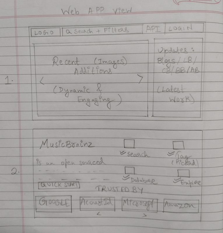
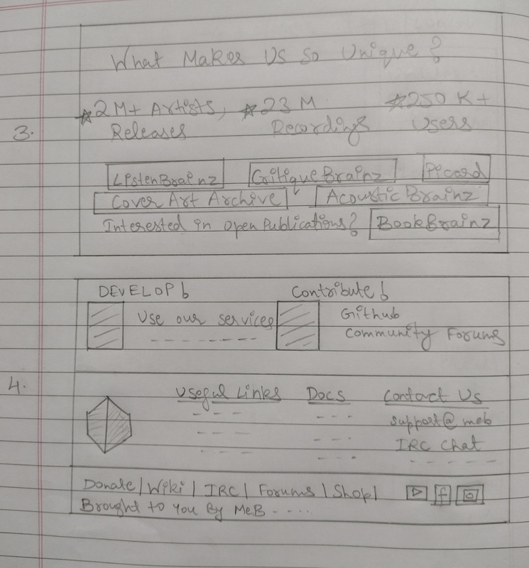
Mocks Ups in whole:
Let’s dive into every section one by one.
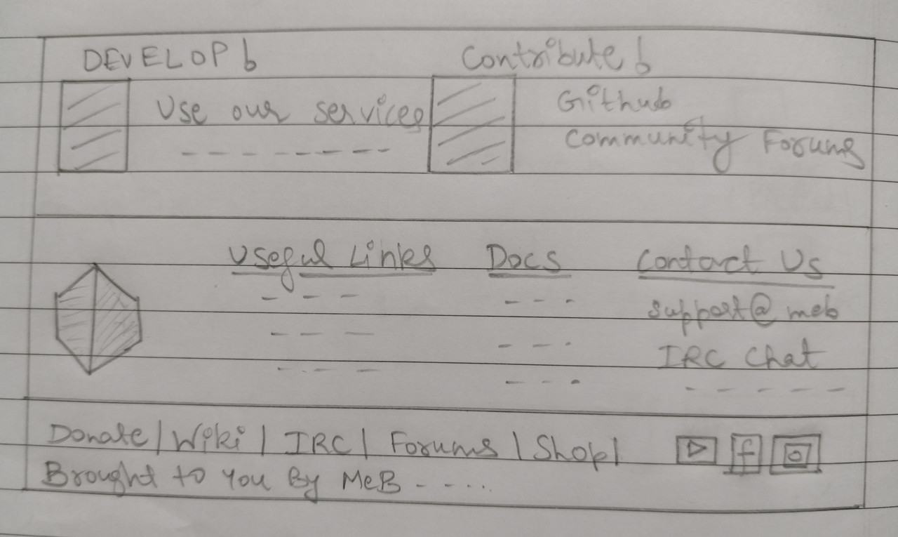
The Opening.
The highlights here are: the Search Bar on top with a single layered Navbar as opposed to the current two layered one, the recent additions moved to the top, and the Updates showcasing our blogs, latest stuff and much more. This will help keep the introduction to the website Dynamic and Engaging in nature!
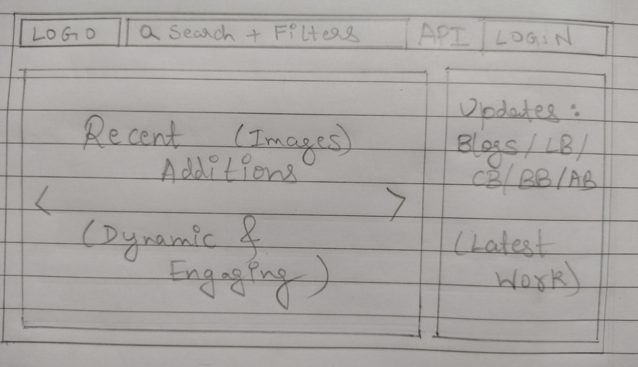
MusicBrainz Introduction and Features
This section will aim to explain the users of the important features and the supporters/sponsors of the project.
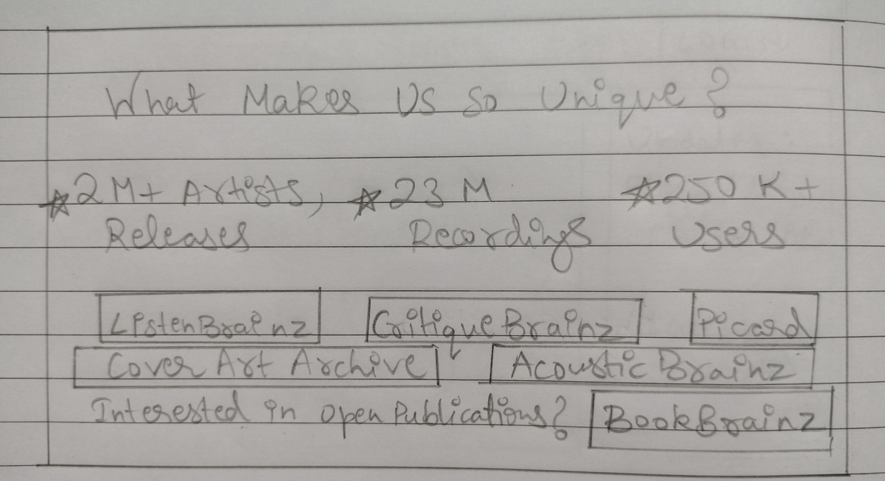
The fun part.
We showcase our progress till now and our major projects which pan out the scope for more user interaction.
Finishing off
Here, we invite the users to contribute, use our services and understand more about us and the relevant information to interact.
Just a comment to section 3, which lists CritiqueBrainz, ListenBrainz and AcousticBrainz as separate projects: why keep considering these different components of the same service as different sites?
Of course, the DB in MusicBrainz is the main component, but using this information is the reason why people visit the site. So, tools to search information about his/her existing music or to find new music should be placed in the upper-left corner of section 1 instead of DB related information.
To search for information about existing music, a user-friendly search interface should be available, possibly avoiding the current preselection of artist/realease/recording, adopting a free combination of them in the same way to add track of the playlist interface in ListenBrainz. Genre categories could help with this too.
To search for new music, the user should be able to use:
for old releases: combination of social feedback from other users (CritiqueBrainz, but also all the rating in the different projects) or user listening statistics (ListenBrainz and AcousticBrainz);
for new releases: user listening musical preferences or uploaded playlists to feed the recommendation engine leveraging on AcousticBrainz.
In such a scenario, the separation of the different projects is irrelevant to the user and should only be in an “About us” section of the site.
I would move the “Introduction” section you have at position 2 to the first position currently occupied by the “recent additions” section. Without context as to what this project is about, a fancy gallery of images or blog post links are largely meaningless to a potential first-time visitor.
I would not list the sponsors that prominently on the main page. This feels like attempting to buy legitimacy with their logos.
The final section starts to inherit a current problem of the main page, namely the “wall of links” with little clear hierarchy. I think the amount of links on the front page should be cut down dramatically, with resources instead linked from further high-level pages.
Finally on a more general note, how do you envision adapting this layout into a responsive form? The current design feels like it might lead to endless stacking of boxes when viewed on a small phone-like screen, with content hidden behind lots of scrolling.
While “mobile first” might not be the right way to think about it, any new design for MusicBrainz really needs to include designs for mobile devices right from the start - so you should think of how the site transitions between different screen sizes, and whether the order of content still makes sense when arranged vertically on a narrow screen instead of horizontally on a wide screen.
At the mockup stage, I’d probably recommend including 3 breakpoints in the design: a portrait phone, a landscape phone/small tablet, and a desktop/large tablet.
Thanks for the comment @PierPiero !
I agree with your thought regarding the search interface and the reasoning as to why we should not separate out the different services of CB, LB, etc.
However, I don’t think we are ready to do that yet. The way we provide our services, we need to first focus on making sure they work in the best manner standalone.
Great points btw!
Thank you for adding your thoughts to this @elomatreb !
Regarding the point about moving the introduction up, I deliberately moved it down the slot because most of the users we have on MusicBrainz are returning users who are already familiar with our work. Since we do not want to separate the landing page from the functional page, pushing the recent additions up is very engaging since it will be something new for both the new users and the returning users.
You make a really good point about the context to the project and I have come up with a solution for it by adding a tagline as well to the top, namely “The Open Music Database” which would make it pretty clear about the intention. To top it off, we could even add a link to the intro section and those who want to understand it, would directly be headed to the section.
Regarding the sponsors, I have to say that we do need to showcase them. It does not have to be only Google or the top companies. I am fine with any logos showcased as long as we provide some references to our partners / sponsors / users. This is how we tell the visitors where the scope of our projects span.
I agree regarding the point about the links. However, I actually adopted the idea for putting out the links in a systematic format after I got to explore the landing page of slack.com and their footer is very neat. That is where I realised we could greatly use the footer since we do need to separate out our projects, organisation, documentations, etc.
And YES! The website is going to become responsive soon
I assure you there won’t be any such boxes as shown in the wireframes. I used the rectangular boxes just for the convenience of drawing and the actual web app will be neat with a great style!
Makes sense. Thanks for the reply @kepstin !
I was on a time crunch hence could not include the mobile wireframes, but I do assure you they are planned out.
Indeed I imagine that most of the users we have on MusicBrainz are returning users, but I was guessing (like @elomatreb, but only based on my own MB usage) that most of the homepage users, specifically, are new people, I mean not even yet users.
I don’t know if we could see that in the stats (proportion of logged in users on the homepage).
Hi @Freso !
Actually the image sizes were greater than the upload limit. Hence, I was unable to upload them to the forum and decided to host them through https://postimages.org/
Huh. I thought Discourse would automatically resize them. I’ve increased the image size limit now (from 4MB to 8MB), but it may also require @zas to up the client_max_body_size.
I’ll be the devil’s advocate here. Or maybe just the plain devil.
Musicbrainz is designed for an elite audience - say 5% of the global population? To edit on it enjoyably takes IT db skills that say 0.1% or 0.001% of the global population has.
There is nothing wrong with us elites making projects that suit our very educated and refined tastes. And if some large number of naive low skilled users should wander by and spend an wasted and frustrating 3 hours going nowhere useful then that will serve to demonstrate our superiority. And the friendlier and more pleasant the home page is then the more failing users there will be to attest to our prestigious IT skills.
Back to the nonsupernatural life:
Having a blind elderly parent who is repeatedly excluded from participation in modern life due to the intersection of having low IT skills and the ongoing farce called “Accessibility” I find the normalisation of sites requiring elite level IT skills being presented as “accessible to all” increasingly problematic.
The current homepage is bad enough in this regard. Why make it worse?
I’m not sure: MB is included in the reference IDs allowed by WikiData, so many people just reach the site to get information about music and are not interested at all in how to build and maintain a DB.
Anyway, the answer should be in site analytics, to understand who is visiting the site, from what source and looking for what.
I found MusicBrainz as a teenager and feel there shouldn’t only be an elite audience to us if there is. We are meant to be open to everyone. We need to bridge this gap so that maximum people can use our resources and take the mantle to an even higher level.
What we do is unique, top-notch, and amazing. If anything, we need to make it more accessible and understanding for everyone.
Everyone is skilled if taught/explained the right way.
Top bar, nice to keep it uniform across the site, not getting into the nitty gritty with this.
I would enlarge the search function. It can allow the page some space to breathe (like in BookBrainz, though I imagine it wouldn’t be quite as big), and I think this is the MB’s #1 asset - the data.
I was thinking instead of having something like your (#3) statistics you could have some dynamic text under the search, e.g. ‘search 1,123,124 recordings’. And have it loop through different entity types. Particularly something like ‘with x added today’ could be a good way to leverage MB’s amazingly accessible data. I think the stats can be subtle but still show off effectively.
It’s common practice these days to focus on the signup button so why not. Big. Login button at the top right or smaller for regular users, doesn’t need to be signposted.
I would avoid using blurbs on the home page. The current text heavy homepage is something to avoid imo. But some descriptive text like ‘the open source music database’ is still important for the people who end up at MB and are scratching their heads about it. An additional link like “why open source?” or “why use musicbrainz” would be great though (maybe it could concertina out an introduction instead of taking you off page). I would love for this link to highlight the story of MusicBrainz, rather than get technical. That all the contributors to CDDB got ripped off and then Rob created this site is a great story, and captures the spirit of MB!! If I didn’t read that somehow I might be on Discogs…
Plus all the most important links, the ones that people use the most, as you already have there in your wireframe. Ideally above the scroll for a desktop browser! So we can have that pretty search bar and background info etc but people can click straight to where they have to go without any scrolling.
The recently added pics are cool, and great to keep. I think there is some potential for ‘play’ on the home page though. Could we have a user type in a tag here and have it cycle through the most recent releases related to that tag? I love watching the Bandcamp ‘selling right now’ ticker (especially when Bandcamp waives fees and it goes crazy :P) but MB’s ticker doesn’t have the same grip on me as it doesn’t dynamically update. Probably out of scope to change though.
NB: I have relegated the blog updates to the bottom because I think the current blog is boring for your avg user, even though the technical updates are great for us long time users. With some work it could be a top level feature, like Bandcamp or Discogs (they put a lot of work into their blogs to be entertaining to the general audience), but not now imo.
The pathways to dig deeper into MB, contribute with code, tutorials on getting started etc. Quite important I think, but okay to scroll to.
A bar with the other MetaBrainz projects, maybe a 3 word description under them.
Latest blog posts and github tickets and stuff like that. Not too sure how big this would be.
Supporter bar
Chuck the rest in a big footer
My dream would be to have an element on the homepage that is more playful, as alluded to with #4. Something where people can put in an artist and see how it relates to something else/all its connections, or have a interlinked data web you can click through or something like that… MB is MADE for that kind of thing and it would be so cool to let people interact with the data in a more ‘real’ way right on the home page. Just a little dream
Maybe the hierarchy would be helpful to look at as well.
(How I read) your mockup:
Recent additions + blog
Search + login
What MB is + important links
Sponsors
What MB is/stats
Other MB projects
Contribute/join pathways
The rest
(How I imagined) my mockup:
Search + signup
What MB is + important links
Recent additions
Contribute/join pathways
Other MB projects
Blog and stuff (maybe)
Sponsors
The rest
Let’s see if we can get some stats on current user behaviour to see if that influences how the hierarchy should be! If @Bitmap has any luck digging something out
p.s. is it hard to put extra blocks in for people who are logged in? Some extra links and info for editors would be very nice, esp. for newbies. Another thing that might be out of scope…
Although you’re right about editing being tricky, I’m not sure editors are the target audience. There might be heaps of people browsing MB without editing it at all?
Just like the Wikipedia target audience isn’t necessarily a Wikipedia editor (though ofc they are very important).