I want more clarity and to be able to automate the whole thing.
That’s possible → Release “The Rocky Horror Picture Show” by Richard O’Brien - Cover art - MusicBrainz
In fact, I should add it, otherwise you might think the picture is printed on the cardboard
I often have the outside of the booklet (page 1 and 4 or 8 or …) and the front separately. The front would be the front, with the goal of having that as the entry’s cover image. I used to mark that outside of the booklet as Booklet/Front/Back but I now know that is wrong and only use Booklet. However, Booklet/Front would still be correct (if there is no O-card or whatever). I always use the comments for booklet pages.
Another edge case is a book where the booklet is a number of pages between thick CD wallets that also have printing on them:
I numbered both the book pages and the booklet pages in the comments. Weird stuff like that is impossible to catch in a few tags. The comments are good for that. Although a page numbers field would be very nice. Please make it allow multiple page numbers! I always scan everything I can see in one go: two opposite pages of a booklet, or all the panes in a multi-pane insert.
1 Like
If there would be a way to fill in comments from filenames that would save me a lot of time. Especially for the booklet page numbers I copy the file names to the comments.
More cover art metadata fields, or other improvements, would be awesome! You can make or vote for an existing ticket with what you want changed. You can then either code the changes or hope another nice person will do it in their valuable time.
Talk on forum posts is always good (and fun!), but if you want features added to an open-source project there’s nobody else to complain to or about sadly.
5 Likes
You are not alone ![]() I have created a bookmarklet to fill image types and comments from filenames:
I have created a bookmarklet to fill image types and comments from filenames:
Currently the comment extraction is fitted to my personal needs, so you might have to adapt it a bit (with my help) until I make a userscript version with configuration options.
2 Likes
@ernstlx - I forgot about vinyl. I was more meaning people who were doing “medium, front” and “medium, back” on the CD in a jewel case.
A picture disc vinyl in a plastic sleeve is a perfect example of showing variations of type combos. The front and back of the item is the actual medium in that case.
@jerry1970 - that Ramases release is a good example of how many variations exist. So many different ways of packaging a product. This is why guidelines always have to be fairly loose and have some flex in them. And also why language for words like “back” get a specific meaning.
I like the confusions caused by some releases. This Crass release is a booklet that folds out into a poster. Plenty of overlaps of types there.
I never managed to get a clean scan stitched together of the outside of the poster. That would technically have been a front, back, booklet, poster ![]()
1 Like
So to keep it a bit loose is necessary for weird packages like Ramases and many others. But I realise the system does need a few specific items. The cover image, and the Front/Back/Spine/Top/Bottom to tell the user what the item looks like on the shelves. (There would be two spines for regular jewel cases and jewel cases inside slipcases, by the way.) I usually upload an image that is a Front only, and then the booklet outside which has the same but also the back. Or in case of a slipcase, I upload the slipcase which often has the top or bottom as well, but I still upload a Front-only as well.
I recently added this:
I made scans as large as possible so I didn’t have to stitch a lot. In this case it took some time to stitch together because of the text (easier with lots of one colour) but it worked out pretty well. That was 9 frames though. I just remembered I also did this one, a 12-pane poster which at 600 dpi turned out to be 34 MB:
1 Like
Cool! Going to test that right away…
I think the guidelines say MB prefers the spines to still be attached to the back. Don’t see many single spines unless they are part of a box. A slipcase is a fun one as you have the carboard spine you see on the shelf, and the inner spines of the CDs sticking out of the box on the other side.
I will sometimes scan the bottom of a standard CD jewel case if there is something like a Sony logo on it.
It is the text that became the killer on that Crass release. Best I could do of that poster is four scans. It was hard enough stitching the poster together, but the text was impossible as I had too many different colourings \ slight twists of text and just couldn’t get it lined up clean enough. If you are fussy on the picture you can spot the joins, but I hid them best I could. Same on the “booklet” shots on there. Just couldn’t manage it on the text on the full foldout - yet.
It is why I left the images from Bandcamp on that release to show how it looks from a distance.
We need a thread of “the most awkward scans we have done” entitled “Can you see the join?” ![]() A 12-pane poster has an emphasis on the pain of production
A 12-pane poster has an emphasis on the pain of production ![]()
1 Like
“medium, back” on vinyl isn’t wrong, just unnecessary. I typically remove that when I see it. The only reason “medium, front” is even really selected is so that a cover art image would appear for tagging when there was no actual cover art.
1 Like
MB also needs something set to front otherwise it will not show an image in the corner. (Or am I getting confused with the coverart script…)
I tick it as front on the basis - Is it what I see when I pick the item off of my shelf?
2 Likes
I’ve put together a list of related tickets, please make sure to comment and/or vote (in the ticket tracker) if you think any would help. If there’s something missing mention it here and we can create new tickets.
- Support page/medium numbers
- Support front/back of types
- Implement grouping on the CAA
- Cover art types: printed on package vs separate booklet
Tangential/cover art-related:
- No Cover Artwork Button
- Reorder Cover Art types
- Cover Art type: packaging
- Show medium cover art in the sidebar if no front cover image is available
- Add new coverart type “Press Kit”
- Create style guideline for Cover Art Archive (closed, but of historical interest to this convo, and you can still comment)
You can browse all open cover art archive tickets here
3 Likes
It doesn’t work for me on mobile, strangely.
Here another link to open CAA issues, in case someone else needs it: https://tickets.metabrainz.org/projects/CAA/issues?filter=allopenissues
1 Like
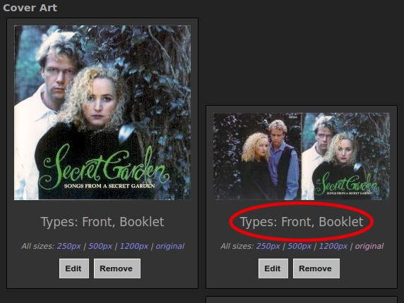
How do you feel about this one? It was originally “Front, Back, Booklet.”
I removed “Back.” Personally, I would remove “Front” from the second image as well, especially since there is an individual “Front” image present. But I thought I’d better ask.
3 Likes
Hmm, I would remove ‘front’ from the second pic as well… but it’s not technically wrong… and MB does love being technically correct ![]()
It’s just not particularly helpful to have that tag on there imo.
At least removing ‘back’ is certainly correct.
4 Likes
That was my thought as well. I’m a Plex user, and if this were the only image with the “Front” tag, Plex would use the image as the album cover, which is certainly not optimal.
1 Like
If there was no other cover at all I would be more tempted to leave it as booklet + front, actually! (only theoretically possible, because I wouldn’t be able to resist cropping out/adding the cover)
Different needs for different users, as always.
1 Like
“Technically” front and booklet. NEVER a “back”.
Booklet makes more sense… but some people like marking anything page one of “booklet” as also “front”… so “meh”
If this is the only front, then it would be better than nothing and likely to nudge someone to download and crop it… (@aerozol thinks like me on this and knows a crop take 60 seconds to download, crop, upload… bish, bosh, done)
1 Like
I do that is if it legitimately is both the front of the release and a booklet, i.e. jewel case releases.
2 Likes