Hi all!
Thanks for the feedback. I’ve gone through every comment, and addressed them where possible. I won’t answer to each directly, but you are welcome to follow up with further comments.
A reminder and apologies about the following:
If any feedback is impractical to implement, or there is disagreement, the designers or dev team will make the call (sorry!)
Though I think I have been able to address a lot of your feedback!
A few notes about this mockup and some of the most common feedback:
- This time it is a ‘logged in’ view.
- I’ve included the menu this time - a redesign that is intended for when a user is in the ‘editor’ flow, and should address a lot of concerns + be a nice upgrade (less clicking!)
Redoing the menu is a bit outside the scope of redoing the homepage, which is why I removed it from draft 1, but with so many comments focussed on wanting quicker access to various links I will talk to the team about the possibility of implementing this alongside the homepage update. - The “Welcome Back” section: There have been a lot of comments about not wanting to scroll down to get to what editors use, but few replies as to what’s actually missing/editors need.
I have put some example links into the new “Welcome Back” section, but specific suggestions would be great. - Homepage density: My mandate to make the homepage more appealing to casual users, combined with some homepage click stats, led to the current design.
We may still reduce the padding above and below the sections - that’s not critical to decide on now I think, we can play with it when the page is in test.
More details: The vast majority of clicks are the search and then the user page (let me know if you always visit the user page for something specific/a link/a stat, maybe we can bring it up front). The about doc is high up in the stats, so that section is just after the scroll (but note that it is still 2,487 clicks vs a combined 31,945 for the 3 spots above it). - The Picard box is an existing graphic that is used pretty much everywhere for Picard where a graphic is useful - I won’t workshop it for the homepage redesign sorry, but it would be easy enough to swap out the picture one day.
Please click the image for full size:
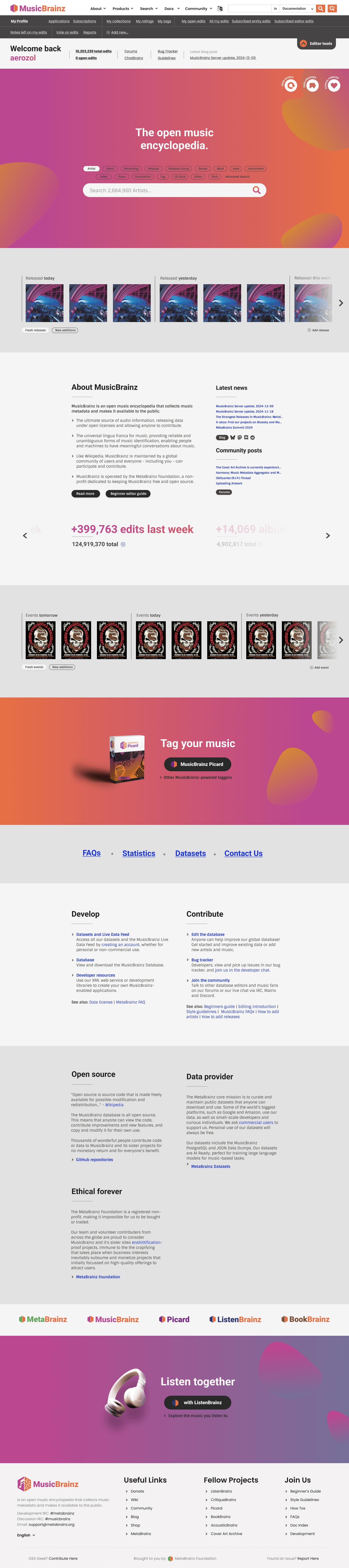
P.S. Agreed that a combined search is a priority. I have pushed for it a number of times lately, even. But it’s not my call… maybe we can get @anshgoyal31 to do it next!
P.P.S. @mr_monkey, I added project logos at the bottom but a bit different to your example - so many of the icons in that one are for defunct or ‘background’ projects! I also wanted to mention that I can make a ‘fancy’ panel for BookBrainz, like there is for Picard and LB, but I will have to do a matching illustration of some sort which will take time. So I will hold off until I know if those ‘fancy’ panels get a thumbs up. We can make the LB panel into a carousel (leading to the BB one), or we can have it separate, keen for your thoughts.