Homepage design mockup

Kia ora!

@anshgoyal31 has found some time to tackle a long-overdue MusicBrainz homepage update, so I have polished up a homepage design. I would love your feedback on these mockups, in case we have missed anything obvious.

Please note:

  • If there are big concerns, we could first apply/test this for the logged out view only (giving extra time to feedback if anything here mucks with your editing workflow)
  • A homepage update is long overdue, so we’re not looking to ‘workshop’ this mockup for long
  • If any feedback is impractical to implement, or there is disagreement, the designers or dev team will make the call (sorry!)
  • I will make mobile mockups after the first round of feedback

Please click the image for full size:

Related: Release page design mockup thread from yonks ago

12 Likes

Would be useful to see the login version too. Design looks new clear and funky - with a long scroll. The kind of thing only a new user who is enquiring about the site is going to roll.

If I saw that for the first time it would keep me engaged as it is not “too messy”.

Having the search the loudest focus front and centre is double plus good.

For me, I’ll be looking at the logged in version where I am after a quick to find menu. My muscle memory hits the top bar menu and the forum link.

I just noticed the time travel predictions in there. “Releases tomorrow”. Now that is some clever coding if you have cracked looking into the future. :grinning_face_with_smiling_eyes:

4 Likes

Are we dropping the recently added section entirely?

I kind of like it as if the mood strikes me I’ll check on whats been added, and sometimes it can have the benefit of finding a newbie who’s maybe not using the right style or making a mistake

4 Likes

I think the recently added is the line of coloured icons at the bottom of the first part of the page. The mock-up is just repeating an image I think,

1 Like

oh i thought that was acting like a release tracker, like these are the records released today, yesterday and tomorrow not what has been added to the database

1 Like

I sometimes add upcoming releases, but let’s not complicate things! Everyone, please know that the mockup has been updated to stay in the present + past :slight_smile:

The ‘recently added’ section was replaced by the ‘released today/yesterday/etc’ timeline, which I think is more useful for non-editor browsers (I see that format on a lot of music-based sites, and I usually have a look).

The best solution is probably be a toggle (e.g. order by: last added to database / date of release / ?), but I don’t want to bury @anshgoyal31 in complicated details already. Perhaps we can put a toggle on a stretch goal list @anshgoyal31, and see if you think it will be easy to add.

An alternative would be to change it to ‘last added’ in the more editor-centric logged in view - but probably that would annoy some editors who prefer the release date view.

As it stands, this is the only mockup. The logged in version would be the same - at this stage.

I don’t use anything on the homepage as part of my editing workflow (apart from the top menu) so I’m keen to hear what else editors use from there, that is missing or too long a scroll here. Good to know you use the forum link IvanDobsky, I will make a note.

Is it as simple as adding a basic no-nonsense panel to the top with all the ‘advanced’ links and tools that editors want? As an editor, stepping outside my role as designer, I couldn’t care less about formatting etc. I’m just not sure what links would even be required/wanted, that’s not already in the top menu:

1 Like

yeah a toggle or a profile preference might be useful; to be honest I know a lot of people using the site aren’t us hardcore data nerds, so maybe a more “hardcore” view could also be an option (even if its a sub page).

Hardcore view could have:

  • recent database additions
  • links to reports
  • links to voting views
  • maybe some statistics like number of open edits and such
1 Like

Did you see the logged-in panel mockup I posted just above your post @sound.and.vision, right at the end of my post?

Reports and my open edits etc are already in the top menu - I don’t want to double up just for the sake of filling space (but happy to if it really is useful!)

Adding a stat part would be cool though (imo)

1 Like

Love the clean new look!
I’ll be participating in the implementation (if only to review), and nothing strikes me as complicated to implement. Some creative CSS in a couple of places (I like the colour gradient on the stats text), but nothing out of the ordinary.
We could even reuse the floating blobs from the ListenBrainz homepage.

I agree with the points made above, specifically:

  • a toggle for “recently added” / “releases today…”.
    I think the new view (recent releases) is a great addition, but I also enjoy the random generator that is clicking one of the recently added releases.
  • search front and center is great!
  • I like the idea of adding some editor stats. Stuff like number of editors, # of edits this day/week/month, etc. could really showcase the community aspect in a way those huge entity numbers don’t

A couple more comments that come to mind:

  • The “create account” and “login” button could be more prominent as a call to action, maybe bigger buttons under the search bar? Not sure how required that is, but for anyone landing there I think a small-ish grey button is not the easiest to find.

  • Are we losing the MusicBrainz logo entirely from the top bar menu? We only see the logo in the footer is the design, for those who make it all the way down.
    BookBrainz and ListenBrainz both use the “icon” version without text, and I think it adds a nice pop of colour that I am missing with the full white bar.
    image
    We could also decide to change all of them to the rarely used “tiny” version if that makes more sense?
    image

  • Speaking of, I think the “and more” bit of text under the LB/BB section could be a nice place to put all the logos underneath (maybe small and just the icon versions) to show the breadth of the project?
    Thinking something like this, icon version

7 Likes

This looks great @aerozol
One thing I would suggest is that the search bar doesn’t default to “works” - people may not get what that is on their first visit… Maybe “artists” instead?

4 Likes

Several thoughts:

  • It’s nice that I don’t have to do any scrolling on the current home page.
  • The mockup has lots of white-space, which I feel becomes a huge waste when browsing via a traditional form-factor.
  • The footer in the mockup is good, IMO a good balance of white-space and links.
  • I feel like a nav bar should be in the top white area.
  • Would the arrows from LB homepage be added to this MB hompage for quick jumping?
  • The Picard banner should be closer to the top as that is how most people stumble upon the MB project.
  • The quick search (although maybe artist or rel-grps instead of works by default), overall stats and the recent community post in the mockup are nice.
  • If there is going to be that much scrolling, a quick links bar at the top would be nice (I wouldn’t be a fan of having to return to the top of the page just to log in).
  • As mentioned in other responses, maybe different view for visitors vs members would be good.
7 Likes

I agree with that. I don’t use the main page much, and it is totally fine with me that it serves mainly as an introduction to the project and is targeted at the new user.

But there are two things I do when I just open the main page:

  1. Start a search (the prominent search in the mockup is great)
  2. Navigate to one of the specific sub pages of MB. This can be anything: the advanced search, my user profile, the stats etc.

Not having a nav bar would really make the front page far less usable to me. Actually from looking at the mockup I would need to scroll down near the bottom for most navigation.

Otherwise I really like the look of it.

3 Likes

This will be a big improvement over the current page! Some feedback:

  • Search being front and center is great. Most of the time, whether I’m editing or just looking something up, search is what I want.
  • That said, the landing is a little too sparse. Having at least part of “About MusicBrainz” and/or some of the dynamic information (either latest news/posts or current releases) would make it feel less empty and put some of the useful-but-not-primary stuff within reach. Regular users are probably the target for a lot of that, and I’d be surprised if regular users scroll past the first page to read it.
  • To Ivan’s point, it might make sense to present different information to logged in users versus not. There’s a mix here of information targeted at new users and editors, and either one will have to do more scrolling than people are likely to do in practice to get to some of it.
  • I’m not sure how much of this is intended to be final, but personally, I don’t love the “software-in-a-box” look for Picard. It doesn’t fit the rest of the page’s aesthetic, we don’t sell Picard, and software in a box has a good chance of feeling dated to a lot of folks, particularly younger users.
  • I really appreciate the color on the page. It does make it feel more alive than the current page.

Thank you for doing this work. What comes out of this process looks like it will help the front page a lot.

7 Likes

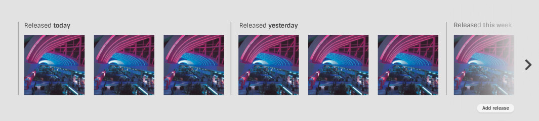
Don’t you mean “added today” otherwise someone will get confused with “Released today” and see a 1960s LP that has just been uploaded.

Edited to add: Okay, I realise I miss read that. If it was “Released Today” then I’d not be interested. Like others I like the totally mad dice roll of oddities that appear. What MB editors are actually doing. MB editors are such a fascinating bunch of bizarre tastes. A “Release Today” may get drown in seven versions of the same image from multiple versions of a single. Feels a like something that should be on Spotify and not MB.

MB should show case editors, not sales.

I like the “Just added releases” images. They can be fascinating. They have also, more than once, led me into a rabbit hole of new music discovery.

My personal use - the home page is my entry point of the site. I look at the top of the page and click on “My Data” menu items like “My Open Edits”, “Edits for subscribed Entities”, “Profile”. And the “Editing” menu. Also use the top right search box.

So a “no-nonsense” menu similar to the current one is fine to me. We all use different stuff.

Just due to the way my bookmarks are setup, I get to the forum via the front page. If I would have to scroll way to the bottom of that page to find the link, then I’d just add a new bookmark instead.

I think I am like @outsidecontext in I use the front page as my door into the site. I am always logged in via cookies(*), so I have a bookmark of this point to enter the site. I’d never scroll down the page. If the page became a multi-MB download I would just bookmark a different part of the site as a start point.

As @Leftmost_Cat picked up on. And I think you already said. The logged in version needs to be streamlined as us editors will just never look below the line. (And I think I’d just bookmark my profile page instead to stay lightweight\fast)

I can certainly see the advantage of having a “beginners” and “expert” type of front pages.

(*) MusicBrainz is almost the only site I allow cookies for. One of the very few places I keep logged in between browser sessions.

5 Likes

What I like:

  • Prominent search bar
  • Major statistics front and center

What can be improved:

  • Not all languages use the thousand, million number system, so for those, “M” cannot be translated
  • I like whitespace in web design but there is too much padding in the mock-up to be functional. This results in too much scrolling. Try reducing the padding.
  • I would like to have a top navigation bar to provide information for users who want to know more. Users I think we should prioritize are music taggers, editors and data enthusiasts. For music taggers, we should point them to Picard, ListenBrainz, MusicBrainz app and tagging on other music players. For data enthusiasts, to our API, dataset licensing, and detailed statistics. For editors, I think we need to retain the editing drop-down to add different entities and a link to our documentation. The editor nav links can be shown only after logging in.
  • The community forum should be advertised more prominently for newcomers to ask questions.
  • There is no MusicBrainz branding on the top of the page
  • The footer uses a different font from the rest of the page
  • The language toggle should be at the top of the page for users who can’t speak English to switch easily
  • Using a box to advertise Picard is fun but it’s a bit old
4 Likes

Thanks for all the feedback!

A quick clarification:

  • The top menu will not be blank, but will remain the same as it currently is.
5 Likes

I like the new look~

I like:

  • search being front and center, especially helpful for the new user and visitor experience (and also editors, but I know this page isn’t just for us)
  • new releases being featured on the homepage, tho I might second having a toggle for newly added releases and just released releases (perhaps the latter should actually be release groups?) same for events
  • our social links being more prominently featured instead of buried at the bottom of the page
  • the placement of the login/sign up buttons. that is exactly where I’d look to find those, since that’s where most other websites have them (especially music databases and wikis)

possible improvements:

  • a sidebar menu with many (or all) of the current top bar links. something like the ListenBrainz menu? maybe have it be an on/off toggle to save editors clicks (would apply to any other redesigned pages when we get there, of course)
  • database stats would be good to have on the front page, maybe number of active editors, recent edits, recently added releases, etc?
  • perhaps add CritiqueBrainz to the list of other projects? I feel like it’s a lesser-used part of the MetaBrainz ecosystem, and that might help at least a little bit
  • as mentioned by others, the missing logos. perhaps the large one above the search bar and a smaller one in a floating header once you scroll?
  • for the future events and releases, perhaps those can prioritize a logged in editor’s subscribed artists? could be a longer-term goal, of course
  • I’ll second not forgetting about the language selector (and perhaps other essential stuff like that)
2 Likes

Storing some comments from ChatBrainz:

@rob: I have is similar to my request for the LB home page: We need to make it clear that we’re ethical and a data provider.

@anomie_: I think the About Musicbrainz section is a little too far down. I think it would be a little easier for an unfamiliar user to navigate if the div containing the search bar got squished until there’s around half an inch on top and bottom, and the about Musicbrainz section was placed below that, then the statistics would complement that after someone finished reading

1 Like

I actually think it’s nice that users aren’t confronted with a wall of text about MusicBrainz and its objectives. The text in the mock-up is OK, but I don’t think it should be in view without scrolling a bit. The text “The open music encyclopedia” should tell first-time visitors exactly what they need to know.

I would condense the the page vertically a little so that the new releases carousel is visible. I actually prefer “latest added” to “latest releases” too, but if there is going to be a toggle, let’s have it in the user profile to prevent cluttering the page.

It would be nice if, when scrolling down the page until the search is no longer visible, there is an animation moving the search into the navigation menu on top.

1 Like

A few observations:

  • I like the aesthetic and design language. It looks like it’ll be easier to interact with on mobile and reduce manual zoom and pan.
  • There are a few things I’m trying to do when I visit the homepage:
    • View my open edits to check for votes, or view my recent votes to check for new comments (via profile links)
    • Check for news from the blog
    • Navigate to an artist, release, etc either by my recent edits or by searching
    • I hope all those tasks stay accessible above the fold. Most everything else on the current homepage and navigation I don’t use.
  • One main nitpick, sorry: I don’t think search is ready to be so front and center. It’s frustrating and confusing because it requires manually selecting the entity type first. I get that wrong about half the time I use it, and can spend quite a while paging through results trying to figure out why The Song Song isn’t in the list of The Artist Bands. (After years on the site and knowing perfectly well how it works if I think about it, it’s still not in my muscle memory since very few other search boxes work like that. That’s why I usually start from my recent edits or votes to find my favorite artists rather than searching - I’ve been Pavloved into avoiding the search box.) Until that’s addressed, I think search should be deemphasized since it’s not a good first-visit experience.
  • Overall: This looks great! I think going in this direction will really improve UX especially on mobile, and is visually a lot cleaner. Love it!
4 Likes