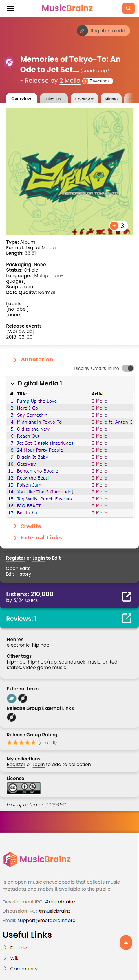
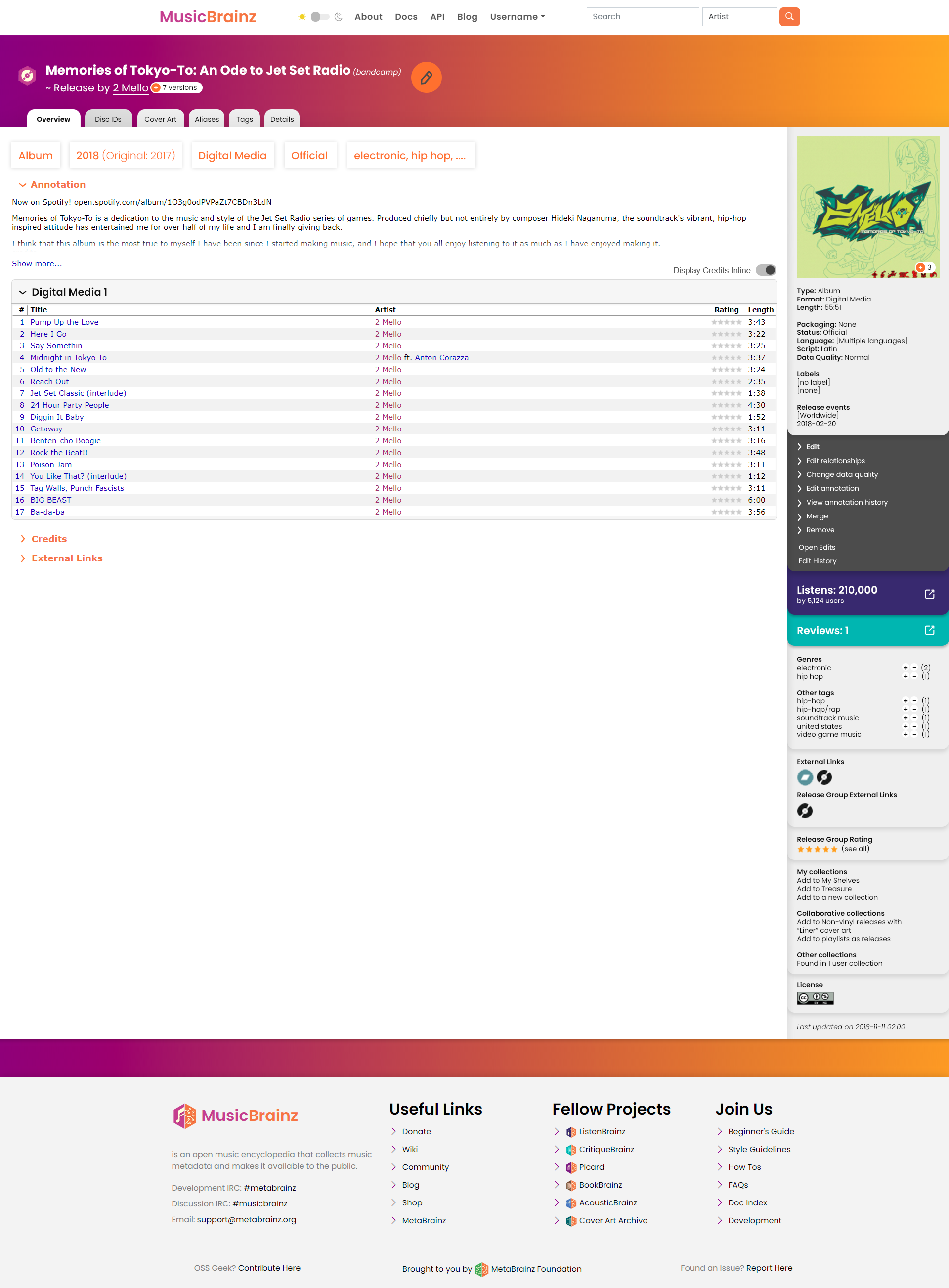
I’ve finally been motivated to make a mockup with my thoughts for how release pages could be improved. Motivated because @akshaaatt has been doing lots of redesigns and I want to be able to worm some of my ideas into his productive brain as early as possible
Please don’t take this as a complete mockup. My time is limited unfortunately!
Key thoughts:
Hierarchy: What is most important to display? Are we sorting the most important elements into the most prominent places?
Hierarchy 2: Are we grouping relevant information so people can pick out sections they want to find at a glance, and then sort within that at a second glance?
Keep it simple: Rethink the display, but keep the basic existing layout. It’s not really fundamentally ‘broken’.
Make it easy to apply the same style/design to other entity/page types (e.g. header, tabs, sidebar, main panel)
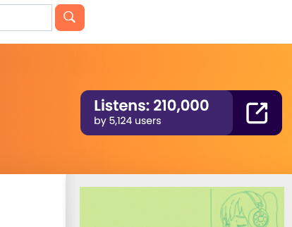
Encourage contributors and link to other MetaBrainz projects: Big ‘edit’ and ‘signup’ buttons. LB listen #'s woo!!
Little things: Are we duplicating any links unnecessarily? Can we replace hyperlink text with toggles where appropriate?
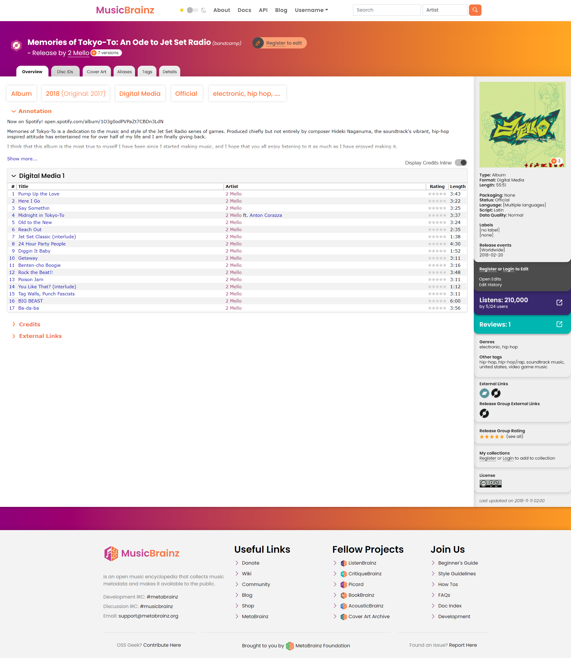
I’m not sure about the big [album] [2018 (original date 2017)] … blocks at the top, but have left it in as an example.
It looks really great!
I also like the current layout, even if your mock-up does look more stylish while keeping the clarity.
I think changing the current layout would be worthes it if it would become a page that can be displayed either on PC and on mobile (called fluent/fluid/?? page, or something like that).
that is real nice! I like that you used the ListenBrainz and CritiqueBrainz colors for their respective sections on the sidebar! a nice touch~
I like the idea of the [album] blocks, I might have those above the tabs tho? I dunno… it’s fine either way~
my main question is how we’d make this responsive. I’ve been doing a lot of editing on mobile recently, and this is at the top of my redesign wishlist
edit: I do like the idea of separating out link relationships from credit relationships more. especially if we start linking each recording to Spotify, YouTube Music, Deezer, and others… that could end up being a lot of links. might even be useful to have those only show in either the main tracklist or a secondary tracklist in the “External links” section
Wonderful @aerozol!
I absolutely love your work and the contributions you make. I am loving the effort you have put into this. Definitely will finalize this work soon and make progress at getting this implemented on the website.
I definitely like the idea of including cross-Brainz data prominently, although I think your first version would do this nicely already if the block of metadata (album type, release status, etc. below the cover art) were moved entirely to the main content column. This also would help reduce the vast empty space below the tracklist.
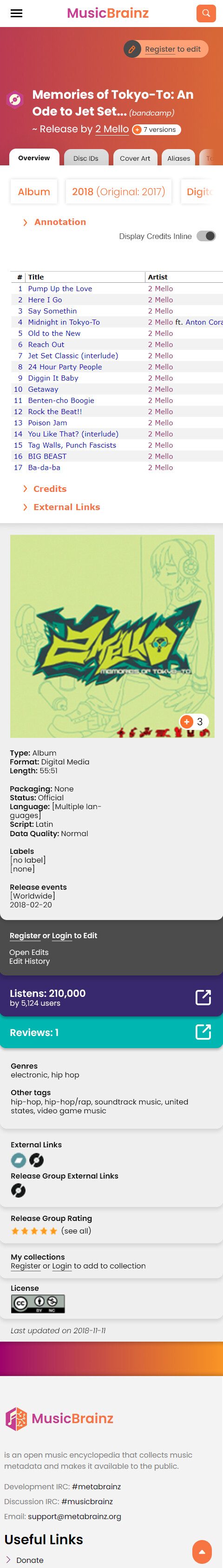
Here is a mobile mockup - one with minimal re-work, it’s just the existing mockup put into a single column. There’s rooms for oodles of mobile-specific improvement on this - sideways scrolling through some related panels instead of it all being vertical, for instance. A nicer ‘info’ panel? The tracklist here is just a boring table, etc.
NOTE: I’m not saying this is what it should necessarily look like/suggesting this, this is more a test of how it looks within a single column
The big things that immediately got highlighted for me making these is that the cover art is going to create difficulty, and that the collapsible ‘annotations’, ‘credits’ etc feature I’ve included is probably a must-have for mobile.
Edit: I also realised that we’ll want to be consistent across page types. This means that the grey ‘info’ text might have to go at the top on everything.
I actually tried this! There are a few issues that I came across:
It is actually quite hard to make use of horizontal space when you basically are just displaying a list of attributes
a few mediums and relationships can make that ‘main’ block suddenly get way longer
You could do something fancy design-wise to get it to work, but MB is actually really consistent with its display across entities. The top right always has the key information (e.g. artist page, label page, work page, etc), so the fancy-design would have to work for any attributes/lists and they can change. Basically, hard and not sure if worth it so I left it
There are heaps of great quality of life elements that could be included (a lot are already in userscripts) so I’ve just focussed on how to display what’s there, trying not to get off the rails by included other improvements
Why display the cover art this big?
It could be a small thumbnail, like on desktop.
A floating thumbnail, so you could display the release info around it, maybe?
Having this data hidden off to the right, when I need to read it to check that I’m on the correct page, is in my view the major layout flaw of the Release layout. (This layout is used for other enities as aerazol points out. It has the same problem there too. Though maybe it is the best available layout unless we move to transparent overlays. )
Re. cover art, as I said this is just a suggestion where I dropped everything directly into one column, with no changes for mobile. So we can already see that cover art will need some extra attention.
Did you see the third mock-up where I moved the cover into the top background? Possible solution? There’s still a ‘cover art’ tab within easy reach if someone wants to see it.
@mmirG agreed, and it looks ugly on mobile! If I find time I’ll see if I can do some alternate mockups of that info panel that’s on all page types. I’m really busy so give me a few months
Take as long as you need.
I do apppreciate you showing various options.
You’ve made it clear to me why having the packaginglabelyearbarcode in the same column as the track info is not an improvement.
Given the recent interest in digital releases with huge country lists, it might be a good idea to consider how those would look like in a redesign.
A neat visual idea might be to show a colorized world map like you get in the ListenBrainz report page to indicate where a release is or is not available. That nicely allows a quick reference at a glance, since a tiny island nation that is excluded for some arbitrary legal reason is less impactful visually than e.g. a specific region like North America being excluded.
I’m trying to limit these redesigns to just ‘redesign’, rather than new features/improvements. Otherwise it will be hard to move forward (there’s a lot of pages to do…)
I posted some ideas in the thread for this issue but it would need a dev to get interested. See what the community thinks and then I’d be happy to help out with a mockup


