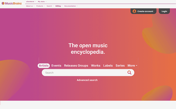
I think this is good feedback. It can probably be solved by taking the entities out of the drop down menu and place them more prominently above the search box, just like major search engines many years ago. Made a quick mockup:
I like this idea, and it would be fairly easy to change once we get unified search, methinks~
I guess I’m destined to be in the minority, but I don’t think this is an improvement. As a new visitor, if the first thing I see on a website is a whole bunch of unused space, my first thought is, “Why are they making me go find stuff?” “Why all this wasted space?”
As a veteran user, I use the top menus heavily, and the link to Forums, so it’s not good to see those things gone or buried down-page.
The current home page has a lot of information visible as soon as I get there. Perhaps it could be arranged somewhat differently, but I’m generally put off by websites where I have to go find the information I’m looking for.
I’m afraid my opinion hasn’t changed much since we discussed this 3 or 4 years back.
@aerozol This new mockup doesn’t seem to fit with something you said back then, which I agreed with:
FAR MORE IMPORTANT than redesigning the home page is a complete replacement of the extremely UN-user-friendly Advanced Search. I’ve figured out how to use the advanced query syntax when I need to, but if I’m just casually looking for a release of, say, Gunter Wand conducting Beethoven, it’s much quicker to go to Discogs, find it there, and hope there’s a link (using the “Import Discogs Releases to Musicbrainz” TamperMonkey script) to an existing MB release.
Unified search seems to have been at least partially implemented: https://tickets.metabrainz.org/browse/SEARCH-587
It would make sense to default to unified search, but I like how the selection is integrated in the search bar in the mock-up. It looks very clean.
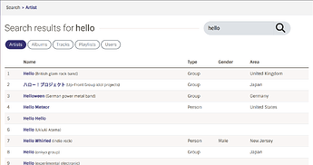
We have previously talked about redesigning the MusicBrainz search page to be more like the one we have in ListenBrainz, with the entity selection at the top like you mention, so this might happen at some point.
For reference (not the proposed design):
General comment: it looks to me like one category of feedback is about accessing you data as a logged-in user.
I think there is is a great opportunity to have a logged-out version as described above, and a separate logged-in version where the top of the page would contain links and features relevant to editors, a small dashboard of sorts if you will.
For example, a list of my open edits (or my most recent edits), another section listing recent edits of my subscribed entities, maybe something with my tags, a list of my collections, a list of entities I recently edited (for quick access), maybe new releases for artists I follow, etc.
In short, where we currently have personalized links in the menu bar, I think we could also show a small preview of that underlying data on the homepage, as a user dashboard for a quick overview. Similar to the profile page but with selected information, and all at a glance rather than behind tabs and links.
I have to agree here, I despise the modern trend of doom-scrolling websites where things that once were put on one screen are spread over pages and pages of mostly nothing. It might make things look “clean” but it doesn’t help to find information.
If there’s a static header and/or footer that always keeps important links / info in view, the scrollable content could / should be limited to “fluff” imo.
Regarding the search, I think expanding on the terms used might be helpful, adding more commonly used terms like “release (albums etc.)”, “work (songs)”, “recording (tracks)”, though that already runs into the confusing works / recordings separation where most users would probably choose “work (songs)” to find a song and get nothing because while every release enforces recordings the same is not true for works. (Though the enforced recordings result in lots of duplicates which is also not ideal.)
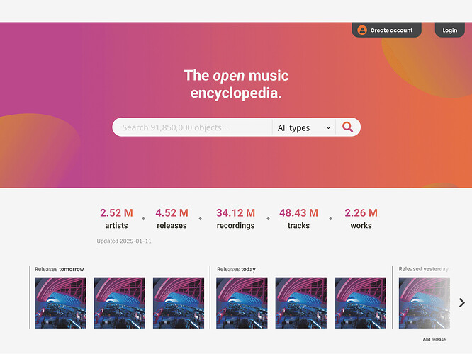
In response to some ideas in this thread, I have made a little mock-up myself.
This is only for the top 1080 pixels of the entire page. I think we can safely assume that most pc viewers have at least that much vertical space. I also think that it is inevitable that users will have to scroll a little to find more information, but their first view of the website should be enticing enough to make them want to scroll down. So I have simply condensed the page vertically.
I have also changed the default search to all object types.
How often are the statistics for numbers of objects updated? We can probably safely drop the update date to remove another bit of clutter.
On oddity that @mfmeulenbelt’s mock-up shows is the missing website name. A home page really does need something that says MusicBrainz right at the start there.
The open music encyclopedia
Having the word “open” in italic makes me think it’s not really open, it seems like they’re is something fishy about it. ![]()
I didn’t add anything to @aerozol’s mock-up, but earlier in the thread he said:
I think that’s what the grey bar at the top of the page is for. The top menu contains the MusicBrainz logo + name.
And maybe the text above the search field could be changed to:
Welcome to MusicBrainz,
the open encyclopedia.
That’s still a lot of wasted space.
Hi all!
Thanks for the feedback. I’ve gone through every comment, and addressed them where possible. I won’t answer to each directly, but you are welcome to follow up with further comments.
A reminder and apologies about the following:
If any feedback is impractical to implement, or there is disagreement, the designers or dev team will make the call (sorry!)
Though I think I have been able to address a lot of your feedback!
A few notes about this mockup and some of the most common feedback:
- This time it is a ‘logged in’ view.
- I’ve included the menu this time - a redesign that is intended for when a user is in the ‘editor’ flow, and should address a lot of concerns + be a nice upgrade (less clicking!)
Redoing the menu is a bit outside the scope of redoing the homepage, which is why I removed it from draft 1, but with so many comments focussed on wanting quicker access to various links I will talk to the team about the possibility of implementing this alongside the homepage update. - The “Welcome Back” section: There have been a lot of comments about not wanting to scroll down to get to what editors use, but few replies as to what’s actually missing/editors need.
I have put some example links into the new “Welcome Back” section, but specific suggestions would be great. - Homepage density: My mandate to make the homepage more appealing to casual users, combined with some homepage click stats, led to the current design.
We may still reduce the padding above and below the sections - that’s not critical to decide on now I think, we can play with it when the page is in test.
More details: The vast majority of clicks are the search and then the user page (let me know if you always visit the user page for something specific/a link/a stat, maybe we can bring it up front). The about doc is high up in the stats, so that section is just after the scroll (but note that it is still 2,487 clicks vs a combined 31,945 for the 3 spots above it). - The Picard box is an existing graphic that is used pretty much everywhere for Picard where a graphic is useful - I won’t workshop it for the homepage redesign sorry, but it would be easy enough to swap out the picture one day.
Please click the image for full size:
P.S. Agreed that a combined search is a priority. I have pushed for it a number of times lately, even. But it’s not my call… maybe we can get @anshgoyal31 to do it next!
P.P.S. @mr_monkey, I added project logos at the bottom but a bit different to your example - so many of the icons in that one are for defunct or ‘background’ projects! I also wanted to mention that I can make a ‘fancy’ panel for BookBrainz, like there is for Picard and LB, but I will have to do a matching illustration of some sort which will take time. So I will hold off until I know if those ‘fancy’ panels get a thumbs up. We can make the LB panel into a carousel (leading to the BB one), or we can have it separate, keen for your thoughts.
- Interesting menu layout. Would use that. Especially if customisable.
- Interesting to see the user’s total edits and open edits on the login screen. I am a little geeky and do watch out for when I pass the x00,000 mileposts.
- Nice happy colours.
- Pity to see the blog posts reduced to one line. I realised the other day this is one of the few reasons I actually look at the home page. (Just seen they appear if I scroll 2.5 pages down)
- Sad to loose the “New Additions” images off of the initial front page. They are always interesting to see. Having to scroll to find them means I won’t see them.
- As noted above by others, as a regular user I will scroll this page once to look at it and then probably never scroll down again. It is a great looking advert for a new user, but us old hands already know what is written. Preaching to the converted

I don’t understand why “Fresh Releases” is ahead of “New Additions” in the images strip. This section should promote the work of MusicBrainz editors, not just list what is in the shops today. This line of images is often a fascinating insight to the wide tastes of our editors. Promoting editors work.
And a curiosity with language. Why are the section titles not using capitals like you see on a CD title? I see “Datasets and Live Data Feed”, but also “Edit the database”. I don’t understand the style rules. Why caps in one place but not another?
IIRC the Live Data Feed is considered a proper noun for the product we offer and that is the only reason for the caps there - the general idea is that this is text, not work titles, and should be capitalized in a normal way.
Thank you. The trouble is spending so much time on MB with Capitalisation Rules it has left me a little puzzled when seeing titles elsewhere.
Looking nice! I like the colors and the customizable editor toolbar. Some more minor feedback from me:
- It might look more consistent if the search bar on the top-right has round corners like the homepage search bar.
- Have the search entity buttons been tested for accessibility in contrast? The gray text against the pink/red gradient is somewhat hard to read.
- I’d suggest that the search entity buttons be reordered for more casual users from the most-likely searched entity to the least likely. I’d say release groups and works are more likely what casual users want – since that’s their equivalent of album and song – than, say, recordings. Artists and events should be listed among the most prominent.
- The wording in the editor toolbar can be shortened by removing all those leading “My”s because everything in the toolbar relates to the logged-in user. The user already knows it’s their collections and ratings, not anyone else’s. So “My collections” can become “Collections” and “My open edits” can become “Open edits”. This makes it easier to translate and makes the bar less of a word salad.
- I visit my profile page for custom searches. I’m not sure if this is practical but it would be awesome if these searches can be added to the editor toolbar.
- “Beginner editor guide” should be “Beginners’ guide” or “Beginner editors’ guide”.
- Will the stats scroll automatically? I’m wondering if there would be too much motion if so. Maybe consider scrolling vertically? But I don’t mind either way.
- I still think it adds to the visual clutter to use two fonts (Century Gothic and Roboto?), especially when the two fonts are not used suggest any visual hierarchy. I’d imagine Century Gothic is used for the header and footer, but the welcome message and the search bar on the top-right use Roboto when the rest of the top bar/header uses Century Gothic. It’s visually consistent.
I still don’t like it ![]() - but more specifically I’ve just noticed what most annoys me about those stupidly long homepages: There’s usually no indication if there’s anything worth scrolling down for, and where whatever I want is if it even is there.
- but more specifically I’ve just noticed what most annoys me about those stupidly long homepages: There’s usually no indication if there’s anything worth scrolling down for, and where whatever I want is if it even is there.
In this case there are “useful links” after scrolling down to the bottom of like ten pages. I kind of have to revise my earlier statement about “fluff”: IMO the further you scroll down the less important the content should be, which at some point should beg the question why it is there at all and thus be a natural limit to the length of the page. As alluded to above, this might be alleviated by good navigation that allows to jump directly to the desired item.
The bottom part with “Metabrainz Musicbrainz Picard Listenbrainz Bookbrainz”, is that supposed to be a scrolly thing that shows info about those in turn? Seems partly redundant since Picard is in the middle of the page already, and the others in the footer, and Metabrainz as umbrella organization could be mentioned at the top like “Musicbrainz, the open music database. A project of the Metabrainz foundation”, then you could have the others as “Other Metabrainz projects” (with Acousticbrainz marked as defunct), and maybe a short description for all of them that’s visible all the time.
And there seems to be a disconnect between what people like to see when visiting the homepage vs. what they then click on, e.g.
Things like blog posts might be more appealing with a short summary; though most of them aren’t very interesting to me, it’s nice seeing them for the few that are.
I’ve mentioned something like that as well, but while adding a release forces creation of recordings for its tracks, adding a track doesn’t enforce an according work, so searching for works will miss a lot of songs that would be found as recordings. Maybe the default could be a simplified search that combines things like recordings and works, and releases and release groups (and maybe series).
What are custom searches!? Searches you’ve saved/made links to in your profile, or an MB feature I’ve missed?
(Custom links would be a great idea for that top section, in general. But I think it would have to be its own ticket, unless @anshgoyal31 thinks it wouldn’t be too hard/distracting.)
Looking at their profile, that’d be specific saved edit searches ![]()


