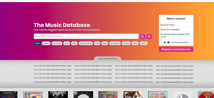
MusicBrainz Web Homepage 2021

Thank you @yindesu for your thoughts on this! I think most of the things have been fixed. Have a look at the latest work and let me know your thoughts!:smiley:

Thank you @InvisibleMan78 ! :innocent:
We have decided to move the FAQs to a separate section and would display them there soon. I think the questions you have mentioned are reasonable and really good to have! Thanks

Now that I can’t use the Home page as Home, can I suggest posting new blog news into the forum? Especially the server updates as we get the Picard news (thanks @outsidecontext ). Linking to the blog pages involves lots of scrolling to check if multiple news items.

Am disappointed that “community” has been demoted to an after thought now. Loosing simple access to the blog and hiding the forum seems a backward step for the community who are here already.

Pretty About page for new people though. Don’t take my comments as negative as I realise this page is not for editors. :slightly_smiling_face: A good visual improvement

1 Like

Yes, what I find a bit confusing is that on the top navigation there is a “Blog” link, and on the right there is a box with the latest blog entries and below that it links to “Community”. Maybe switch that around?

For me having the “Community” more prominent in the header would make sense, it is IMHO the most important place here (despite the musicbrainz.org website and database itself), and the most lively one. I mean that’s where we, the community, actually meet.

I’d also try to link the headline in the blog box to the blog directly. Currently it reads “Blogs & Updates”, maybe rename that to “News & Updates” and have it linked to https://blog.metabrainz.org/

8 Likes

Another though: Dark mode toggle (I love the look and feel actually) and language selection currently both are very prominent and take up a lot of space in the header. But:

  • Both are something that can initially be set by browser preference.
  • And which a user, once set, probably doesn’t toggle that often. If they feel the need to change it at all.

Maybe put both in kind of a settings menu, maybe with an icon? Or make it part of the user menu? It should still be easily accessible, I just don’t think it should be that prominent and take up as much space as it currently does

6 Likes

Woo!

Going back to the current user behaviour stats given by @Bitmap here, it’s looking pretty good (in order of traffic/clicks from the homepage):
search > user profile* > ‘what is MB’ doc > release > login > user open edits* > register > mp3tag (?) > user collections* > user edits*

What seems to be missing is:
login + register buttons (register is really important imo)
easy access to some of those editor links (the ones with an asterisk*)
text such as “tag your files” - I think a lot of people will be searching for something like “tag my mp3’s” or “tag my FLAC’s”, based on how many people click ‘mp3tag’ from the current homepage


Design feedback yay!


Top section

Is it possible to give everything some more breathing space? ‘Download our app and software’ at the bottom is really clean in comparison to the top.

Remove one of the titles if you have to, or make that subtitle less strong, as in the mockup, so it doesn’t compete with the headline. Details like greying out and italicizing search text are important as it needs to be clear that it’s not regular text.

Having the search options relegated to one row, you can have it concertina out when you press ‘more…’, would really help. We can put the less-used ones at the end. See @Yindesu’s post on which search buttons might be more useful than others.

Mockup:

Cocertina after clicking ‘more’:
image


Styles

Can we make the ‘Read More’ button the same style as the ‘Search’ buttons? If you’re using this page as the basis for all other mb pages (and metabrainz projects eventually :partying_face:) there needs to be a consistent UI ‘language’ that the user can understand. E.g. if it’s orange, I can click it. It will make designing the other pages easier too.

Same for stuff like the purple/orange ‘News & Updates’ and ‘About MusicBrainz’ titles. They’re kinda cool, but a user should be able to scan the page and be able to spot and read all the headers without too much trouble.

On that note, where is the blue background, dark blue headers, and yellow highlights from? I think with the gradient, grey and white bg’s, and the purple and orange elements, there’s no need to add something new that’s not part of the MB style/colours.

This is a lot:
image vs image vs image

btw, an easy way to make things to look modern is to not use true black. Try swapping the black text across the board to #1e1e1e or something. Full black on a white background is too high contrast anyway, it is hard on the eyes and makes it hard for people with dyslexia to read it.

I preferred the smaller and lighter text in the older header btw. If you got asked to change it maybe there’s a middle ground, it’s really bold and big at the moment.


Latest releases

Sorry but I really don’t at all like how this part is presented :cry:

Album art is a huge part of music for me, and this cropped three cover (on desktop) format really makes everything look ugly. They’re (usually) meant to be square! We’re all here for music, so let’s present it well <3

Also, why so narrow? The more the better. I’m not very likely to see anything interesting if I see a little bit of just three covers. It’s got nothing to do with the search or the blog updates so squishing it in with them in a ‘trio’ layout is kinda confusing.

Mockup (ripped more or less from Discogs):

Or take the look that’s on the MB website at the moment.


About MB

I like this, very pretty, except for the music notes stock picture. (obvious) stock photos are a turn off for me when it comes to websites. But it’s easy to change later so I’m not fussed.

The stats section still takes up way too much space on mobile. Can we please make this a carousel on mobile view?

‘Carousel-ing’ things is a really easy way to make things work on mobile and will be useful all the time, so I think it should be in MB’s bag of go-tos (e.g. the explore section could use this too).


Other Metabrainz projects

Everything is so pretty and then this is just somehuge logos with text alternating down the page. Taking up a absolutely massive two full-page scrolls on my desktop.

I’d have stopped reading before I get to ‘explore mb’ or ‘download our app’ which isn’t good, especially if I’m not interested in the other projects.

Not a fan sorry!

Mockup:


Explore

Nice, I think the text can be made better, maybe stuff that’s optimised for search engines. But it looks good.

Carousel on mobile?


Supporters

Too big and a bit meh looking on mobile - carousel?


Download and use…

Beautiful. Wording could use work. “Download and use” - If I’m downloading it then I’ll probably use it.

Confusing to have the ‘Picard’ button next to Android? Users don’t know what Picard is. Should probably say ‘PC & Mac’ instead?


New section? Editor dashboard

I know, I know, new section… but this might make it easier for you to address some of the editor-centric feedback without having to mess with your existing layout.

You’re already using JS so it should be really easy to make the regular editors happy by giving them a toggleable dashboard, that remembers if you’ve expanded it or not. This section could have bit more of a ‘functional’ look so it might not take long/hold up the design much.

Subtle toggle mockup:

Toggled mockup:


Anyway great work @akshaaatt, you’ve been working wonders :raised_hands:

10 Likes

@aerozol +1 especially for the wonderful Mockup for “Other Metabrainz projects”!
Looks great.

2 Likes

Thank you for the amazing design as always @aerozol! :smiley:

  • The homepage looks perfect imo right now. The cover arts being showcased in the same section as the main is to make sure the layout doesn’t cut out and is presented as a whole.

  • The icon next to the search is supposed to open up the webcam/camera present on the device and allow them to scan a barcode and search for a release.

  • Regarding the Brainz projects, I think we can reduce the size but we should have a description for each project as well. A carousel would be fine but for smaller devices, it would hide the fact about showcasing all the projects at one go. The vertical scroll is more prominent for a user to go through so if we are prioritizing advertising the projects, we do need to keep them separate. If it doesn’t bother too much, I do think we can stick with how it is rn. Do let me know!

  • The FAQs section has been omited from the homepage and would be housed separately.

  • Supporters are definitely bigger for a vertical scroll on mobile, maybe for this we can have the carousel!

Thank you for picking how the homepage would look like! :100:

1 Like

Thank you @selflessself for the comment! :smiley:
Will surely take care of this.

Why have a webcam button when you don’t have the option to type a barcode?

Select ‘Release’ and enter the barcode. I agree that it’s not very intuitive, but it works.

When did that start working? I notice all Release searches do that now I test the normal search. Really is not very clear. Too hidden but good to finally see.

Don’t ask me to test things :smiley: I break 'em. It breaks if you have spaces in the barcode. Also is very confusing that it opens in a second tab. When I returned for a follow-up test nothing was happening because the tab was already open and browser would not swap to it.

They still look badly blurred and do not open on a click. The people coming to this site are music people - please give them the full artwork, not something badly cropped and blurred. It just looks weird…

1 Like

Wow. I never knew it could do that either. I’m always going to the search page to the barcode lookup. That must be fairly new.

Let’s not forget, this page is a work in progress. I’d think it’s to be expected that features may appear on the page first, and functionality will be added later.

1 Like

More text/a longer scroll isn’t prioritizing, it makes it less likely for people to read any of it :cry:

Is there a reason for a blue background and title style? Is this part of a MetaBrainz web style you’ll be using on other pages?

That and the cover art carousel (not sure what you mean by making sure the layout doesn’t cut out?) are downgrades from the current page imo. Those sections stand out as being untidy (this is your fault for making the other sections too nice and clean :smiley: ):

The rest can all use tightening, but looks good :+1:

Do you think you’ll be coming back to this @akshaaatt?

MB projects have been known to languish for years (decades!) so I’m trying to get in ‘while the iron is hot’ :stuck_out_tongue:

3 Likes

One of my first thoughts was that “The Music Database” seemed kinda odd as the h1, since it’s not the name of the project – or maybe “The” is supposed to be in italics to stress that we’re the only music database worth giving a damn about? :stuck_out_tongue:

If you removed it and just left “World’s Biggest Open Source Music Database” as the title, I actually think that would be fine.

Agreed. In several examples on the demo, the title or artist name on the cover is cut off.

This is something I commented about on IRC too (it looks cheesy). Maybe you can move the stats boxes right below this section to be where the image currently is?

aerozol’s mockup here looks nice. I like that we’re linking to the other projects more prominently, but I’m not sure having an essay on each project is going to keep people’s attention. A short description that can be understood in less than a second is more likely to pique someone’s interest.

7 Likes

I mentioned this in the initial thread introducing this effort. I see you’ve come up with a different statistic to indicate the size of your database (“Search 41,054,421 entities”), but I still have to ask — are you sure yours is the “World’s biggest open source database?”

I haven’t found a number at Discogs that equates to your vague “entities,” but the more specific numbers quoted in that original thread seem to indicate that Discogs’ db may be larger than MB’s.

If it’s demonstrably true, then fine, but I have little patience for unsubstantiated claims. It’s a major pet peeve.

1 Like

I thought the key words there were “open source.” Discogs publishes their core data as CC0, but the actual product around it is closed source. But I didn’t write this, and perhaps it sounds like weasel words to people?

I guess I just don’t like the tone of “We’re the biggest” claims. I’d rather highlight the goals aspect, as stated in the “About” section (“MusicBrainz aims to be…”). It feels more cooperative and positive, rather than competitive or adversarial.

Besides, with bots designed to import data from the other databases that you’re bragging about being larger than, taking a competitive tone feels a little hypocritical.

4 Likes

it’s still way too long on mobile. on a 375px wide phone it’s 12744 pixels tall, that’s way too much

3 Likes