There is a risk of having terabytes of edit note data in database.
6 posts were split to a new topic: Request for ability to search in subscribed Collections
Just want to support people who suggest focusing the home page for the database user. For me one of the main things I do when I hit MusicBrainz is search. Making the search more prominent and having that workflow streamlined makes sense to me. Having another section to help point new users in the directions they want to go also makes sense to me. Such as “Get started editing >” or “Learn more about MusicBrainz >”.
And then I also like seeing the feed of recent edits and uploads. It doesn’t serve a particular utility but it is fun and seeing activity makes the community come to life for me.
i really liked the mockup image you posted so i started on a responsive web version
Cool!!! Love it. FYI I think @akshaaatt is already onto the digital/coding side of this project 
i see that! there are some nice looking components in there!
really i was just drawn to how your design puts search front and center and felt like seeing how it could look on different devices
it got me thinking about search engines, and the ui pattern of having the search type selection (web/images/news/videos etc.) as “tabs” on the search result page
i was thinking that but for artists/releases/RGs/etc.could be cool
with a search engine style ux (super minimal homepage, basically just a search box and a minimal logo), we could really “show not tell” new users what musicbrainz is.
i guess i’m thinking
- top bar (logo/log in/create drop down when logged in)
- search the open music encyclopedia
- recent additions maybe? (like news on https://www.qwant.com/)
- footer with links (the one on https://musicbrainz-web.web.app/ is long but looks really nice!)
this is all kind of based on a recent mobile use case i had, looking up a recording to see different albums/compilations it was released on. the info is readily available on musicbrainz, but not something someone can find easily with traditional search engines
tl;dr - i think musicbrainz on mobile web should feel like a search engine
I figured this would be the best place to bring it up.
I think we need a better notification system. currently, (as far as I know), the only notifications we have are new notes on your own edits, server status, and post-edit confirmations (Thank you, your edit (#86506232) has been automatically accepted and applied).
there are, of course, email notifications for edits on subscribed entities, notes on edits you’ve added notes to, and whatnot, but those don’t show up at all on the website. the former does have a page you can visit, and the latter you can do an edit search to approximate this functionality.
a notification center would be an excellent addition, where you can see previous notifications, i.e. like most social media sites have.
also nice would be the ability to change notification settings per subscribed collection (and maybe by entity?), but that’s not a must…
Sounds reasonable and wonderful to me. Will surely look into this and see what I can provide regarding this.
Thanks for bringing it up @UltimateRiff! 
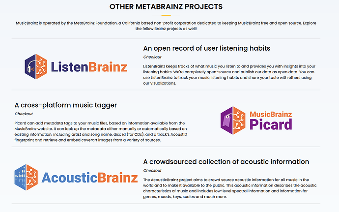
Just a minor remark, on the currently shown example, the Other MetaBrainz Projects are listed with logos alternatively on left & right, it doesn’t make it easy to know to which project each description text belongs.
At least, an horizontal separator should be added:
Makes sense, will do so @Zas. Thank you! 
Oh wow…that is sad that an artist/whomever created a lawsuit!
Little idea for the front-page, peoples birthdays. Not the contributers, but artists and such - we already store these things, or maybe even better a wikipedia style “on this day” to include birthdays, deaths, group formations(?), big releases, events etc.
We do. I have some SQL for that, I intend to work on the system in 2022, but then, I also intended that for most of 2021, so no promises. I’ll certainly want help from @akshaaatt and @aerozol at least for how to show notifications once I have something working, but yeah, no idea how long it will take to reach that step ![]()
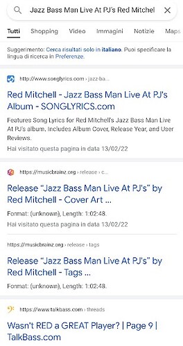
Just an example about why a landing page (for both artists and releases) must be a single page, instead of distributing the information in different tabs: by searching for "Jazz Bass Man Live At PJ’s Red Mitchell" on Google, the results in MB are the cover art and tags pages (empty) instead of the overview page (missing).

