I am here to ask everyone about their best experiences scrolling through the MusicBrainz Web Page, their favorite features on the website and what changes would they vote to be added in terms of design in 2021.
We are open to any suggestions regarding the website but I would love to start off with the starting page on this topic.
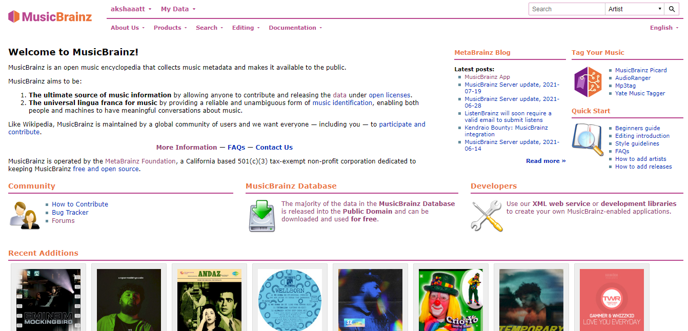
I for one think that we could use the cover arts from the recent additions a bit up on the page so that the page looks more appealing when the users visit the website.
Secondly, I think we have a good amount of content to be presented to the user and hence could do so in a better format with a few images.
The website can be made responsive in the coming future so that it is user-friendly on mobile devices as well.
Not until recently when my eyes began to hurt (just kidding, not that serious) did I realize the font and text size of MB is not so pleasant for me, a desktop user. After replacing the default font and adjusting the size it becomes better now, really a relief for my eyes.
Some prominent statistics (e.g. number of artists/releases/recordings)
Making important links much more immediately visible and useful. Currently, useful links are shoved into sidebars or hidden at the bottom of the page (esp. the forum!), and there is an overload of options (e.g. the “Quick Start” section contains 6 different links a beginner might want to read).
I could imagine having 4 large links, equally prominent:
A link to the Picard homepage or the docs on how to tag music
A single “Getting started editing” link, which ideally would bring you to a single comprehensive page containing guidelines for how to get started with common editing tasks
A “Community” link, which probably should link directly to this forum
To compensate for this, “advanced” topics like the developer documentation and possibly also the data download do not need to be mentioned as prominently as they currently are in my opinion, as these are generally useful to people who are already at least somewhat familiar with Musicbrainz.
This would be really handy. Took me three years to find there was an expanded search. It could be as simple as ADVANCED SEARCH link sitting under the constantly used Quick Search box.
Search will also drag more of those noobs in. Convert the casual searcher into a contributor.
Yeah, yeah, I know the menu option shouts SEARCH but amazing what the brain fails to see every day when it has been taught that search is in the corner.
As an editor, things I use a lot on the front page are:
*My Data menu (everything)
*My Profile menu
*Editing menu
*Quick Search box
*Forum link
*Blog news list
Talking of the top menu. It seems strange that About Us\Products are next to Editing\Search\Documentation. The first pair are for those who want to know what MusicBrainz is. The other three are in constant use by editors. Seem a strange fit side by side.
Also second most of what @elomatreb just said. Make the forum more findable as it is so helpful, friendly and plain darn useful. The site and Picard can be confusing to noobs and they need the forum.
It is also worth thinking of your slightly different groups. I came here as a tagger, stayed as a database editor. I doubt I am unique in that. Picard and Tagging drew me in. They need to be loud and prominent. That is how you get the noobs addicted
General
** Bigger font
** Better mobile compatibility - browsing the website on a phone is awkward and there is no app for iOS (I think most MB users [including myself] are not iOS users but still)
** Keep the website lightweight
** Replace gravatar with libravatar
** Increase the size and resolution of the rating stars
** Show a numerical representation of something’s rating next to the rating stars so you can still see the average rating after you rate it
Front page
** Link to the full search form
** The icons might need to be updated, I like the older aesthetic but it might scare some people
** Show the most active editors of the week in terms of votes, cover art, new addition…
** Show the most popular release groups and artists of the week
** Use the design philosophy of the AB/LB/CB front pages?
User page
** Link to profiles on all the other *Brainz services
Artist page
** Display an artist image from Wikidata if there is one, otherwise display the cover art for their most popular release group in that spot (maybe allow users to vote for a certain release group’s art in case one is a better representation than the most popular) that links to that group if you click on it
** Display a thumbnail of a release group’s cover art next to the group
** If all of the release groups under a primary type have the same artist credit, do not display the artist column
Release groups
** Pull the attached streaming/digital purchase links from the releases and display them prominently underneath the cover art with an icon that represents the service, like a bandcamp icon for a bandcamp link and a spotify icon for a spotify link
Releases
** Increase the font size on attached works so we can more easily see if the right unicode character(s) are being used
edit: and we could use a better font for Japanese/Chinese characers. Even when zoomed in some characters will be squashed and borderline unreadable.
One question to ask is “who/what is the home page for?”
The current home page functions largely as an introduction to the overall project. In that context, keeping the ‘recent additions’ at the bottom makes sense, they’re more of a teaser (and adding a bit of color to a text-heavy page) rather than the main content. The primary question that the current page answers could be stated as “What the heck is Musicbrainz?”
Other questions that the home page answers to varying extents:
“How can I contribute to Musicbrainz?”
“What can I do with Musicbrainz data?”
That last question is, I believe, the one that the home page does the worst job of answering. The “Tag your Music” section addresses this question but not much else does. (The “Developers” section does also address ways to use the data, but that speaks to a very small subset of overall data users.)
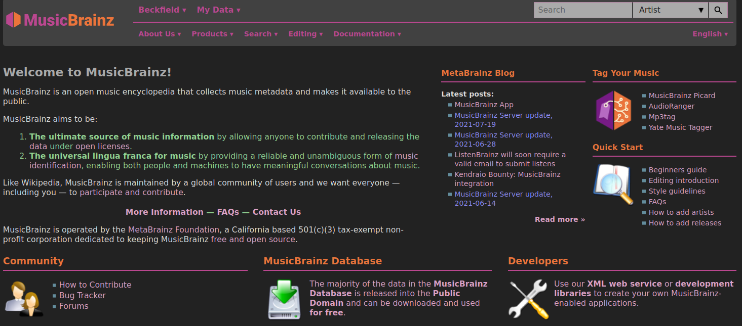
I have just finished (I think) putting together a Stylus theme for a darker MB (it actually works for most MetaBrainz product sites). I suppose you’re going to break it now.
The home page has always been kind of “noisy.” The mission statement, important as it is, could probably go to an “About” or “Our Mission” page, with a prominent way of drawing attention to it.
Artist images are no longer allowed. There was a whole lawsuit situation about it, so it was just decided best not to allow artist images anymore. I don’t have the link handy, but it’s quite detailed somewhere on the boards here. Not sure what you mean by release groups having links to the digital stores, but this is a bad idea as I’ve worked on some release groups that have up to 30 different digital releases!!! They are all unique in their own way (mostly barcodes, but can be different labels, artwork, etc.). Note: There is a script ( Display shortcut for relationships on MusicBrainz) that will displays many links. I think those should be updated to include the digital store links, but they have not.
We can’t even get them from Wikidata? Wouldn’t those be under a free license?
By the release group link thing I mean something like what is on Sonemic. I am not sure how they do it, but when you got a release group’s page, they display a few big icons under the art that you can click on to go to the most recent pages for an album.
That is specifically what the lawsuit was about. We used to have the artist images that showed up on Wikipedia here under the “free” license, but asshole photographer sued everyone. Fortunately, MB was able to get the lawsuit dropped, but it was decided then to drop that feature. Oh. Try the script called “Funky Illustrated Records” as it shows the artwork at the top of the page like that. Yeah, maybe some of the features that are currently on scripts could be implemented without having to run them, or update that script to incorprate the linked digital stores, but I think it might get too cluttered for those who don’t like all the script stuff.