This is my current thoughts for a possible events widget:
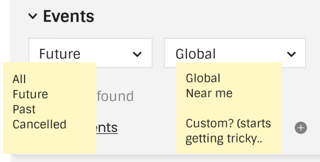
Feedback welcome! Remember to feedback on anything you want to see changed or would use differently.
Edit: I just noticed that ‘cancelled’ needs to be a toggle, like ‘include cancelled’
This is my current thoughts for a possible events widget:
Feedback welcome! Remember to feedback on anything you want to see changed or would use differently.
Edit: I just noticed that ‘cancelled’ needs to be a toggle, like ‘include cancelled’
If I feel that the paragraph is too wide to be comfortable, I’ll narrow the browser window. I’d rather make that choice myself. I object to these wide margins for CB and LB, I object to it on Discourse, I object to it at my bank’s website, and everywhere else I see it. In a couple of cases, where it was possible, I’ve overridden the margins using Stylus. The current MB website uses the full page width, and that was thankfully something I didn’t have to fight with when I was making my dark Stylus theme.
I guess this will give me something to do in Stylus in the future. ![]()
For comfortable reading those colour banners are literally painful on the eyes. I agree with @Beckfield, please make full use of the screen width. It works well on a current MB page. Don’t waste over 20% of the screen.
Discourse is only one item on the page, so a narrow band in the middle makes sense. Agree, you don’t want to read wide sentences. MB is displaying multiple things across the page. Let the columns breath.
Your eye scanning will only be looking at one area at a time. For example - you are likely to scan down just the column of Album titles. You are not really reading a full width page. You scan down sections of the page.
When you come to a Releases or Recordings page, then you will really need that full width to show all the other multiple columns needed on the page.
Also making use of the width means your improved column on the right gets more space to breathe and be readable. Less squished.
Re: Events Widget - I recognised it from the setlist.fm feature. I can see some may like it. Personally I’m a weird one who doesn’t do “Social Networking” so it would be unused by me and hidden.
A maximum width for text paragraphs is essential for readability, and we have long paragraphs in many locations like annotations or Wikipedia excerpts.
I know I am not alone in using the MB website at a high browser zoom level (150%) to reduce the effect of long lines somewhat, and I have perfect vision and a large monitor.
Exactly. I almost made that point as well, but I was afraid I was going on too long.
On my ultra-wide monitor, I have the browser width set to where sites with reasonable margins (like the current MB site) are comfortable to read. I use browser zoom for two reasons - a) to increase font size (my eyes are aging), and b) to make sites with space-wasting margins use the full width of the browser.
Not everyone uses a large hi-res display.
For example, my primary device is 11,6″ at 1366×768. Sometimes I set the zoom to 80-90%
This image is wider than my widest screen, but I guess it will have a max-width in non-pixel value so there will be no issues? ![]()
It would be all scanned and uploaded art for the artist.
Are you saying artwork for newly released albums/releases is not supported? Like current month, current year releases?
Thank you for quoting me, aerozol. Regarding IvanDobsky saying earlier, we don’t want to send people to other sites immediately - in this case:
In any case thank you for your continued mockups. I am certain your redesign will benefit the community at large, and any additional cover art display will help deduce edition differences better.
Thank you!
Artwork is attached to the Releases (CDs\Vinyl\etc). Copyright issues means there are no images for an Artist. (No pictures of the band members)
Your artwork ideas seem to be more focused towards the Release Group page.
True.
Hey, how does Discogs get away with having pictures of the artist? Do you know?
Buried in this forum are the answers to that. (best not to go off topic here too much) (example here and blog here)
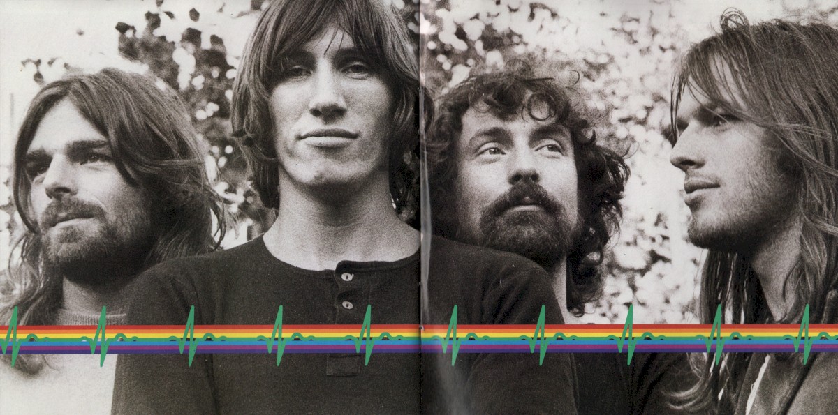
I actually wonder if this could be used for artist pictures from the cover art. for example, this pair of pages from my copy of Dark Side of the Moon, or I’ve had some digital releases that include an artist picture with the download. I’ve actually added artist photo links to the latter’s images on CAA for the artists involved.
Adding my voice here in favor of limited page width (with a reasonable size we could try to agree on). It is what I have come to expect of modern websites.
As stated above there are readability issues with wide screens; smaller screens shouldn’t be affected.
Responding to the idea of wasting horizontal space, as far as I see it having a full-width page will very rarely (wiki/annotation is the only one I can think of) offer more usable space considering we wouldn’t be cramming in other columns, just making existing tables larger. Personally I think this white space is more appropriate on the sides, rather than filling the middle of my page with blank.
However I also agree with @IvanDobsky that the very colorful background makes it look a lot busier rather than give the main content of the page breathing space.
Not opposed to the gradient, but I would limit it to the page header.
Also as a final note, the maximum page width is very easy to customize with the appropriate browser extension of your choice; it should be a single css definition on one html element.
You seem to be assuming that everyone always has their browser in full-screen or maximized mode all the time. I’d be willing to bet that’s not true. Very few people with ultra-wide monitors use their browser in full screen mode, except for occasional needs. In my case, my browser width is usually about 2/3 to 3/4 the width of the monitor.
This confuses me. How is the extra space not usable? Whether you add columns or make existing tables larger, you are making use of the extra space.
Nobody is suggesting “filling the middle with blank.”
Sure, for those who know how to do that, and have the time and inclination to do it. Assuming that everyone should just do it themselves isn’t a very user-friendly policy. I’d hate to hear that from my car mechanic. ![]()
for what it’s worth, I believe in these cases the white space would be trimmed automatically. for example, how it’s handled on ListenBrainz (homepage and user page for example). try resizing the window horizontally on those pages, and there’s a couple points where the layout changes slightly to fill the window better. I’d imagine something similar will be implemented on the final design.
Making the large pink \ orange space borders will make the Release page cramped. I assume this mockup would be a style to be used across the site. Please lets create a mock-up page of a Release page where multiple columns are important before a decision is made on those edges.
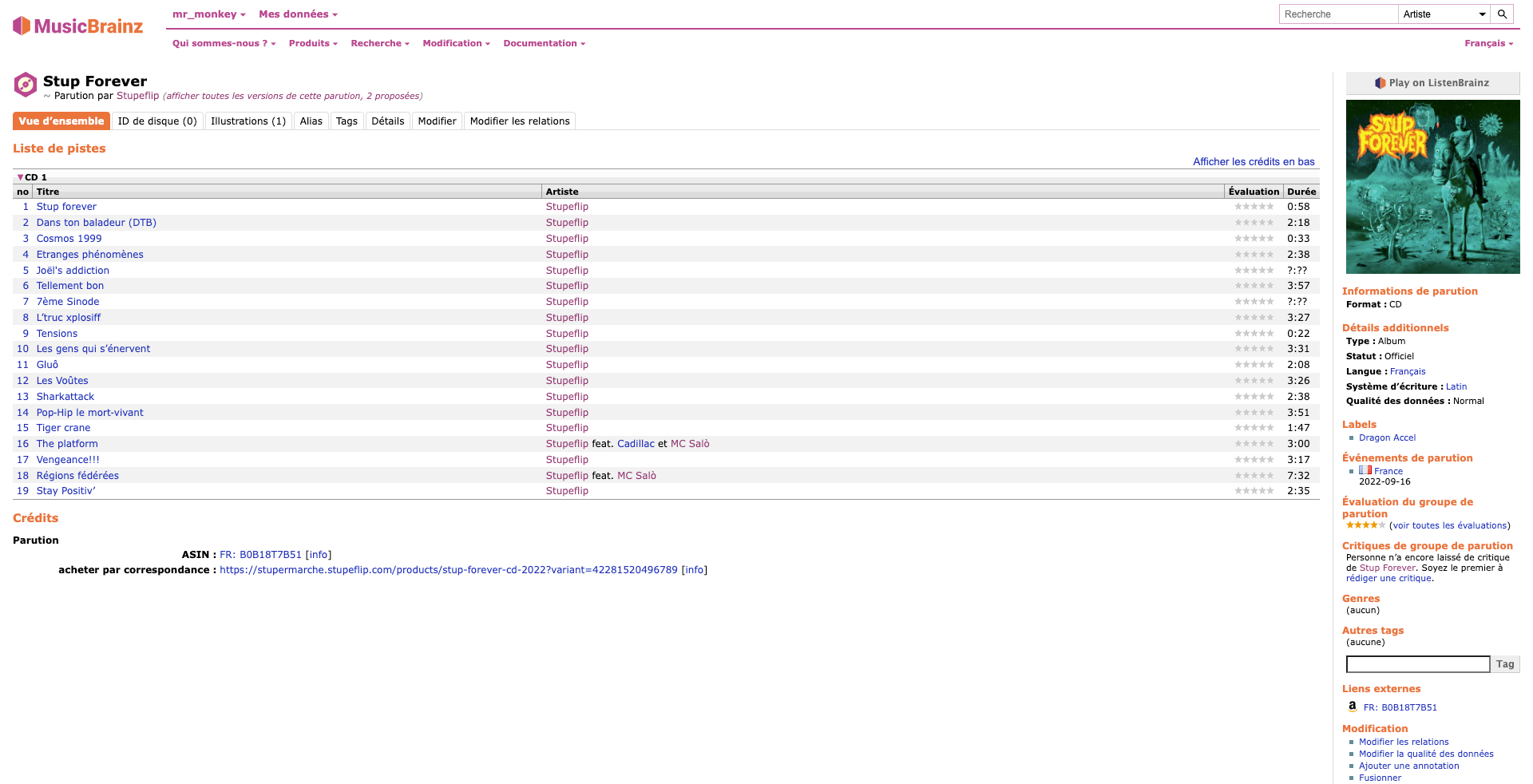
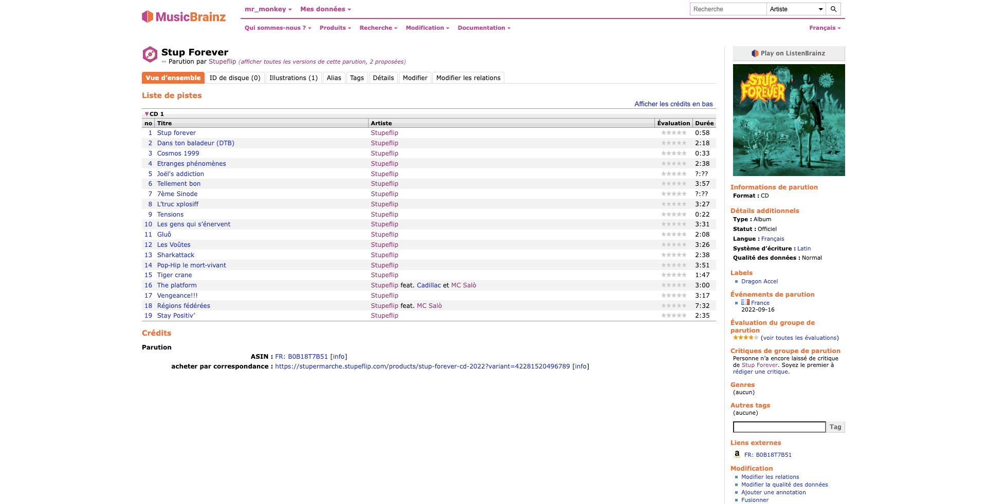
If I may demonstrate what I mean using screenshots of the current MB layout, first without any change and second with a maximum body width (the size is arbitrary, I’m not making a redesign mockup here ![]() ):
):
You’re quite right. However, considering most websites these days follow the same pattern (limited page width, centered) I think the great majority of users won’t be surprised.
I am of the opinion that a full width page is not very user-friendly, and the burden of change lies on those who wish to deviate from that norm.
I was merely pointing out that for those who are very much against it, it is a fairly easy one to solve, which might lower the stakes a bit.
I don’t want anyone to be angry or disappointed with the new design, even though I know we won’t ever please everyone…
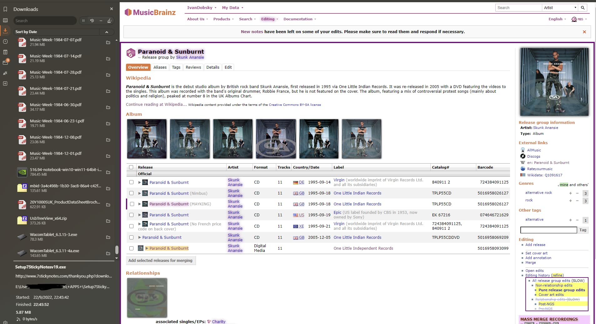
The Release Group page needs space due to the extra columns compared with the examples shown so far. Here is my actual monitor as it currently looks like. As I use Vivaldi I already have a wide border in use. This is a 1920x1200 screen. Complete with various scripts running.
(Sorry if this email comes over grumpy… it is not meant to be… just showing you an alternate look of a screen from one of your editors)
Would the border shrink away at a minimum width of display? If the above screen became 20% borders I’d be needing to learn CSS editing ![]()
I am of the opposite opinion – I find the wasted margin space to be very user-unfriendly, and I think the “norm,” if it really is a norm, should change. Your screenshots again assume that everyone is going to have their browser maximized on wide monitors, which I think is a mistake. Also, some of that space could be taken up with a more readable font size.
Anyway, I’ve had my say. I may be in the minority among webpage developers, but I’d have to be convinced that I’m in the minority among typical users.
If the browser window is narrower, the white space on the sides will be sacrificed, not the information in the middle. Just because x% of the page with in full width would be white space, doesn’t mean it would be the same x% if the window were smaller.
I’m all for a better-readable and slightly larger font though.