Thanks all! I’m away on a ski trip 

So an updated mockup will follow when I’m back at work, in the meantime let’s chat about some of the feedback. Please do follow up if you think something remains unresolved.
Thanks for the feedback @joiletjake!
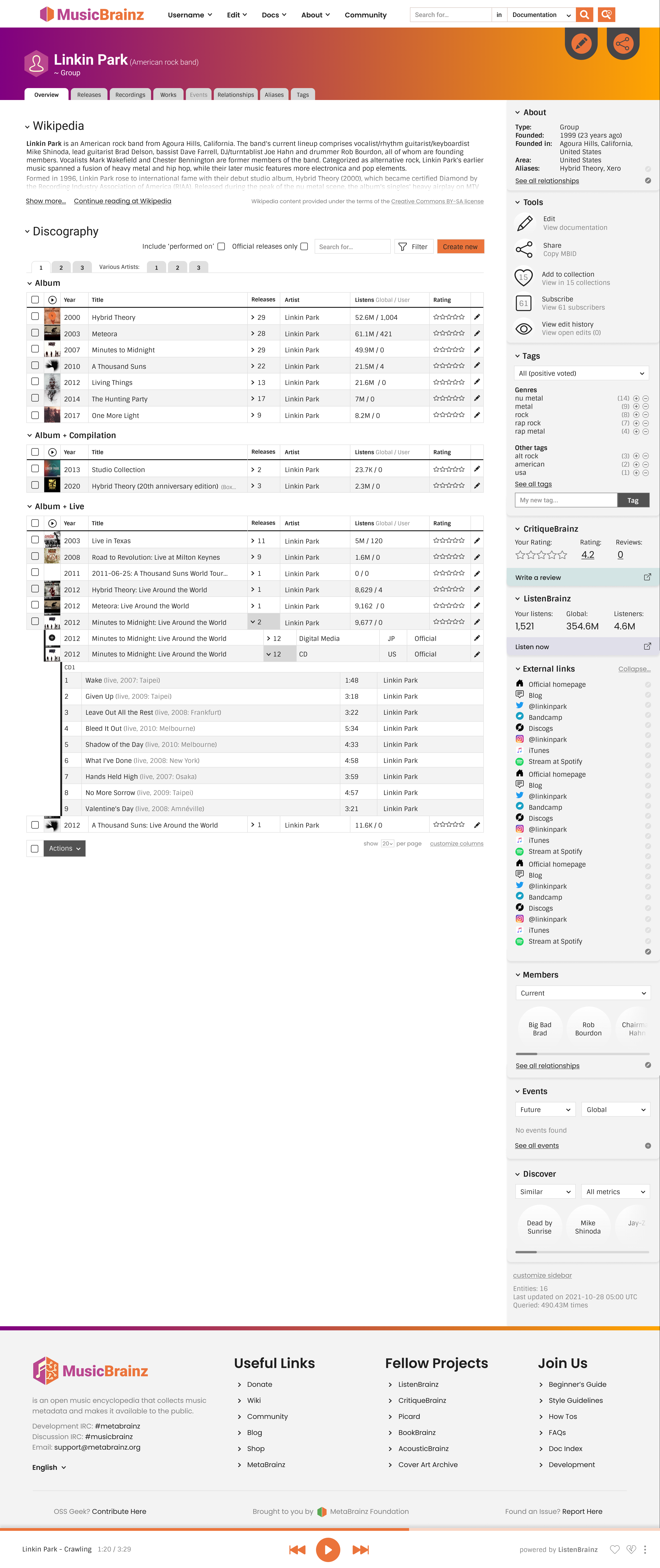
I feel like most of your feedback is resolved through details in the design (particularly interactions that can’t be shown in the pic), let me know if not. I sense an overall feeling of ‘I don’t like it’ - if so let me know and we can nail down what exactly I can do to help.
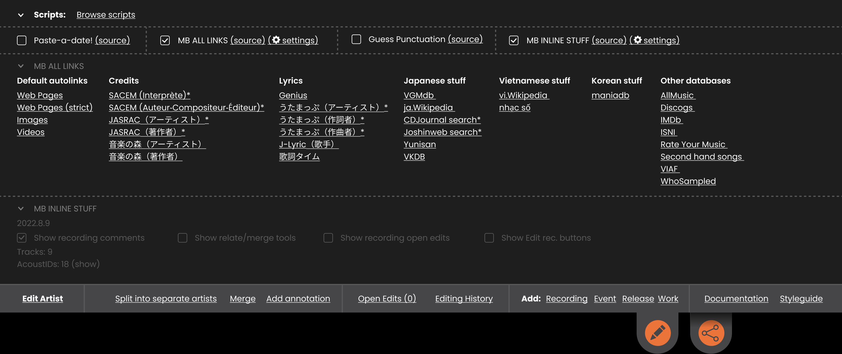
Yup! I had the expanded ‘toolbox’ in the earlier mockup, but that’s just on the ticket. You can see a screenshot here. Moving away from that, back to what we have now, because a few people haven’t liked the change, but it could still be an option.
This was after feedback that they stood out too much. I’ll do some further tweaking (but probably wont make everyone happy in the end unfortunately)
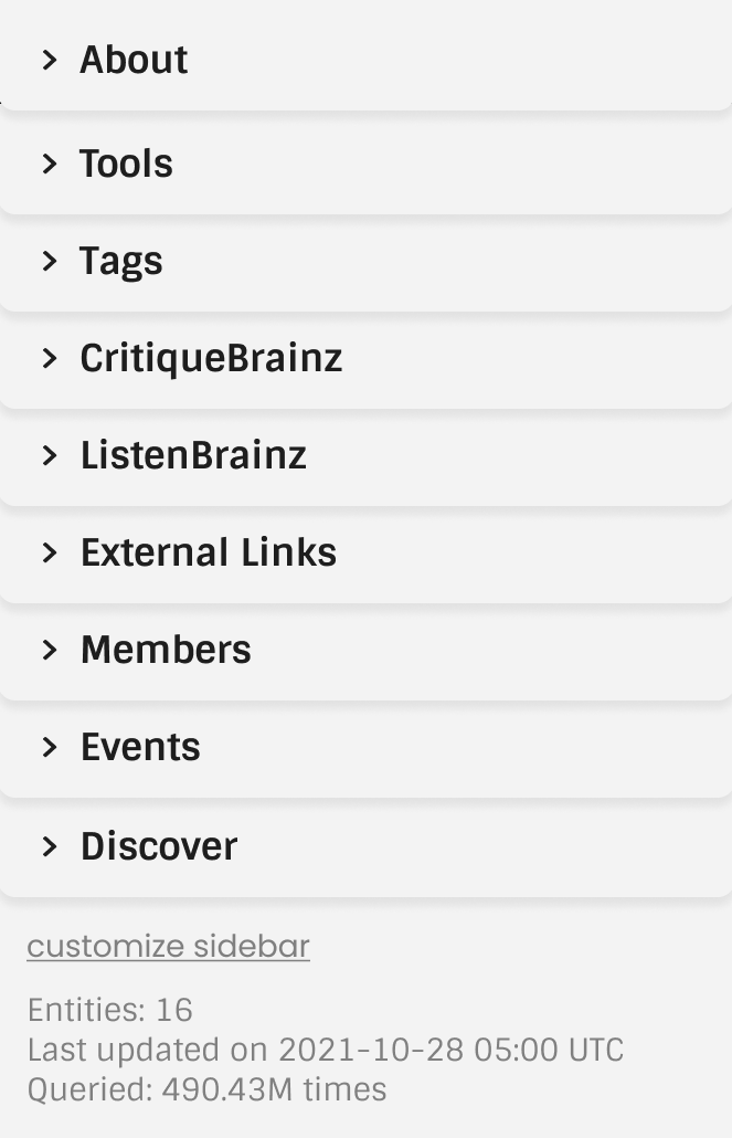
Some pages (e.g. releases with relationships) have a massive left column scroll, so this is hard to balance. My solution is to be able to collapse and/or (ideally both) customize the columns. Even a very large amount of items in the right-hand columns collapses to a small size, see example here.
Some of them should default to collapsed.
See above (collapsible/customizable sidebar). So the default positioning is more what we want to show a new user, assuming heavy users will customize it.
RG section/the columns is similar with a customizing option, which means we can add a bunch of interesting things - I think there will be a pretty massive back and forth on what the defaults should be. Maybe just keep them as now to avoid the arguing hah. Or maybe someone can think of a way to semi display/hint at more?
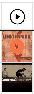
Jesus had this same question, see my reply to them. It will not bethere if you never hit ‘play’ (unless we think more visibility for it would be good).
Hmm, could easily have an expand/collapse button for these, like with some of the others? And in that case just list them vertically. By default or with a click.
(We should keep the horizontal versions for the mobile display anyway)
You’re right, the titles blend in more now. I’ll have a play.
Thanks @barrymieny!
I imagine it would eventually max out (but I haven’t really thought about this yet). It’s not very easy on the eyes to have to follow long rows of text or those big blank spaces in the tables. However with customizable tables enough width to display all the columns (if enabled) on a wide monitor might be good.
Does anybody have any thoughts on this?
I imagine the main drawcards to entice new users is the much more prominent ‘edit’ button at the top and the orange ‘create new’ button at the top of the table. Rather than the more technical edit tool list (which is hidden anyway when not logged in).
But rearranging the default order of those side bars is absolutely up for discussion.
This is based on the style guide, which you can see here. I think the mockup at 100% is accurate but your screen rez might be messing with it? Have a look at the font sizing and let me know if anything looks off.
Oops: Actually I think I may be a font point down in the mockup. Let me know what you think anyway, the guidelines are new and also changeable.
Fonts are from the guidelines as well, Roboto for titles, Sintony for content, same as over at ListenBrainz. Feedback also welcome.
Great spotting re. the use of another font! Figma has a bug where Sintony barely shows an underline. So I put in a similar font (can’t check on this connection) when I wanted to make it clear there would be an underline/link. If that’s what you’re referring to - I think the rest should just be Roboto and Sintony?
Thanks @UltimateRiff!
I’m not sure how that info would be generated, and I assume you couldn’t edit it. I’m a bit wary that it could at least sometimes be wrong or not perfect, so I wanted to signpost that/split it out. And this way you can display one and not the other in customization/collapse one. Is there a better way to do it?
Yeah once the desktop is more or less locked in we’ll do a mobile version and see what we can do. Presumably most of this will default to collapsed. There’s a few other things we can do but might be better to discuss at the time.
Has come up a few times now, so is definitely something that should be worked on. Thanks for the example. Probably deserves its own thread at some point. Should actually be tackled on the current design, independently… but a redesign could be a good motivator.
Thanks @IvanDobsky!
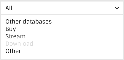
Shops aren’t important imo, but the artists are. This is a bit of crossover from some discussions behind ListenBrainz, but artists are getting shafted in a lot of ways atm, and it would be great for MBz to be a place where we can support them.
Besides that, the distinction is very useful to me. I think random browsers will find it useful as well (as opposed to hardcore editors - maybe not). Repitition between sections is what I would expect anyway. Note that you can select the top level that covers all three, if you don’t want the distinction.
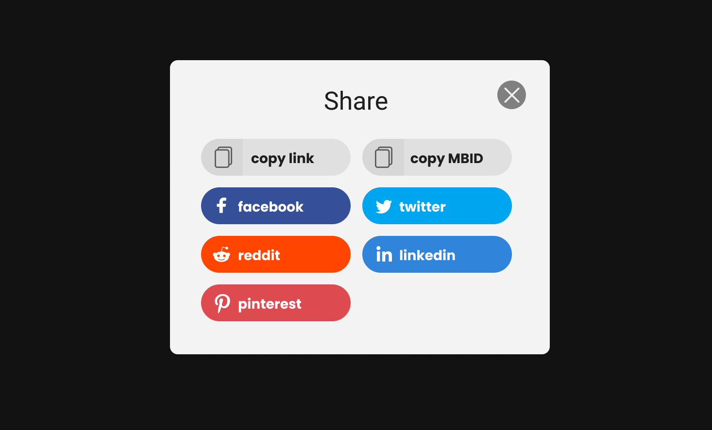
One of the considerations behind this design is definitely to open up MB a bit more to the outside world. I know that the typical MB editor is not at all keen on this kind of thing/social media. But I think MB can make itself more open to a wider audience without hampering editors (!!important!!). So I can live with adding things that you (and myself tbh) don’t care for, but do let me know if it’s actively breaking your workflow. I assume the share button doesn’t do this, otherwise do feed back again please.
It is a little bit, because it’s trying to address some specific feedback brought up by @Jim_DeLaHunt. Have a look at their notes on the ticket. I think it’s a really good point that they bring up - if anybody has any thoughts on it, especially specific ideas on how we can tackle it (can be something completely different to what I have done), let me know.
The ‘contributed’ tab in mockup 1.3 is trying to address some of that feedback in tandem as well.
Agreed, great idea @jesus2099! I think that one should stick.
My thoughts exactly. I suspect this may be more trouble than its worth. Even though it looks pretty. Some bands have some preeeetty rough covers as well… I’ll leave it out of the next version I think.
Thanks again all


