Artist Page Redesign

I like your mock-up very much, @aerozol!
I agree with what @IvanDobsky says.


I would prefer not these big buttons in the header, I don’t like them very much and we already have their equivalent in the sidebar, making them redundant.

Also, with the Customise sidebar, I would like to be able to deactivate the sidebar Share link, as I already copy the URL quickly on my own without it: with Overview tab link right-click, C, or even F8 (address bar focus), Ctrl+C. And I don’t have any SNS.


Write a review and Listen now button look like (good looking) headers.
So I’m little bit confused as they are in fact at the end of some sections, not the at start.


Can’t Write a review stay inside the Reviews link?


I don’t understand the Listen now and the multimedia buttons in the page footer (previous, play, next).
But I hope I would be able to hide them with the Customise sidebar again.
I don’t necessarily want to hide listens, but certainly don’t want to keep play buttons that I could never use (I don’t have any streaming service).


It would be nice if the release group expand would show releases date(s?), mediums (ex.: 2×CD + 8cm CD), catalogue numbers and barcodes, maybe track counts, but not necessarily the full tracklists (second level expand).
Like Ivan said.


I like all the rest.


One thing I would like on all entity pages is a Contributors list, like on Discogs, that would only count edits directly related to that entity (not the edits on linked entities), ordered by edit count, descending.


Pre-installing nice userscripts wouldn’t be so good because they are all prone to become obsolete, and more effort should be put in integrating features in MBS.

But wow! Having a standardised area to drop our userscript stuff like that could be very nice! It’s a nice idea, that could even be agreed on between userscript authors, even on the current MB layout!

3 Likes

this looks nice and i think it fits with a similar theme of other metabrainz projects like bookbrainz, but also noticeably different enough you can tell them apart. i usually don’t like “modern” designs, but you did it really well.
with this redesign i’d also like to see eps be listed before singles. eps are often full projects, especially in recent years and i think they should be listed right underneath albums. you also wouldn’t have to scroll through potentially hundreds of singles just to get to eps.

1 Like

This sounds good. +1.

What would be bonus plus good is if the various types could be shuffled and collapsed on screen… then those of us who want to see Live above Compilation would be happy.

2 Likes

Then also lives are original recording releases and should be shown before compilations, with other original RG:

Update order:

  1. Albums (no secondary types)
  2. EP (as it means mini-album in many cases)
  3. Singles
  4. Lives (as they also are original material)
  5. Original soundtrack
  6. Remixes
  7. Compilations
4 Likes

Thanks for the feedback, quick people!

I’ll give it a bit more time before I integrate it into a version 2.2, but I wanted to discuss some of the points that have been brought up. If you read my thinking and think ’no, I still think that’s dumb’, don’t hold back and let me know :smiley:

Can you clarify what you mean?
If anyone missed it, my mockup has a more prominent ‘Official releases only’ button at the top now (I personally also use the “?all=1” script)

I have just thrown in everything I would wish to see, without consideration for database calls/loading times. Another reason to not get too attached. Let’s shoot for the stars for now!

This is a big change that I expect to get a lot of feedback on (@CatQuest also expressed dismay), but after spending some time with it I am a big fan. All editing tools are in that top bar. No need to check sidebars or tabs, it’s always in the same place, for all page types. A new editor shouldn’t have trouble finding any editor tools, as that’s where it will be.

Where a big ‘edit’ button isn’t in that section it’s more or less to entice a new user to get editing/sign up.
The Figma page has a mockup with the edit tab expanded, but I forgot that it’s not shown here. Here are your missing edit functions, with space for more without getting in the way of anything else. Dream scripts section included for now:

(more feedback welcome)

Maybe a filter would be useful (just some quick example categories in this pic)

image

These are my small concession to new users, most other things have been kept fairly functional and compact (at least I think so?)

‘Edit’ and ‘Share’ I’ve picked out as high value buttons for a more casual user to be drawn to. I can change them but I would really like at least an ‘edit’ button stand out in a pretty big way, at least if you’re not logged in :thinking:

imo ideally we experienced users can live with a bit of empty space and some big buttons in that little top right corner, we own the rest : P

In a design/UI terms this kind of button is a ‘call to action’. Basically, it gets really high engagement from users, because they can click on something that performs an immediate and clear action. I don’t think this kind of thing is needed by the ‘core’ MB userbase, but for new visitors who aren’t interested in editing MB, but are interested in writing reviews, I think it will make a difference in whether some join in or not.

Yet another concession to the more casual user - I expect we’ll be going back and forth a bit on that stuff before we find a middle ground.

Collapsable is already in there (arrows next to the main types).
I don’t know about re-shuffling but it could be integrated into customize columns (perhaps renamed to ‘customize view’ or something like that)

3 Likes

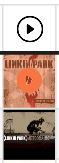
Missed this - sorry, this isn’t quite clear in the mockup. You can click on the artwork column to play the album, using the ListenBrainz player. I imagine it would be hidden unless you clicked the play button (actually, I need to add a ‘close’ button to the player don’t I)

image

One thing I’m excited about is how things like this can have knock-on effects that are really interesting! If clicking the ‘play’ button at the top of a table plays through everything in there, it means collections and labels etc become something people can listen to. Cool. Cool? Cool. :sunglasses:

I’m aware not everyone will want this which is why it didn’t get its own column, just uses an existing one (but again, let me know if you still hate it)

Combining the ‘MBz ecosystem’ was one of my key aims in the ticket, which I should have put here:

  • Ease of use for editors, without cluttering the display for casual users (editing tools at the top)
  • Calls to action (big edit button at the top, big buttons for key actions on the side, various edit icons)
  • Linking the MBz ‘ecosystem’ (sections leveraging and inviting users to LB and CB)
  • every display, table, sorting, collapsing quality-of-life improvement I could think of at this time…
2 Likes

Shooting for stars, but staying efficient from the start. If you are designing a GUI to be customisable, link in the functions too. I like the “lets try everything” approach, it gives more choice, but I also like efficient. If I am turning off ListenBrainz stats, Spotify\YouTube player, etc then please don’t make those calls. That’s a lot of bandwidth - and literally electrical power - which I would want to disable.

I don’t do GUI design now - but it feels a long way away from the eye. The sea of Orange makes it even further. That is a lot of mouse mileage.

Shouldn’t Edit be one of your biggest “Call To Action” things for the database? Seems odd for emphasis now to leave to CritcBrainz, ListenBrains, Twitter, Apple shopping. We also need to engage and get them to stay here too. :slight_smile: (Don’t worry, I get the need to advertise the wider Meta projects, just don’t forget to make this one easy too :wink: )

Again - please don’t take my feedback as negative. And I expect you already have the above in hand. I like the looks, and it sounds like you are thinking customisable from the start. All good.

1 Like

Click on Pink Floyd. And scroll. Notice that Album + Compilation, Album + Live, etc appears more than once due to bootlegs being separated. So does Single as promos are also split. It can be a little confusing as this only happens when there is nothing Official in an RG. It can make it quite confusing when trying to locate something. Those promo singles at bottom of page 5 are official releases. (Yes, there is a ticket on this, which is why I should not have mentioned it really. Don’t want to disrupt thread) The main aim is also so you can see some chaotic Arists and how they would look in your new style. :slight_smile:

1 Like

Mockup 1.3 (desktop):


This one has notes in the pic, for easier reading/feedback (see earlier versions if you want an unobstructed ‘look and feel’ view).

Changes that I wanted to comment on:

  • Edit tools put back into the sidebar, based on Feedback from @IvanDobsky and @CatQuest (editing and share icons still kept prominent at the top, sorry!)
    We can go back to the ‘editing toolbox’ at the top if anyone mourns it, pipe up if so, but maybe it was just me that found that useful/saw a potential to give us a much bigger editor playground
  • The addition of ‘contributed to’ tabs, as well as an ‘auto summary’ section on the side, based on @Jim_DeLaHunt’s feedback (which is that they use the artist page to identify artists, rather than browse their discography)
    If anyone has any better ideas for how we could integrate ‘contributions’ better (engineering, produced, etc) please do share! We’ve really just been tweaking the current MB view here but we could always make more radical changes if someone has an idea
    Edit: See the mockup for the ‘contributed’ tabs here. Note the different columns
  • I took some columns out of the release group table because I thought it was becoming distracting. Basically, there’s heaps we can put in there. Noodling out what should go into the default view will get its own fun discussion.
    However if anybody has ideas for new columns (at any level) that could be fun please let me know now
  • Updated columns at the release (expanded RG) level based on @jesus2099 and @IvanDobsky’s feedback. Is it too crazy to drop the release title? Probably huh

Some other bigger changes in there that I don’t have anything more to say about, have a look at the pic and see.

All feedback still welcome at this stage.
Especially let me know if you gave feedback and you feel it wasn’t addressed, in case I lost it in the mix.

3 Likes

It would be interesting to know what the end goal is with the design of this page (the page as a whole) and why the design choices was made because some of the features that I mention below are more prominent than that I feel that they “should” be, based on how users probably currently use the website.

I have only written down the things I like less than the rest (I wrote this last night so most of the comments are about 1.2).

  • I don’t like the huge edit and share buttons in the top right. The design feels a bit flat (could stand out more and be more button-like). The other thing is the intention. Both buttons seems to be linked with things that happens very rarely (unless the edit button actually is a multi use button that can be used to “add release”, “add RG”, etc). Simply “edit artist” and “sharing” seems to be two things that only rarely are going to be used, which makes me feel that they should be less prominent in the layout. Ask yourself, how often do you share links to reddit/twitter/etc via buttons like these on other websites? 1.3: the look, placement and size feels more appropriate now, but the buttons do now blend in too much with the background, because of their smaller size combined with dark colours (dark-orange + dark-grey mix). Changing the icons to white might work better.
  • I don’t like the lack of balance between the left and right side. The huge empty white space under the RG section does not look good and is going to look even worse when you have an artist that only have 1-2 RG’s but the same amount of space to the right side as in the mockup. Too much vertical scrolling.
  • I don’t like how prominent Listenbrainz is in the layout. I have no interest in using Listenbrainz and I imagine that it would be annoying to have to see that everywhere. It’s most distracting in the RG section (removed in 1.3, but could perhaps be added back as an optional add-on for LB users in a settings menu). Is the idea that the player always is visible (for logged in users) at the bottom of the page or do you have to scroll all the way down to see it? I would probably keep just the right LB section for all MB users.
  • I don’t like the design of the “Members” and “Discover” sections. It feels like it takes up too much space vertically. I’m also not a fan of the “endless” horizontal scrolling where you can’t see the end, which also makes it easier to miss content that’s somewhere in the middle or in this case hidden just 3 steps to the left or right.
  • A minor thing is that I miss the coloured headlines in the right column. It’s now harder to quickly find the right section. But this is easy to fix with a userscript or change it later on if you get too many complaints about it. Maybe try to just make the “collapse” arrows orange to see if that’s enough?
2 Likes

It looks/feels more modern in many regards.

Some points from me:

  • Is the design responsive? This question is more aimed at larger screen sizes rather than mobile. In the current design, the layout just keeps stretching horizontally which is really awkward on a large monitor. Would this design have a maximum breakpoint or keep the current behaviour?
  • Why are the editing links so far down the sidebar? Would that not impede contribution having these outside the view on load? I did see the option to customise the sidebar right at the bottom, but would/should the default layout be aimed at consumers or contributors?

And some points specifically about the typography:

  • I don’t know at which size the screenshot is supposed to be viewed, but it only starts feeling easily readable when I zoom it to about 2/3 or 3/4 of the screen width on a 24" 4K monitor. At that point it feels comparable to the type size on these pages. Is that roughly the size it’s meant to convey?
  • Is the random use of Avant Garde intentional or an oversight? It seems odd to me to mix the two typefaces for no discernible reason.
  • What is the main font that’s used? I ask since some letter shapes seem odd at smaller sizes (lowercase “a” and 5 jump out the most for me) and in some places it feels like the type is a bit uneven on the baseline.
1 Like

I’m quite liking the new designs, especially pulling details from the tabs (Events, Aliases, Relationships, etc.) out to the overview tab. I especially like the addition of the Auto Summary section, though it feels like that could be combined with the About section? (logically, that’s where non-editors would expect it, that is)

my main issue is I’m imagining scrolling through all that info on a mobile screen, where the page ends up about a mile long. I do like the mobile external links/tags you’ve added on 1.3 tho~ (I do also understand this is the desktop version, and the mobile version could be trimmed/collapsed quite a bit)

I do like the big, in your face Edit and Share buttons from 1.2… perhaps they could be repurposed to save space on the mobile version? maybe they can be turned off/adjusted in the settings? just thinking about non-editors here…

I believe customizability is key, and I like how customizable these designs might be~

the order of release group sections is also important, as I don’t think all secondary types should be grouped with the rest of the primary types, see Family Force 5, for example. maybe only Live, Remix, and Soundtrack follow the only-primary groups, then the rest go below Singles and EPs? maybe even collapsed by default (unless that’s all an artist has, that is)?

Example release group sort

note, not exhaustive

  • Albums
  • Soundtrack Albums
  • Live Albums
  • Remix Albums
  • EPs
  • Live EPs
  • Remix EPs
  • Singles
  • Soundtrack Singles
  • Soundtrack Remix Singles
  • Remix Singles
  • Broadcasts
  • Live Broadcasts
  • Compilation Albums
  • Live Compilation Albums
  • Demo Albums
  • Spokenword Albums
  • Mixtape/Street EPs
  • etc.
1 Like

I’ll add more another time…

On the right “buy, stream, download” seems to misunderstand how these shops work. Make that a single group “shops”. Otherwise it will be repeating the same icons multiple times. Don’t separate Buy, Stream, Download. Shops should not be important (unless they pay sponsorship cash :dollar: :dollar:)

As an editor, I usually already own this music. BUT as an editor of an artist I know little about I’ll hammer these links to use as part of my new data imports.

This is the big point to me. It is impossible to cover all uses without this. As @joiletjake says - you’d share once, but edit many times. I’m an anti-social editor with none of those Share accounts - but addicted to editing. I am pure MusicBrainz as my “listens” are personal data I don’t share. Everyone has different needs. Don’t scare off editors like me.

Auto-Summary looks a bit of an after thought for now… but it could be developed to something strong. I can see where you are going. But don’t make up this data on the fly. When I am editing I will not look at this, so don’t slow down my page loading. (I could go all hippie and EnviroMental here…) Don’t try and do everything.

Contributors is pretty cool. I know that I can go blitz an artist in a few days. So it is nice to see this kinda credit. It also lets you know who to go and poke if you have questions on that artist where you want some feedback.

Artwork in the corner - a messy one. If we could add Artist images it would make sense. But picking a random RG or “first” RG is going to be messy. You’d need to at least make this selectable (like happens with a Release Image on an RG) but that is going to be a HUGE list… and which is that artist’s most important album? haha… warzone…

2 Likes

Thanks all! I’m away on a ski trip :skier: :tada:

So an updated mockup will follow when I’m back at work, in the meantime let’s chat about some of the feedback. Please do follow up if you think something remains unresolved.


Thanks for the feedback @joiletjake!

I feel like most of your feedback is resolved through details in the design (particularly interactions that can’t be shown in the pic), let me know if not. I sense an overall feeling of ‘I don’t like it’ - if so let me know and we can nail down what exactly I can do to help.

Yup! I had the expanded ‘toolbox’ in the earlier mockup, but that’s just on the ticket. You can see a screenshot here. Moving away from that, back to what we have now, because a few people haven’t liked the change, but it could still be an option.

This was after feedback that they stood out too much. I’ll do some further tweaking (but probably wont make everyone happy in the end unfortunately)

Some pages (e.g. releases with relationships) have a massive left column scroll, so this is hard to balance. My solution is to be able to collapse and/or (ideally both) customize the columns. Even a very large amount of items in the right-hand columns collapses to a small size, see example here.

Some of them should default to collapsed.

See above (collapsible/customizable sidebar). So the default positioning is more what we want to show a new user, assuming heavy users will customize it.

RG section/the columns is similar with a customizing option, which means we can add a bunch of interesting things - I think there will be a pretty massive back and forth on what the defaults should be. Maybe just keep them as now to avoid the arguing hah. Or maybe someone can think of a way to semi display/hint at more?

Jesus had this same question, see my reply to them. It will not bethere if you never hit ‘play’ (unless we think more visibility for it would be good).

Hmm, could easily have an expand/collapse button for these, like with some of the others? And in that case just list them vertically. By default or with a click.

(We should keep the horizontal versions for the mobile display anyway)

You’re right, the titles blend in more now. I’ll have a play.


Thanks @barrymieny!

I imagine it would eventually max out (but I haven’t really thought about this yet). It’s not very easy on the eyes to have to follow long rows of text or those big blank spaces in the tables. However with customizable tables enough width to display all the columns (if enabled) on a wide monitor might be good.

Does anybody have any thoughts on this?

I imagine the main drawcards to entice new users is the much more prominent ‘edit’ button at the top and the orange ‘create new’ button at the top of the table. Rather than the more technical edit tool list (which is hidden anyway when not logged in).

But rearranging the default order of those side bars is absolutely up for discussion.

This is based on the style guide, which you can see here. I think the mockup at 100% is accurate but your screen rez might be messing with it? Have a look at the font sizing and let me know if anything looks off.
Oops: Actually I think I may be a font point down in the mockup. Let me know what you think anyway, the guidelines are new and also changeable.

Fonts are from the guidelines as well, Roboto for titles, Sintony for content, same as over at ListenBrainz. Feedback also welcome.

Great spotting re. the use of another font! Figma has a bug where Sintony barely shows an underline. So I put in a similar font (can’t check on this connection) when I wanted to make it clear there would be an underline/link. If that’s what you’re referring to - I think the rest should just be Roboto and Sintony?


Thanks @UltimateRiff!

I’m not sure how that info would be generated, and I assume you couldn’t edit it. I’m a bit wary that it could at least sometimes be wrong or not perfect, so I wanted to signpost that/split it out. And this way you can display one and not the other in customization/collapse one. Is there a better way to do it?

Yeah once the desktop is more or less locked in we’ll do a mobile version and see what we can do. Presumably most of this will default to collapsed. There’s a few other things we can do but might be better to discuss at the time.

Has come up a few times now, so is definitely something that should be worked on. Thanks for the example. Probably deserves its own thread at some point. Should actually be tackled on the current design, independently… but a redesign could be a good motivator.


Thanks @IvanDobsky!

Shops aren’t important imo, but the artists are. This is a bit of crossover from some discussions behind ListenBrainz, but artists are getting shafted in a lot of ways atm, and it would be great for MBz to be a place where we can support them.

Besides that, the distinction is very useful to me. I think random browsers will find it useful as well (as opposed to hardcore editors - maybe not). Repitition between sections is what I would expect anyway. Note that you can select the top level that covers all three, if you don’t want the distinction.

One of the considerations behind this design is definitely to open up MB a bit more to the outside world. I know that the typical MB editor is not at all keen on this kind of thing/social media. But I think MB can make itself more open to a wider audience without hampering editors (!!important!!). So I can live with adding things that you (and myself tbh) don’t care for, but do let me know if it’s actively breaking your workflow. I assume the share button doesn’t do this, otherwise do feed back again please.

It is a little bit, because it’s trying to address some specific feedback brought up by @Jim_DeLaHunt. Have a look at their notes on the ticket. I think it’s a really good point that they bring up - if anybody has any thoughts on it, especially specific ideas on how we can tackle it (can be something completely different to what I have done), let me know.

The ‘contributed’ tab in mockup 1.3 is trying to address some of that feedback in tandem as well.

Agreed, great idea @jesus2099! I think that one should stick.

My thoughts exactly. I suspect this may be more trouble than its worth. Even though it looks pretty. Some bands have some preeeetty rough covers as well… I’ll leave it out of the next version I think.


Thanks again all

4 Likes

Ultimately you are displaying tables of data. And this is what we all want to focus on - the data.

90% of the use on this page will be looking at those tables.

This will be an interesting debate. It will need a discussion all on its own. What is the main aim of someone looking at this page? Do they come here to find a link to Spotify to then leave MB and buy some music? Or are they coming here to look up reference details? Or are they an editor adding data? Don’t just design for a New User as you’ll need to keep us old 'uns happy too :grin:

This is sensible. I am not anti-social links, just get bored when they dominate a site. (I have all kinda scripts that kill those links anyway). As long as I can find the edit buttons without scrolling past flashing “share me” links then I’m happy.

I’ll still put a large emphasis on - make this editable and customisable for all users. We all need something different and it will be a big bonus to us old 'uns if we can hide the bling and keep those customisations in our profile. I am not a web designer, just please promise me not to use cookies to keep settings in.

Oh - and font feedback from me is I like the crisp look, and the colours are all good.

2 Likes

I’ll leave functional ideas to the experts; I’m a stranger in this town. But +1 on cookies: I also shred most cookies on browser close. That’s my choice and I do expect to lose some context, but I also hope that login brings at least some settings back.

2 Likes

Not at all, that’s just because I only wrote about the things I liked less than the rest. Everything else looks good to me. I probably should also have mentioned that I went in blind and did purposely not read any comments or replies to get a more genuine first reaction. You are probably right that some of my feedback can be solved with interactivity, like e.g. the left/right balance and the overall customizability so that you can add/remove things that you like/dislike. A big problem with websites like this is information overload, so which of them that’s should be expanded by default will probably in the end come down to what features that you want to promote the most (which I imagine will change over time), because having them all expanded by default feels a bit much imo and will worsen the information overload compared to how much that’s displayed in the old layout.

To clarify a bit, I like the placement and size of the big “edit” button if you can edit everything (artist, releases, etc) when you click on it. I would place it as in 1.3 if it does not include things related to “release” and is instead just related to editing “artist”. I think the menu needs some rearranging though as “edit artist” probably isn’t the first thing you want new user to click on.

Re: LB: I think it would be a good idea to have a big pop-up “demo” the first time the user links their LB to MB or vice versa (not sure how this process works tbh) either at LB when this happens or make it pop-up when they first visit MB/artist again. Then you can show that “we have added these widgets [here & here & here, etc], but you can add/remove them here ->”. Maybe also show the LB icon to make this settings area easier to find in the footer or wherever it end up being placed. Ideally I would also want a separate settings page at the mb/user page where you customize everything at the same place and add/remove widgets. I imagine that there at some point in the future will be users who wants similar widgets for e.g. CB, events, or perhaps widgets related to editing classical music. It might be a good idea to in general also have a cogwheel icon or similar at places that can be customized.

1 Like

Interestingly none of the LB features I’ve put in would be removed or wouldn’t work for non-LB users. Yay! The play function works fine when not logged in, and global listen stats will still be useful. All signing up does is add a personal listening stat (in this mockup anyway) in a couple of places. So hopefully no need for big explanations.

One thing I’m not sure about is if we want to enable people to hide widgets completely. Personally since they collapse so small, and can be ordered, I don’t think it’s worth making an extra function/options screen. The really hardcore users who need everything exactly ‘so’ can hide things with a script. Anyone thinking differnetly?

2 Likes

Mockup 1.4 (desktop):

Comments:

  • Playing with different display options - e.g. the coloured background in the right column. I think this will get some criticism but let’s see ; )
  • Stronger headings in the right column, so it’s easier to visually distinguish and jump to sections
  • An example of how we should default to displaying some sections collapsed. This is about what I personally imagine the default to be
  • A chat panel added to the right column - another example of a new feature that could fit in nicely
  • Made the top edit & share buttons a bit bigger, added a play one as well (plays whole artist on shuffle or by top song)
  • Make it possible to shuffle/drag and drop sections without going into another page or popup (move icon at top right of sections). Unsure of how this would work with the release groupings, particular since its paginated, but would be very cool if it could work. Note that the online game I cribbed this customizing style from does fine tying these changes to a login/account, so it should be possible for us?
  • Made it more obvious that you can add table columns with a ‘+ add columns’ button - probably remove it after you’ve added a column for the first time
4 Likes

I would want to 100% hide LB, CB and the player. I know many are enthusiastic about it, but these kinds of stats are really not of any interest to me. I don’t look at music as stats. :slight_smile: Also really not wanting to add those extra downloads to an already heavy page. Save some loading time.

Hiding a widget completely would surely make the code easier to say “don’t load any of this bit at all”? As you are thinking of adding these to the login account, it could be a set of on\off toggles for features in there. Bonus this saves on server load\bandwidth\power use. :wink:

Colours are good, do you also have a dark mode? Is it intentional styled on a sunset? (nice)

Kinda interesting to see “Edit” is seen as something to hide by default. Should this not be prominent to say “take part in MusicBrainz”. That should be visible by default otherwise you are doing too much promotion of ways to leave. Please consider keeping that one open to draw the noobie’s eye to “you an also change things”

External Links - will the expand bring all the words back on the side? Or pop open a new window? This layout is a great advert for the shops, but not obvious where things are unless you already know the branding. For example - I didn’t even know that was Bandcamp’s logo and its the only one in there I use. :smiley: I often look for the fan discographies\gigographies in these lists and they can be hard to identify on the current GUI.

This is all looking great, but also have this strange feeling this is getting more about playing music and leaving the site instead. Using it like Wikipedia. And less about staying and contributing. I guess I understand MB in a different way and you guys know the visitor stats…

2 Likes