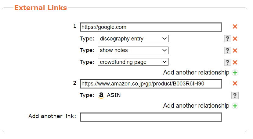
With the editor becoming more and more advanced, it can be expected that the UI will become more and more complicated, e.g. we have to add an edit icon beside each relationship to open edit dialog for attibutes like start/end date etc:
That looks like madness for navigating through. Meanwhile has lost all clarity as to what is being edited to gain what? The Amazon box has a URL visible in it, quick check, tab past and exit. Meanwhile that google box has lost all visible details. But I think this is part of the problem - do you use the site yourself as that is a weird example? You will never have three google links like that. What examples are you working with in the spec?
How many cases are there of needing multiple types? I had mentioned Bandcamp earlier, but now I think of it there would be different releases for each type.
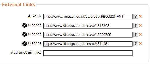
Sometimes I will add two Discogs links, but I would still need to see the URLs as tidied up when I am on the edit page or how will I know which one to fix? Don’t hide this detail. We are on the edit page.
You seem to be proposing something that will show less in edit mode than view mode. Why is your edit mode hiding the URLs? I am confused.
Why is there an x next to show notes when you can’t actually see the link to the show notes to know if it is correct. You can only know to delete it if you can read it? Simple edit box is clearer.
I still don’t get the point of the pencils. Opening an edit box for an edit box to make an edit and hit OK is illogical.
We need to enter data quickly, without extra button presses. All I see is complexity for a few edge cases where two types are used with one URL. I am sorry, but I just don’t get how this is making it easier to edit a wikidata entry (as in ticket) when everything becomes hidden behind so many buttons.
You seem to be over-complicating it for no real gain. Sorry if I am missing something.
Just seen this. I had been puzzled by that bizarre pencil. Start end dates? How many of the current URLs would really need that? That is such a rare edge case it should not be the cause of a huge disruption to data entry. especially not on a new release as you are almost never going to add a dead URL.
The pencil would make more sense on a totally separate button AFTER all the URLs are shown. “Set an end date” is going to be needed so rarely that it can be stuck on the side in some kinda “advanced” option.
IMHO a start \ end \ start up again date would be of more use on an Artist than a URL. I have had more need of a “this band disbanded and then reformed” option than a need to say “this URL has now ceased to be”
Sorry I forgot to mention that this is an unreal example for demonstration.
I guess a common case is “get the music”, for more information, see MBS-9902.
I’m not sure I get your point, this new UI groups links by URL, so if you’re adding 2 Discogs links with identical URL, they should be grouped together, and the URL is shown above only once.
The URL is shown above as it is one of multiple relationships of one URL, again I don’t understand your question, please be more specific.
I’m surprised that you’re doubting the whole point of this project. I think you’ll find out by reading MBS-3774. It’ll avoid redundant edits and is more straightforward.
I disagree with that. New releases are not necessarily new, they might be old releases that are missing in database, I myself have run into this kind of situation before, so it’s clearly not “almost never”.
It reminds me autofocus and keyboard navigation userscript needs many updates.
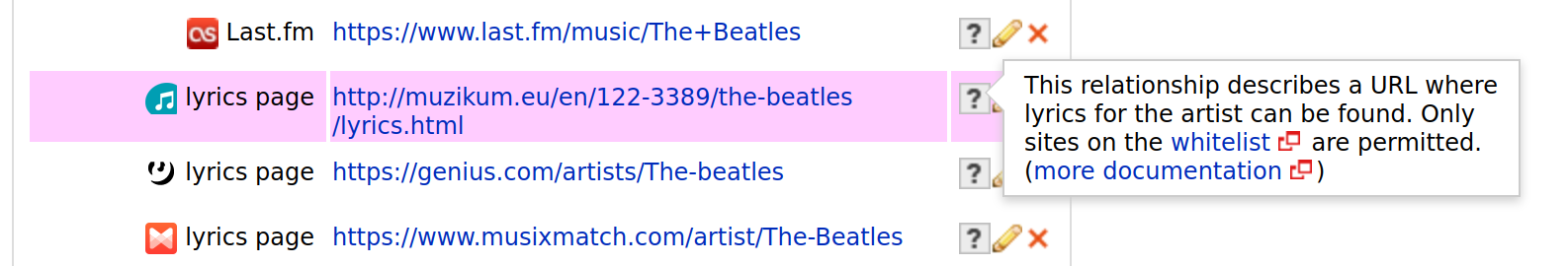
I see in this screenshot that I could add UP ↑ / DOWN ↓ key shortcuts to jump between URL fields.
This is why I am asking to not damage the GUI for an edge case. Or maybe only merge when the Types are different?
You cannot do that as grouping will not make sense. For example, the two discogs links will point to two different items on another website that are separate entities that need to stay in separate edit boxes and be visible in Edit mode. Your suggested GUI makes it impossible to see which one to edit and update.
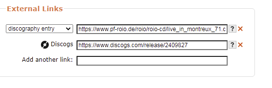
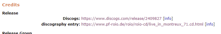
An example:
In your mock-up and above explanation you will hide the three separate numbers. This is backwards for an editor. They need to stay visible as three items like on this screen.
If you merge these three like in your mock-up I cannot work out which one to delete with the red x or know which one to edit and update.
Maybe “if of same type” then keep edit boxes fully visible like your Amazon example. (This above example would be equally valid if you have three ASINs and had opened the editor to delete one of those)
I am asking for details as an active editor who does not read tickets. I work in the database. Please explain to me how often an end date is really needed on a URL? These plans for pencils will have a large disruption for minimal use.
I am constantly adding old releases. Thousands of them. But when adding that release i have never needed to add a link to an expired page. This is why I am asking for examples. If only 1% of URLs need an expiry date, then that is what I am referring to as a major disruption to work flow for minimal gain in the majority case.
Please don’t take the above as negative or personal. I know I don’t word things well. I worry about the loss of clarity and ease of use of the current GUI just so some dates can be added in some very rare situations. I am trying to give genuine feedback.
It also avoids an extra step to add an ended URL, currently you have to add the link first and turn to URL editing page to make it as ended, resulting in 2 edits: Add relationship and Edit relationship. And many unaware editors don’t know this approach, and remove dead links directly. This feature was proposed by @jesus2099 and 13 editors voted for it. Maybe you’re right that this is a rare case, we just haven’t found a better solution yet. I’m wondering if adding a page for creating URL will help?
I can feel that you don’t welcome this change, but we need other editors’ voice too.
I very much welcome being able to set ended and dates from the edit page, but I also agree that in most cases, this is not needed - so rather than always forcing extra clicks, I’d prefer one of two options: either normally no extra clicks are required, but a pencil needs to be clicked to change the dates, or a bubble with additional forms for dates and ended and whatnot opens whenever the URL field is selected (the second option is possibly better because it makes it clear it’s possible to make those changes, even if you don’t want to make them yet, so the user will know when they do need the option)
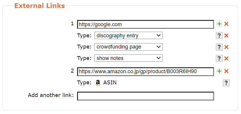
I welcome change when it is done correctly and adds useful features. What you were showing was loosing features. I welcome that different layout you now shows of the Discogs image as I can now see what I am doing there, unlike your Google example above.
Sorry if I am too vocal, but you asked for feedback. I am not the only one with problems with pencils and too many tab stops. Not my fault other people are not as vocal as me, but I’ll go away and shut up now. Thanks for listening.
That might be true, in which case we could special-case that one to require an extra click, while the others do not, maybe? (with the bubble saying something like “this URL is used in several relationships, to modify each one click the pencil icon by the relationship data”). Not sure what’d be the best way, but I’m sure it’s doable in some way
Something that has annoyed me about the delete button is that it immediately applies with no way to undo it. When I accidentally remove the wrong URL I’ll have to reload to page and lose all other input.
Regular relationships are marked for removal and are only actually removed once the edit is submitted.
On the other hand, sometimes I want to remove multiple consecutive URLs and this behavior is more desirable as I can just click away.
I don’t want to be the only person commenting, but you need feedback as this is going to disrupt data entry for a lot of people and other people don’t seem to want to be as vocal as me. (And a majority of editors in the database never visit this form).
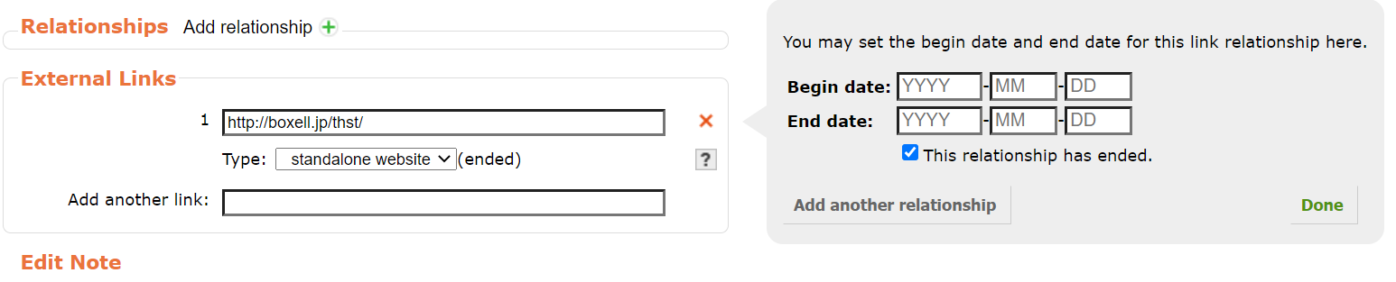
Why Begin dates? These will be very hard to fill in. And an End date is very rare. What I am tying to ask is don’t make this dominate the GUI.
Though I have no idea how to guess an end date for when an Artist’s website went offline… just don’t get how to make this accurate data. (This may be getting a bit OT from your edits. Juts trying to understand :))
In this thread we have two types of edits - Artist pages and Release pages. I can see some cases where an artist page may need end dates, but rarely can I see it on the Releases page.
I can never see a time when I’ll be adding a new Release with a new URL with an end date as that implies I am adding a link to a site after it has gone. (Think about - that would make it impossible to add and validate a URL that has already ended) Only if editing a release may I want to add a date - but this is long after the URL was initially added.
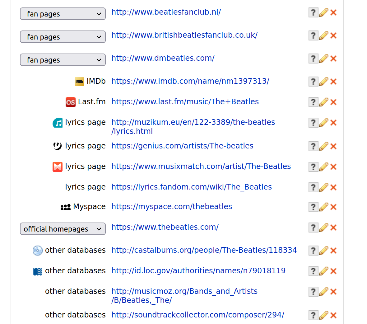
With the pop-out idea specifically: Look at Zas’s image of the Beatles Artist page with dozens of URLs. Now imagine tabbing down that with that data pop-out appearing on every line. That is adding ten extra tab presses per line. The pencil is better than that pop-out. Date changes will be very rare so it is acceptable to make changing dates to require more button presses.
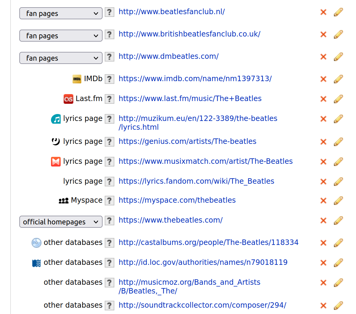
I’m wondering if you misunderstood something, the tab navigation won’t go through the bubble, so there’s actually no extra click than the current UI, while the pencils will introduce extra clicks.