Thank you all for your feedbacks, this is exactly what this thread is for! As you see, this change is still in testing and open for improvement. We’ll reconsider the effect on editing efficiency and accessibility, since other coming features will also affect keyboard navigation, e.g. grouping links by URL as shown in the screenshot. Meanwhile, we would like to hear more feedbacks, common usecases, your expectations and your thoughts on how to improve this UI.
3 Likes
The aim is to show the originally pasted URL next to the cleaned-up URL so that the editor realises that their URL has been changed?
In my opinion, because the current editing interface is good for me, I would just display the original URL in the same fashion as the current error messages, such as:
This relationship already exists.
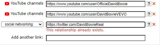
These messages don’t mess up with the tabindex of keyboard navigation.
The workflow is the same as when there are no errors, so it is good. No additional keys, no additional clicks.
As it’s not an error, it could be a warning in yellow and not blocking, just informing that:
Original URL before cleanup: http://blabla.blabla/blabla?this=that
1 Like
We have thought about that before, its disadvantage is that it can’t preserve raw URL, but it’s a minimal change indeed.
Apart from that, what do you think of the screenshot of ‘Grouping links by URL’? Because the type select is placed below the input box, an extra tab is needed, are you OK with that, and how often do you use keyboard to navigate to the type select?
1 Like
Hmm, I don’t understand what you mean with raw URL?
The screenshot still lacks a new button link called Add another type, probably.
And when there is only one type, maybe no type red cross (remove).
Currently type is before URL and we only have red cross.
So after pasting a new URL, I need to press Tab key twice (2) to go to new URL field:
After pasting a new URL:
- URL red cross
- New URL
But then with the screenshot, we would put type after URL and we still have URL red cross
After pasting a new URL:
- URL red cross
- Type red cross (maybe not if only one type)
- Add new type
- New URL
So if type is auto-detected (no type selector and no Add type, as there is only one possible?) and there is only one (no type red cross):
After pasting a new URL:
- URL red cross
- New URL
Am I right? ![]()
It means the URL you inputed before clean-up.
Right, that’s exactly what it looks like now. I forgot to update the screenshot and the latest code is WIP, so I only have an old screenshot here:
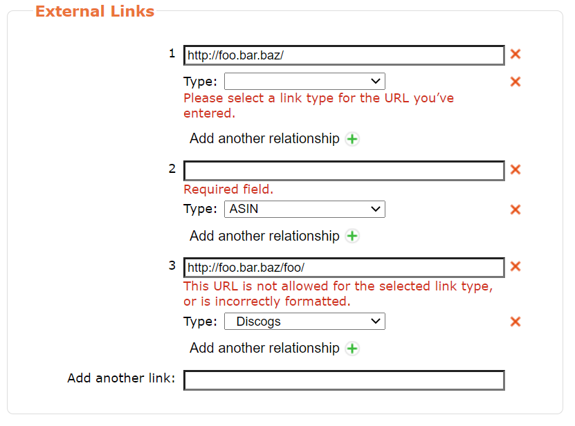
The layout is adjusted, and the delete icon is removed if there’s only one relationship. (You got it all right!)
There’s still an ‘add new type’ button, but I’m considering to prevent it from tab selection since it’s not commonly used(I guess), might also put it on the same line with other icons to make the UI more compact.
Basically you’re right, so are you OK with this extra tab?
Many types are auto-detected-and-set when there is no possible other types to be added.
In these cases, like for ASIN in your first screenshot:
- The type should be a text (not a select input)
- There should not be a remove red cross (because only onetype)
- There should not be any Add another relationship button (because it would not have been auto-detected-and-set if there were any other possible types)
It’s why I imagined:
Am I right? ![]()
Indeed it’s rare that I use keyboard for type.
It only happens when I replace a Wikipedia URL by its matching Wikidata URL:
- Paste Wikidata URL over Wikipedia URL
- Press Shift+Tab to go to type
- Press Up arrow to select Wikidata type
But ideally, the Wikidata type could have been auto-detected instead.
Always. Every time I enter data as it is faster when you have been used to it for decades. It also causes much less pain in mouse usage. I often paste discography links that cannot be auto-detected so shift-tab back to the selection box.
this does not look to bad to me as it is keeping edit boxes and just swapping the type box to after instead of before. This is a more logical working order. Paste link, tab, tab, select type with arrows, tab away to next data.
This is a little confusing. Everything clickable should be tab selectable. I get confused by this “add relationship” as surely “add another relationship” will have relatively low usage. Would it not be easier to automate that bit? When same URL is pasted for a second time, then the second type is selected and edit boxes get merged? Would that not be more efficient too?
What I see here is a big improvement as it removes the pencils. I have to say I laughed when I saw the edit box for an edit box also included OK and CANCEL buttons as I thought modern GUIs were killing those.
3 Likes
In my experience, 95% of the URL I paste have an auto-detected-and-set type.
So, even if generally I heavily use the keyboard, I don’t need it often specifically for URL type.
Not you?
This is what adds one Tab between each new URL.
But as it should not be an input but only text (no tabindex) for auto-detected-and-set types (95% of the time for me), it should still be OK. ![]()
2 Likes
Yes that’s supported, but I think a button would be more straightforward.
In fact this is another feature I’m working on in parallel with the popover thing. We’ve received your feedbacks on that and are discussing about it.
2 Likes
Good idea, I’ll take it into consideration.
3 Likes
That would be great, though.
Why is it impossible?
2 Likes
The input box should keep cleaned-up URL for final check before submitting, so if you’re inputting URL instead of pasting, you would be interrupted by clean-up. And what if you edit the clean URL? Which one should be kept as raw URL?
Some days I’ll be working a lot on Pink Floyd concert bootlegs. There are some brilliant Floyd discographies out there cataloguing these same bootleg releases. Being able to link these as discographies is really handy feature of MB. That way an MB release can have two or three external links to validate the source, and supply more details, reviews, etc.
When I add something like Bandcamp that will be using an import script. Which will all get borken when these changes appear ![]()
If it can be tabbed straight past it becomes a “double tap” instead of a single tap. Much easier to deal with than the pop-up edit box for an edit box with built in tab to OK button excess. Those boxes were a minefield of many extra taps as OK was last in tab order.
Adding a button for very small use cases is adding a click to every case for rare use scenarios. I guess this is for bandcamp? As long as it is selectable by tab, but also can be tabbed over, it is quicker that a edit box for an edit box like on the test server. ![]()
2 Likes
If you change the cleaned up URL then you have entered a new URL and decided to abandon your original. So this new URL is now the raw.
About how to display Before / After URL cleanup:
I did never feel the necessity myself of seeing how was the URL that I had just copied a few seconds ago.
Just a simple inline warning that the URL has been changed, maybe, why not, without having to show before/after.
1 Like
I do this too, for what it’s worth. I’m sure we’re a minority, but there’s dozens of us. Dozens!
5 Likes
One case where I can see displaying the original as useful is when you are editing an already existing URL. I think I suggested this in a pull request or IRC or somewhere, but for that case, I could see having a third option “current” (or “original”), so “current”, “new, as entered”, “new, cleaned up”.
2 Likes
I kinda meant that. If you have left the edit box and accepted that new URL, then you start to change it. Now that thing you are editing has become the “raw” and what you have in the editbox is now the “current”. But I admit I ain’t fully thought that through as I rarely need to correct something that has been auto-corrected.
Example: If I have pasted a Discogs link, then realise I have to change it to a different link, I am more likely to paste a whole new link on top of my mistake than try and edit my original error. In that case I’d only care about what I have pasted that second time replacing the error. It would be annoying to see the edit box go back to my original mistake as then I’d hit the red x and start again.
(I work best when I think of real examples)
1 Like
This is what I love about this database. All the links to all the other databases. I’ve learnt so much about my music thanks to those. Which is why I paste links in for others.
2 Likes
Yes, Shift+Tab and press the D key.
With this change it would become Tab Tab D, apparently, which is maybe even better.
Because after Shift+Tab D, you had to press Tab Tab Tab for the next new URL and with this change it would be Tab (because only one type) to the new new URL.
2 Likes