Well, for my editing that seems great as it fits my selfish needs. It allows to focus on the main data and grab a mouse for the less used stuff. But that isn’t the point of GUI design. We need to think about all kinds of people who use this interface. I used to design software in the late 1990s for Epson. This is why I am so keyboard addicted. They were very thorough in making sure the disabled could access a page fully without a mouse.
I guess I am now very out of date and accessibility is not as important anymore. I haven’t kept up with modern GUI design rules. So I apologise for being out of date.
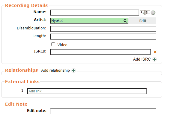
I am still puzzled. I can’t see on these examples where the begin and end dates are going to be displayed. My questions above about how to even find begin and end dates still stand. It seems to be a feature being bolted on without full thought.
Will the dates be displayed under the URLs? I guess the date will only display in those rare cases a date is known and nothing shown in the majority of cases?
Adding end dates is going to have to break normal rules of MB as we can only really say “website is not here today” and take a guess on an end date. We can’t be certain when it disappeared. Even the Wayback Machine is only going to show an old snapshot and not the end date. Puzzled to how the feature will work.
The questions are mainly to help kick the interface a bit more to help it come out fully formed. Thank you for doing a great job and listening to us awkward users
For clarification: this feature already exists, it’s just only available from URL edit pages such as this one. @jesus2099 for example uses it often. The idea is just to make it more easily available to use.
The sources can vary - if a big website closes there will usually be an announcement date. For a smaller website you can often figure the year out, at least, by checking archived versions on the Wayback Machine - if you see that there’s a page there at the start of 2020 but it’s gone at the end of 2020 then it’s fine to set 2020 as the end date
This bubble should either include or link to some documentation about URL dates, which we need to write
Very sorry. I have never seen that before. Which probably makes a good point that this needs to be more visible in the GUI. If it is already all done and decided I need to go away and not appear in the middle of a already decided discussion. Sorry.
Thank you also for the clarity as to the vagueness allowed in the values. I guess the display of the dates is also already worked out.
Sorry @yyoung , didn’t mean to disrupt something that is already decided. I’ll go away. Thank you for listening.
I blame my annoying clients not giving me enough work to do this month giving me too much time on the forum
No, I still value accessibility design, especially in such a large global database. But since I have little knowledge about that, it’ll take me some time to learn and refine the design.
In my opinion they should be displayed next to the type select, since they’re attributes at relationship level.
Yes I think so.
Yes, and I guess begin/end dates are more rarely used than the ended flag, but it make no sense to only add a checkbox for that instead of a form for all attributes, since it still introduce an extra click.
It sounds like an excellent addition to me, I would use it
(I have rarely bothered trying to set an ended date with the current UI)
Great work btw @yyoung, a lot of (clunky…) UI edits just get put through without coming through the forums at all! This may have been a painful process having to redo stuff here but the result is going to be so much more user friendly as a result
The URL input field (or edit box) was doing changes without notifying you. It was most often working correctly but happened to block editor from typing some characters, to make wrong changes, to become outdated after external websites made breaking changes to their URL patterns (which happens very frequently and usually takes weeks to get fixed).
No one feels the need of seeing the untouched URL you did paste and the automatically formatted URL separately, but everyone is reporting issues about URL Cleanup (400+ tickets created so far, many of them about this specific automated clean-up feature) that could be more effectively addressed if more insight was given to editors. That is the main motivation of this change which is just a prerequisite to further improvements. For example, it is also planned to allow bypassing the automated formatter when needed.
The input field is replaced with a clickable URL only after you started focusing on something else (either by clicking elsewhere or by hitting the TAB key). When hitting the edit button, the input field in the popover dialog is auto-focused, so it is not really more efforts than getting focus to the input field again.
That is right but it does not make as many changes to the content of the input field either. The inspiration for replacing input field with button and popover comes from the relationship editor which allows for more input capabilities and better visibility of actual changes.
Which site? @yyoung would probably be happy to include it into use cases/real examples.
One motivation of creating a popover (or bubble) dialog is to make room for additional features without damaging the navigation in the external links field set. So yes, it requires more key strokes, but it saves more of them given the advanced features to be added.
I have not been able to reproduce your test, because Amazon is autoselected in the drop down when I paste an Amazon link. Can you please provide the URL you pasted and the URL of the editing form?
Sorry about that but it is not possible to add the wanted features without redesigning the external links field set. I also got used to shift-tab and all sort of weird habits to go through the old UI that has its own issues. Some tasks will become more difficult for the ones, easier for the others. The new UI will most probably not be optimal at first but it will allow to expose the many improvements being made behind the scene. We didn’t rush the new UI either, we spent a fair amount of time on preventing the UI to require too many additional efforts from editors, still we don’t know about all workflows and needs and that is how your feedback is particularly useful.
It is not being redesigned for the fun of redesigning stuff or for some pretty pencils. It helps with exposing features that were not there before, it allows exposing future features too. One reason for presenting these changes with so little actual improvements (just showing changes to the URL for now) is to identify navigation issues as early as possible, given every editor may have a different workflow and needs.
Automated tests have been updated to make sure this change doesn’t break the seeding feature userscripts are based on at least.
Yes, external links field set is missing some features from relationship editor. Replacing URL input field with the submitted value will allow to implement the orange highlight for edited links like for relationships.
Thanks to everyone who spent time testing and giving valuable information in return. I read it all from the beginning as I’m mentoring @yyoung with his project, enabling me to also answer about important points that have been discussed during the development.
As a reminder, I did push mostly existing tickets about URL editing to the list of ideas for GSoC this year, which have been investigated by @yyoung to make his own proposal. It got reviewed and approved. The current roadmap is slightly different from the initial proposal as implementation details become more clear. The current UI change is relatively small compared to the rest of the expected tasks. More insight should be provided about the overall progress of this project soon.
I love this.
(still feel strange to have the “type” selector under the urlbox tho, seems it’ll take a lot of vertical screen estate. but I see that keyboard users prefer it.)
Updated UI layout is now available from beta website, it features both URL editing popover (MBS-11391) and grouping of edited URL relationships by external link (MBS-11680), and makes use of previously improved error messages (MBS-11698). Next improvements still in progress making use of this new layout are to support auto-select/cleanup/validation of more than one relationship type for external links (MBS-9902), to support adding URL relationship with begin and end dates (MBS-3774), and to support bypassing URL relationship validation (MBS-9040). More improvements to come in further releases.
When adding an existing URL again, this number is used as a position reference in error message to inform where the original URL can be found and where the second relationship will be added. This is particularly useful when there are so many external links that the whole field set don’t fit in the screen.
I just pasted this URL into the box and it acts the same as the current implementation and complains - bryancorbett.co.uk - a link WITHOUT any http, https or www. It is still valid, but gets rejected.
If it is typed with www. on the front it gets resolved. Would be good if that happens to other valid links like this one.
BIG plus… if this is pasted into the current live website it is a PITA to fix as my attempts to add the https:// on the front are thrwarted by the GUI auto-correction. Your new interface is much better as it does at least let me type up the front of the box.
Sorry, but I didn’t get the point, do you mean the new UI introduces a new bug or it fixes a current issue? BTW, I can’t reproduce the bug, could you be more specific?
AH - hang on… just tested something. It was PEBCAK. I was pasting text which had a bogus SPACE in front of the text. Whoops. My paste buffer was " bryancorbett.co.uk". A SPACE in front of the B.
Sorry. Though that could change to the request to remove white space from the text as part of validation… Told you I find imaginative ways to bork things
OK now I can reproduce it, it exists both on stable version and on beta, and it would be better to fix it, but I’m afraid we can’t be certain about whether to add ‘http’ or ‘https’.
I can’t really answer the http vs https thing. Just use the same as you do for www. addresses. Usually if you hit a website with http it will autodirect to the https. But https is now much more common. Toss a coin.
I hit things as a “dumb user” so just try and use things. Yes, I have experience of GUI design, but all the best GUIs handle unpredictable users.
I know I copy URLs from all kinds of places. Often off of a website, so various formatting characters will be in the buffer when I paste. Your new GUI is easier to clean up text as the current one keeps putting the cursor at the end of the edit box when it is auto-correcting.