Look at this lovely old copy of the Joni Mitchell Blue cover… (from discogs)
It’s well-used and weathered… It’s not perfect, but in many senses I’d like to be looking at this while listening to the album… Do we need a ‘weathered’ attribute?
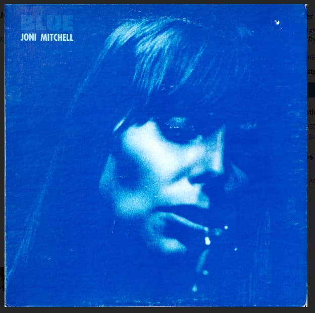
Look at this lovely old copy of the Joni Mitchell Blue cover… (from discogs)
It’s well-used and weathered… It’s not perfect, but in many senses I’d like to be looking at this while listening to the album… Do we need a ‘weathered’ attribute?
OR a “Photoshopped unto the edge of unreality” option… ![]()
Give me battered over artificial any day. There are plenty of other sites for touch-up repainted perfectionism. A well loved album looks good as well loved. (But a 600x600 image is too small for me…)
agreed…
there’s probably a weathering filter that can be applied… I know I have some for photos on my phone that turn my landscapes in oil paintings… (by constable or picasso ![]() )
)
yes, just an example…I have this album in vinyl and as a cd… when I’m listening to the flac from the cd, in my mind I’m listening to the vinyl…
Nope because then we may end up with 100 variations of one cover in various states of disrepair, and then people may ask “i want one for water damage” or “I want one for torn”. Use the free text field to state condition (if you so desire); however don’t be surprised if another editor comes along and replaces your scan that is in poor condition with one that is better condition.
I don’t think @dpr was serious. Sorry, we should probably have started a new thread in General Chatter…
I was half serious, but @sound.and.vision is probably right…
obligatory @webuywhitealbums link
apologies - i’ll put my silly hat back on 
I’m actually in favour of a weathered/damaged attribute, the same as how we have one for watermarks.
I don’t see anything wrong with a weathered attribute, it may need a guideline to go with it to clarify that they should be replaced with cleaner versions (?), as the attribute could be seen as ‘legitimizing’ them as separate covers. Which could also be cool… but probably not in MBs wheelhouse 
The UI could probably separate out some of these secondary ‘condition’ types if more were added, as well.
why not just have a grading system against the cover art, like we have for overall data quality?
I don’t see the point of a grading system. Better quality artwork already replaces the bad artwork. Artwork has its own natural grading system.
You only have to look at how weird the release grading system is. Release grading is just a personal opinion by one editor. I see a lot of releases with 600x600 artwork and no copyright relationships marked as “high”. Or old pre-NGS rating still in place on a release that is now clearly borderline.
Every editor has a different opinion on a “complete” release. It would be the same on the artwork. There are better places to spend the precious developer hours.
I’m not in favour of it. It was a fun idea, but I think there’s already enough to do on the artwork area for each release:
With a good / great quality scan, it should be
easy to run it through a filter and create a coffee stained, weathered cover
Agreed
Random but related open question: What’s the level of hate for digital fake ‘weathered’ covers ![]()
Or do people find them charming?
Like this one (initially shared by @UltimateRiff in Discord)
I don’t dislike the fakes, they are amusing…I much prefer the covers that are genuine. Sort of like jeans that have torn knees you can buy. My jeans have worn though use and working in the house or garden
Would be a fun feature if your media player would show cover art with different artificial wear depending on the age of the release  I think I’d love such a feature, as long as it would not manipulate the original files but just apply it for display.
I’d love it too. I don’t have a media player that will even display the back or the booklet… what do you use?
I’m a ‘pristine as possible’ cover art person, myself. If the publishing label produces a cover with a weathered look, that’s the way I want it represented. If I’m scanning a cover that has natural wear, I’ll generally try to clean it up.
This wouldn’t be hard to do from a visual standpoint, transparent PNG’s with wear and tear get overlaid based on the year tag.
Shame MeB doesn’t make a player ![]()
I don’t mean when a user wants to show off their Photoshop skills by making a good quality scan look worse by adding a coffee stain or whatever to it. I mean when the actual thing being scanned is in a poor condition and a good quality scan of it will still look terrible, like @UltimateRiff’s White Albums example.