I was just adding a release and I had a thought - this interface is the wrong way around:
You want to give people the least amount of clicks for common tasks, and put anything of less interest behind an extra click (if you have to). Anything over 5 items is probably a bit long for a clickable list and you might have to go to a drop-down.
On both counts is this the wrong way around?
Note: I’m not really fussed/this isn’t a suggestion. I believe a UX overhaul is coming to MB once everything’s being converted to react (?). I just thought it might be interesting to share and see if anyone else has had similar interesting thoughts on stuff. This one has been staring me in the face for years and I only just noticed…
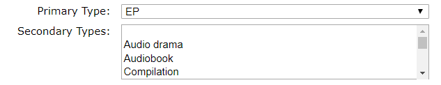
The idea behind it is that primary type is only one, but secondary types can be many. So one dropdown wouldn’t work for that. That said, it might make sense to have multiple dropdowns, like with work attributes, where you select one and have a button for “add more secondary types”…
There aren’t that many options here. I’m curious what the benefit of a drop down is vs radio button or check box, where it would be easier to see and clear that you could pick one of the first and many of the second.
Hehe, I totally forgot about the multi-selection on the second one…
A scroll bar that doesn’t have any radio buttons but is actually multi-selection as long as you know to press shift (edit: no, ctrl?) is it’s own special variation
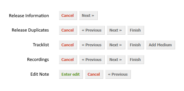
One more thing. I’ve always found it weird how the buttons are sorted in release editor’s last tab.
Edit: Hmm. At least it’s hard to accidentally enter an edit… Unless you meant to cancel it!
Edit2: Greyed out “previous” and “next” buttons on the first and last tab could also give some consistency. Like this:
Edit3: Ctrl+Enter could be added as an official shortcut for entering an edit. That would ease mouseless editing. Ctrl+Enter is currently in use for that purpose by some userscripts at least.
Edit4: I agree with Navap that it’s an unreasonable expectation that one tab press from the edit note box should get you to the submit button. At the same time, it would be nice ofc giving an alternative shortcut for those who are used to the one-tab-and-enter way of doing it.