Picard 2.5 used to have sorting in the right panel by these symbols: modified album


When we add a directory to Picard again, the changed albums will be at the top of the list.
Can this be restored?
Picard 2.5 used to have sorting in the right panel by these symbols: modified album
When we add a directory to Picard again, the changed albums will be at the top of the list.
Can this be restored?
I don’t think this was ever a Picard feature?
Because there’s a outstanding ticket for it to be added here:
There was such a possibility.
It wasn’t a dream. ![]()
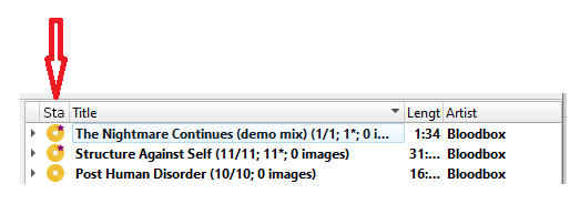
There is a screenshot in this ticket that shows that there was a “Sta” tab, probably Status, and currently there is nothing in this column.
No, that actually did no exist, hence the ticket. Where did you get the info from that this existed in Picard 2.5?
The screenshot you shared is actually the mockup proposed by @aerozol exactly on the ticket ![]()
haha OK.
From my memory.
It was around 2020, I don’t know exactly which version of Picard was back then.
@outsidecontext why is this difficult to implement?
Need to complete the tickets on creating the 36hour day and 8 day week first…
You tell us, as you have not implemented it yet either ¯_(ツ)_/¯
If that was aimed at me - I’m not trolling at all.
MetaBrainz projects are free and open-source, and @outsidecontext does all of his contributions in his free time, alongside his job and family.
You and him are literally on equal standing when it comes to having to answer to demands for features.
@aerozol you don’t have to explain/defend @outsidecontext.
My question about the difficulty was innocent.
I don’t demand anything and I don’t rush anything.
I asked out of pure curiosity. ![]()
Actually let me give you two answers to this. First about the actual issue: Displaying some kind of column with icon is probably not too difficult if you don’t care about how it looks like. However, having this look good is actually not that easy. The reason for this is how the Qt list view work. In general they allow you to show text labels in the cells, and you can optionally also show an icon. That is what the title column is doing. Now the text is not really optional. You can keep it empty, but still the icon will be on the left with some space to the right. It really looks and feels off and unfinished.
One way around this is to have the application render the content of the cell itself. That way you can place arbitrary graphical content there. That is what we did for the AcoustID fingerprint column. However, this has some not unsignificant performance impact on rendering the list. I tried to make this as fast as possible for the AcoustID column, but it still is slow. I wouldn’t want an additional column like this, most certainly not one that is as essential as the status icon.
Another thing is the header label. If you show a full label like “Status” the column by default gets significantly wider than in the screenshot. Depending on translation maybe even quite significantly. Abbreviating it again does likely not work well with translations and also makes it unclear. Without further knowledge I wouldn’t know what “Sta” is. I’d probably opt for not showing a text label at all in the header and instead only add a tooltip and accessibility label.
There are other possible solutions (all with their own pros and cons):
My second answer is about the general implication that if something is not yet done it is difficult, and the resulting opposite assumption that if it is easy it should have been done already.
First something being easy does not mean it is free to do. Even a pretty simple bugfix (unless it is absolutely trivial like a typo) quickly takes one or two hours to deal with. The problem reported has to be understood, reproduced, the code changed, test written or at least tested (depending on the change on multiple platforms), code reviewed, and feedback given. And that is for a simple case. Especially bug fixing often is much more time consuming.
We don’t have many contributors to Picard. Most of the changes currently are done by me, zas and rdswift. My time available varies. A lot of this gets used by evaluating tickets, answering forum posts, trying to reproduce reported issues, fixing bugs and doing general maintenance for Picard like updating the build system, managing translations etc.
Furthermore things often are not as easy as they look like from the surface. Every option, every feature we add has both a maintenance cost and increases complexity for the user. Picard already has plenty of options that interact with each other, which makes it easy to break functionality on updates. Added options can have side effects or interact strangely with others (take for example the cover art options “always use the primary image type as file name” and the text field for the image file name).
Once an option is added it is difficult to take it back. There will be those who use it.
We of course could start going a more experimental route, add everything someone proposes quick and dirty, if it does not work remove it again and expect users to deal with that.
But I think Picard has a pretty good track record of staying consistent and only seldom break existing functionality if it is really needed (and when it did the impact was rather limited).
I’ll just post this here instead of opening a separate thread.
Would like to say thank you for Picard and Musicbrainz it is always a pleasure to use but also to contribute metadata.
The only “Problem” i have is that if you have a collection of more than X releases and maybe one or two who have upstream metadata changes.
Right now you have to scroll over the whole collection in picard to find the one with red dot and apply.
I know i could just save all my files again but then i missed what changed and unable to review.
I would love to have this option as well. I want to filter out all the albums that are already sorted, and just show the ones which have pending changes.
Related: How to select only files in right pane with changes