Greetings, Everyone!
We have recently been making a few changes to the UX of the MusicBrainz Android App and would love to hear your thoughts on it.
Here are a few snippets of the changes made:
Please find the video demo at
https://drive.google.com/file/d/1I2hOSxvucY-L6z43aCkXwygGUVHe0ylU/view?usp=sharing
If you like the design, do give it a thumbs up and if you have any suggestions to be added or modified, do let us know here.
Thank you!
4 Likes
Are these changes pushed to the app on the play store yet?
Not yet, we are looking for confirmation from everyone if they find them alright 
Probably will be released soon on the playstore if everyone’s fine with it.
cool - couple of points after watching the video
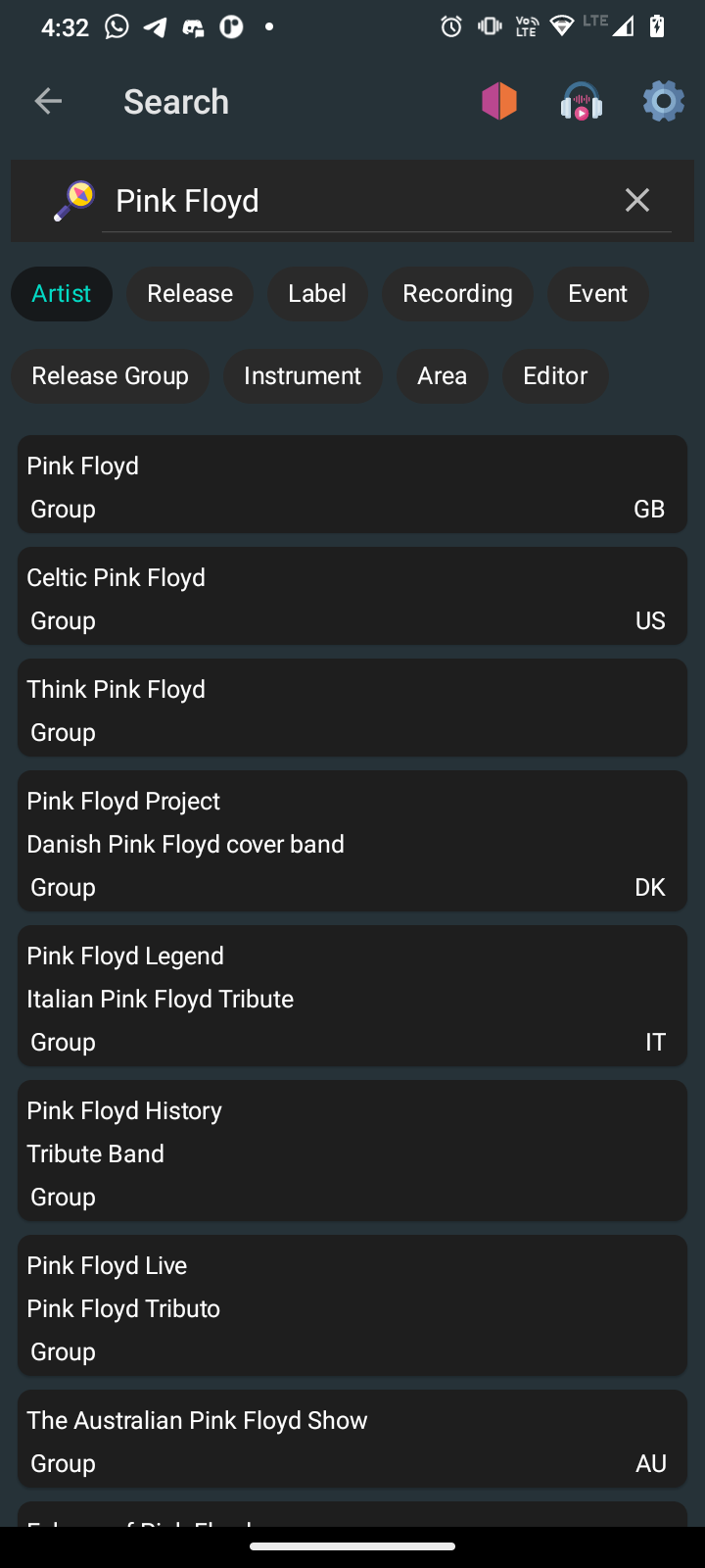
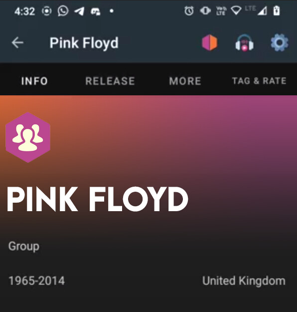
is there a reason why a Blink 182 band animation shows up under the info page when you go to Pink Floyd?
On the artist page, shouldn’t it read Releases instead of just a singular Release in the top menu?
Will Bio fill with linked the wikidata entry?
Have any improvements been made to the release pages themselves? If so can we see?
1 Like
At first we were trying really hard to be able to display the artist/band pictures there using the Wikipedia api. However due to copyright issues that we might face, we decided to scrap that idea and just show two different animations there, one for a group and the other for a person.
The Releases point makes sense and we might adapt to that.
The bio is fetched from the Wikipedia api.
Sure! The improvements have been made to the releases display and are available in the playstore in the latest release there of 2.2.9
Thank you!
1 Like
Cool no worries - but still the animation for “band” is very clearly Blink-182 (it even has a logo 182 on Travis’ drum set!) which might still edge into the realms of legal problems.
I thought that all photographs on wikipedia are part of the Wikimedia Commons and are thus covered under their license options: Commons:Reusing content outside Wikimedia - Wikimedia Commons
1 Like
I understand the point you make. If you could suggest an animation from lottiefiles.com which would suit a band, I would be happy to change it. 
Checkout IRC Logs for #metabrainz | MetaBrainz Chatlogs ,
you might have to scroll a bit up or down to get the conversation I had with the team regarding the image licensing!
I can’t find a suitable replacement, the website keeps forcing me to sign up which I don’t really want to do  .
.
I see, copyright is a real shame and makes things a lot more difficult than they really need to be.
1 Like
Looks nice
Regarding comments:
- The icon for Adding Label looks like the one used by applications for “Tags”. Considering how it it uses on MBz it could be more user friendly to have a picture symbolizing companies or kind of anonymized imprint
- Add Release Group icon show only one disc whereas this item is normally a group of multiple discs, icon could symbolize it by showing multiple discs (Ex: 4). Then potentially the current icon could be use for “Add Release”.
PS: Those are “Nice to have” comments, nothing to prevent a release on the store
4 Likes
Sorry to come back to the image again, but why is so much of the screen taken up with a random pic? I thought it might be a ‘loading’ animation, but the comments here indicate that it just sits at the top?
If so, based off the vid, just get rid of it 
2 Likes
I do have to kinda agree, certainly as I couldn’t easily find an animation of a band that wasn’t the one that is quite clearly Blink-182. I think it’d be fine for it to just show the linked wikidata entry
1 Like
Thanks a lot @ulugabi ! I will take this into consideration and make the relevant changes.
1 Like
Getting rid of it would make the page look dull with just text.
Thanks for the opinion though!
2 Likes
Do you suggest we merge the releases slide and the wiki data so that it looks neat and serves the purpose as well?
1 Like
If you want to have more visuals and less text, how about using country flag icons instead of the two-letter country codes? I think this would look neat in the artist search view.
2 Likes
This I agree with. I would want to use the app for information and not loose 50% of the screen to an animation that will get very annoying very quickly. If it was a band image I could understand but the same childish image every time I did a lookup would make me abandon the app very quickly.
As a privacy person I would also be keen to know what type of data is being collected by the app. Any diagnostics of usage patterns?
Also second Kellnerd suggestion about flags instead of country codes.
2 Likes
This sounds interesting. I’ll have a word with the team regarding this.
Thank you!
1 Like
The point you make is completely valid and I agree with it. Now that everyone is mentioning it precisely, I think we will make the relevant changes.
Thank you!
Definitely worth leaving some space and putting in some imagery!
I’m happy to supply mockups if it’s ever helpful. This is what first came to mind:
I wouldn’t even put in the icon since there’s the text that says ‘group’, empty space is always nice. But if there is an image I would use the icons that MB already has to distinguish between groups and people.
6 Likes