I don’t know if this is still a work in progress, but I just happened to take another look. I have two observations:
- I remain steadfast in my absolute hatred for images scrolling across the screen as soon as I land on it. I mean, my eyes glow red, steam starts blasting from my ears, the plants on my desk wilt, and Wile E. Coyote finally catches the Roadrunner. I have already created a Stylus style that will hide this carousel:
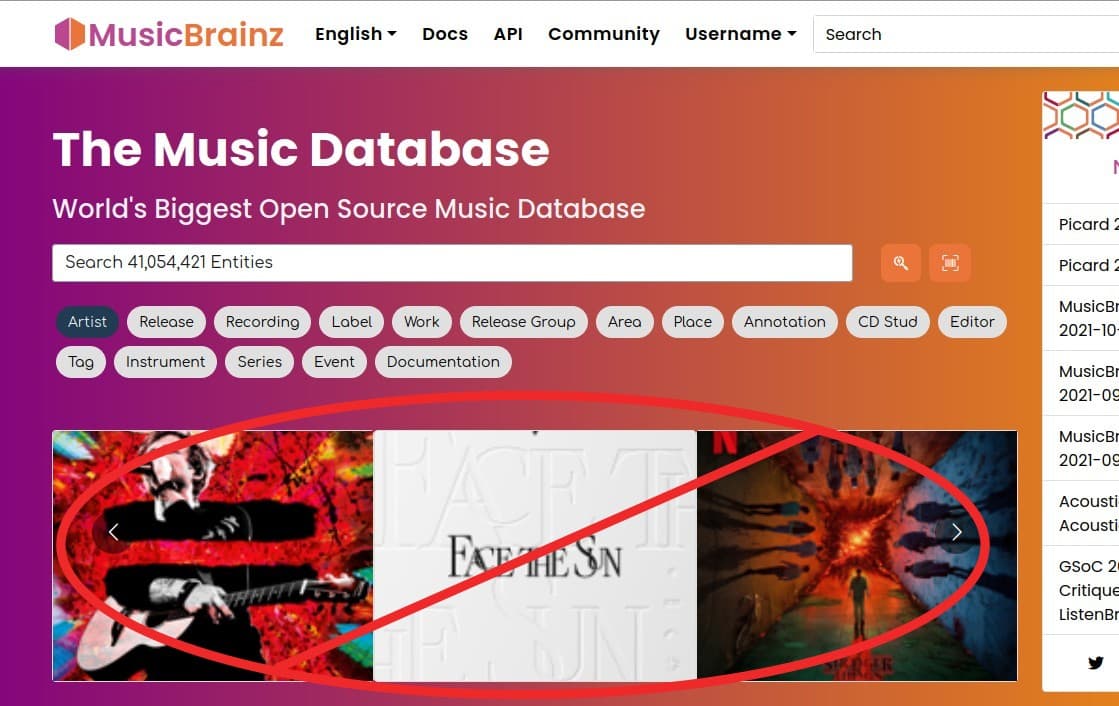
- I happened to click on Username > Profile, which shows a sample profile. Then I clicked on the MusicBrainz logo at the top left, which returns to the home page. But the home page now looks like this (the carousel is hidden due to my Stylus style):
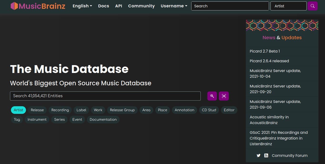
Now that is a dark theme that I would love to see made available. Refreshing the page right now returns it to the bright white. I don’t know if any of that is intentional, but I’d sure like to see that theme available, if this page is ever incorporated into the main website.

