I am opening this topic for a general discussion on visualization of MusicBrainz data, a topic I know a lot of people are interested about.
A bit of context
In April I had a discussion with @rob and @quesito about data visualization using the MusicBrainz database.
The discussion revolved mainly around one fact (MusicBrainz has a huge and rich database, and we should advertise it more) and two questions:
what kind of visualizations can we do (and show) with the data we have?
how can we help our users make their own visualizations and use our data in new ways? can we lower the entry barrier for them, if they don’t know about programming/database/etc?
Visualization examples
For the first point I did some proof of concept on my side, using Python + Jupyter notebook + various Python/JS plotting libraries on my local copy of the database (Jupyter notebooks are like HTML documents where you can mix code, documentation and graphs; people can download these files and run them locally or modify them easily).
The code is available on a git repository (on bitbucket and github). The first results (mainly about classical music) can be seen on github.io if you don’t want to download the repository.
NB: I didn’t try to make things particularly good-looking, I wanted to show different examples of data to extract and display. This is still work in progress and I have other ideas…
Building an infrastructure for data visualization
In April we discussed about the possibility of publicly hosting this kind of notebooks on a server, so that MusicBrainz users could write their own visualization examples without the need to install a local copy of the database.
As a first step I used the existing Docker setup for MusicBrainz to add a Python/Jupyter notebook server connected to the database (see for example this page). You can find the docker configuration on musicbrainz-docker.
If people are interested, we should look at the feasibility of having this kind of container (with the proper security and multi-user capacity) hosted directly by MetaBrainz.
What’s next?
Dear MusicBrainz users: it’s your turn
I’d be happy to have some feedback:
does that look interesting/useful to you?
What would you like to see? Do you have other ideas for visualization?
Would you like some of those to be added on MusicBrainz web pages? (that was also one of my personal goals here, I’d like to see work/artist timelines on their overview page)
Would you be interested in having access to a sandbox to play with the data yourself?
How can we extend this ideas to LB/AB/etc.?
And of course feel free to use the ideas/setup above. Share your results here! I’ll try to post some screenshots later (but nothing as cool as the mockups @quesito showed some time ago)
I would love a sandbox to play with the data @loujin!
I think this would be incredibly useful and interesting, as well as positive for the foundation. Giving visual representation to the data, imho would really bring our data to life. It would be great to add these as interactive pieces for people to understand the data more as well as static pieces to share via social media, etc.
I am (still) just starting this data visualization journey, I am learning D3js
I am able to create shapes from data and manipulate them…but I have a lot more to learn!!!
im interrested also.
i’ve been busy trying to visualize event data.
(mainly festivals)
ive just been using javascript.
but i’m very interrested in other visualisations
here are some ideas that i have:
a sort of time table like view with the members of a band, and it what OTHER bands they played in (i have made a proof of concept you can see via Music Brainz
i would also like to see the other bands that the bandmembers are in, in the neighboorhood visualisation.
automatically generated festival views, that also highlight liked artists
automatically generated Listen brainz radio playlist that only include artist that play on a certain event
automatically generated Listen Brainz radio playlist that only include artists the user likes that play on a certain event they are about to attened to.
I have worked on a few visualisations using MusicBrainz. It has been quite exciting to unlock the potential of this data. The following are the ones that I have tried up until now. I am planning to dive deeper into this if we can work together.
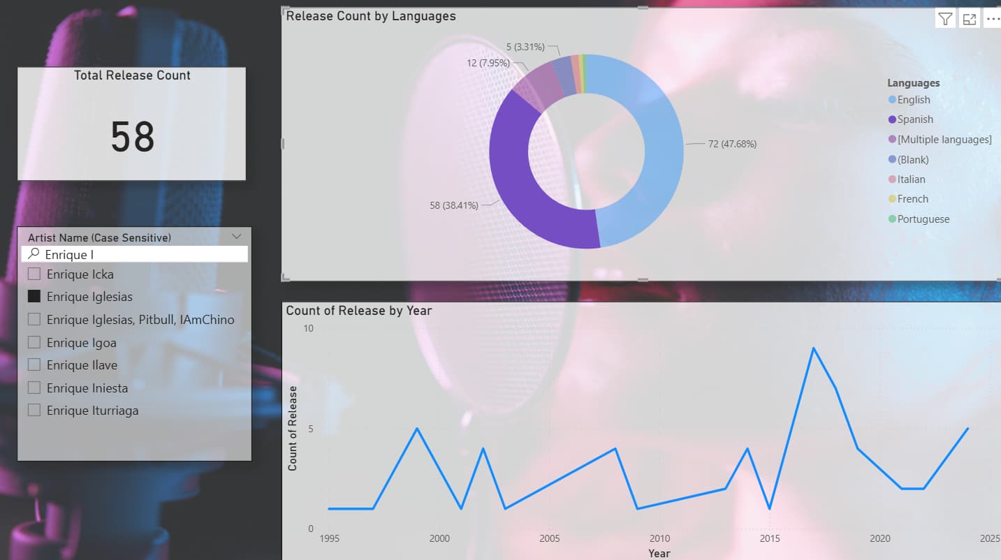
DV1 (Artist Release Trend): Displays an artist’s release count by year, languages used, and total releases. Interactive visuals provide insights into career start, activity levels, and language distribution.
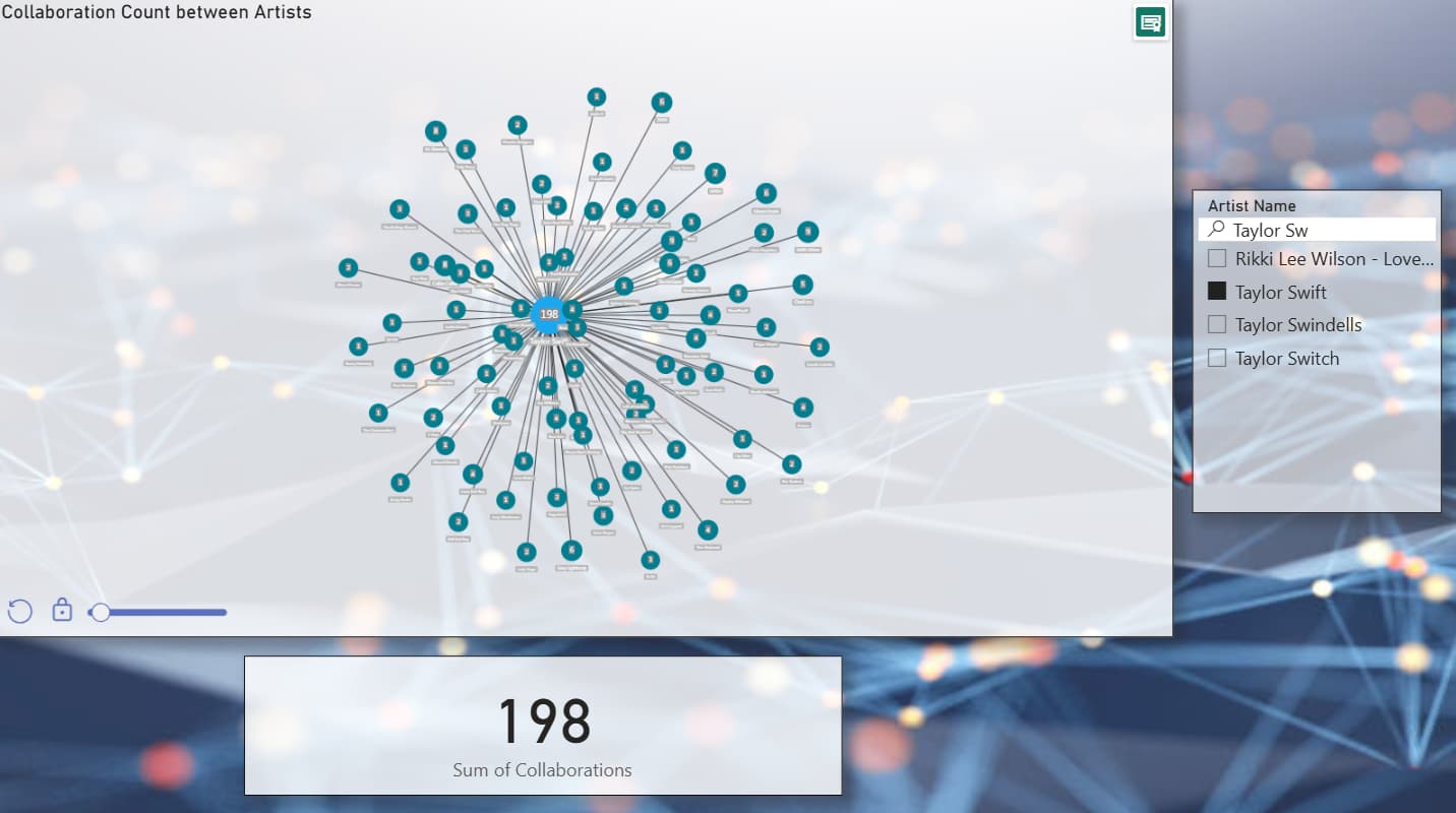
DV2 (Collaborative Network): Shows an artist’s collaboration network with others, including the frequency of each collaboration. Allows filtering to focus on highly frequent collaborations
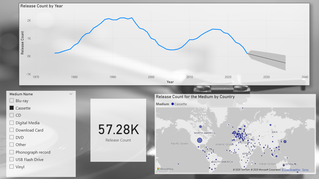
DV3 (Medium of Release Trends): Analyzes trends in the medium of release the past years, with forecasts for the next decade. A heatmap shows geographical medium preferences and the number of releases by country.
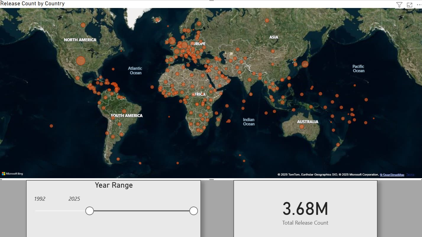
DV4 (Geographical Release Heatmap): Visualizes global music releases, with a heatmap showing release distribution across countries. Adjusts based on a timeline filter and highlights even the smallest countries with bubble size and tooltips.