And a problem when submitting no changes:
I added some early mockups to the ticket, have a look and let us know if any of this would solve the problem. Or if I’m missing the mark.
1 Like
Looks pretty good, I personally currently prefer the ones where the difference is more obvious: different background in 4 & 5 and the lines in 7 & 8 (all of these also works best when zoomed out). It also looks a bit weird that the headline “performance” and the selectable “arranged/arranger” currently is on the same level. You’ve also highlighted how bad the indentation currently is, so increasing that is a minimum imo if you decide to do any changes, because it really helps a lot when distinguishing between the different options. Increasing the indentation + make sure that the headlines are not on the same level as selectable options might be the way forward? “Bold” is afaict now used to show the selected item, which I like because it matches how the relationships are shown after the pop-up window is closed, but this also means that it probably is not a good idea to make the headline “bold”. I also have no idea if you plan to introduce more colours here in the upcoming redesign, which could be an additional option to somehow make the distinction a bit clearer.
1 Like
Some lines are headlines and selectable, so this isn’t a clear difference imo. I wouldn’t want some headlines to look really different when I’m scanning the page looking for groupings/headlines. Does that make sense?
I also thought more indentation seems a pretty clear way to improve this in general.
Oh, I didn’t realise that the real problem is that headlines can be selected. I guess this is similar to the old “guitar family” and “membranophone” problem then. It really only becomes a problem in edge cases like this where you have something that should be both noticeable (headline) and not be noticeable (can’t be selected) at the same time, which obviously is not optimal.
Increasing the indentation makes the difference much clearer, but there will be an inconsistency which means that some headlines are harder to spot than others. You went with only light-grey for “can’t be selected” which makes sense because that’s how most websites does it. In the old MB rel editor you combine light-grey text with a dark-grey background. Replicating the old MB css style (which also have bigger indentation) OR adding a new headline to “arranged/arranger” (all of the other selectable items are already on level 2) plus new unique css to the headlines, seems like the two best solutions to me.
1 Like
Basically, there’s no such thing as a headline, in concept, right now. There’s “relationships that can be selected” (black) and “relationships that cannot be selected and are only used for grouping others” (grey), but they all live in the same tree. For example some entity combos (like artist-event) have a lot of top-level selectable relationships plus one used for grouping, and some (like event-recording) don’t have any grouping types at all. So, it’s kinda weird and it’s hard to decide “this is a heading but this is not” ![]()
1 Like
This is now out, thanks for all your help! That said, if some of you who weren’t usually using beta keep using it in the future, it will surely help us find more issues with our changes before they get released to everyone, so we’re thankful to anyone who decides to stick around as a beta tester ![]()
5 Likes
It looks like a feature regression slipped through. IIRC previously it was possible to expand dates on relationships by adding them anew.
Edit by @yvanzo: now tracked as [MBS-12966] Regression: Specifying an attribute to a relationship duplicates it - MetaBrainz JIRA
Yes, my edit there. I commented on that earlier in this thread. Quite annoying, especially since batch-helping scripts no longer works.
One thought after using the editor a bit: Would it make sense to hide the “These relationships have a specific ordering” checkbox on relationships that don’t actually have more than one value? In the common case of a single recording being linked to a single work this checkbox takes up space and the unconditional plural is a bit confusing.
Edit by @yvanzo: now tracked as [MBS-12967] Hide the ordering checkbox under lone relationships - MetaBrainz JIRA
3 Likes
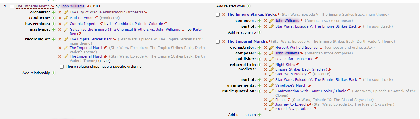
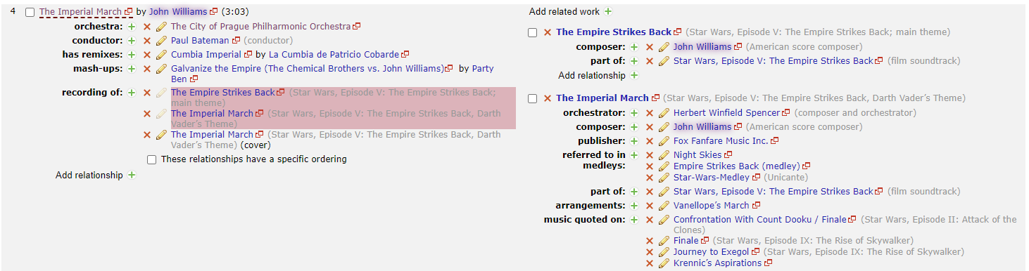
This is a mess left after a merge.
On the left we see Imperial March is added twice. But this is now not shown on the right. I can’t see any mention of (cover) like in the past.
Imperial March should appear twice on the right in this image.
The release in question: https://musicbrainz.org/release/3e68c7c1-4a01-43c2-a14a-7f72fae2abd8
(I have now added edits to clean this up… so the error will not show next week…)
Edit by @yvanzo: Now tracked as [MBS-12968] Regression: Release relationship editor's “Related Works” column is missing recording's attributes - MetaBrainz JIRA
Also, when I do mark the works to delete, this is not being shown on the right hand side
By seeing all the duplicated errors on the right hand column it makes it easy to clean up messes caused by merges. Not seeing this make duplicated work errors very hard to spot. I assume this is an unintentional regression?
Edit by @yvanzo: Now tracked as [MBS-12969] Recording relationships are not shown as deleted in the "Related Works" column - MetaBrainz JIRA
1 Like
Yes to that 2 remarks.
And actually, the right-hand side no longer really shows the recording-work relationships.
It is now more a list of works that appear on the recordings.
Slightly off topic
I used to be able to mass apply recording dates on several recording-work relationships but, now, on a release with studio and live recordings of the same works, I can no longer mass set dates on live recording-work relationships only, or even not at all.
But it was a feature from a userscript, so it doesn’t count much.
Maybe I will find a way with the new layout.
1 Like
I find it quite a large regression as now it is hard to see dates, cover, live etc. This was very useful in the past to allow quickly seeing when duplicate works are attached and fixing the issue. And the Dates feature you mention was really useful for concerts. I hope this comes back.
Maybe I do too much editing “tidying up” artists \ releases. This change makes it hard to quickly fix a multi-disk release as you can’t see the errors now.
2 Likes
@bitmap paid a particular attention at keeping support for userscripts during the beta period, with the noticeable help of @kellnerd. If your script is broken, it is likely it can still be adapted to work with the new implementation. If that is not the case, please open a ticket or get in touch with them on IRC.
2 Likes
For what it’s worth, it’s not a bug that it only shows once: it’s intended, because the right just shows “works related to this recording and info for them” now, while the left shows, among other things, “way this recording is related to said works”.
2 Likes
This thread is largely off-topic since the beta version discussed here has been released.
All regressions and improvement requests posted in this thread after that are now tracked as tickets; See links added in the posts. So I’m closing this thread now.
Please consider adding a ticket directly (with open registration/login using MusicBrainz account) to report further issues, as structured information is much better for issue tracking.
2 Likes