First, a quick background: I entered two releases for something. They are mostly the same. The main difference is the media: one CD, and the other digital. There are other details, such as slightly different track lengths and audio formats, as well as other little things. But the most prominent ones, namely the title and the artist, are identical. In order to be able to distinguish these easily, I added disambiguation comments for the media.
Recently, however, someone removed those comments. When I asked why, they said the comments are redundant. I pointed out that without disambiguation, there are places where it’s difficult to tell these apart, for instance when entering a relationship or in search results. The other person blamed this on an interface shortcoming, and claimed that disambiguation is only appropriate “when all displayed data fields are same or similar enough to be confused”. Finally, I argued that the documentation only makes an issue of identical names. You can see the whole discussion in edit #62966473.
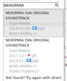
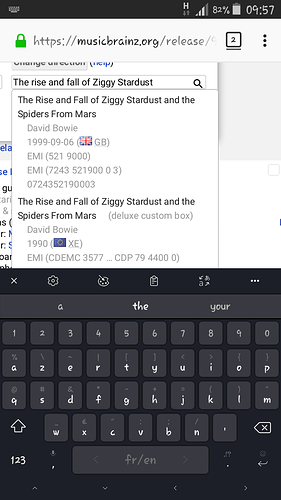
So, I want to ask, what is appropriate in a case like this? I know there have been similar discussions along these lines, but my main concern is to do with ease of editing. The below picture shows the popup with the two relevant releases. Can you tell just from this which is which?

I can, but only because of the different release event details that I entered myself, and one has a barcode. To others, it probably won’t be so obvious.
Edit histories show even less information: just the title and artist. There may be other places where this is a problem, too, but these are the ones I’ve noticed.
IMO, disambigs are a simple solution for cases like this. Alternatively, as the other suggested, the interface could be enhanced to show media in such lists. What do you all think?

