Well, that’s the question I was asking—I can either upload images in sRGB (after conversion) or upload them in the scanner’s native color space w/ an attached profile (so whatever is displaying them can do the conversion). (But as noted, for some reason the browsers aren’t doing so—even though they’re supposed to.)
You should definitely convert them to sRGB.
But the important question is: How do the images come out of your scanner? Not color managed at all? With the scanner’s profile? Or with a different profile?
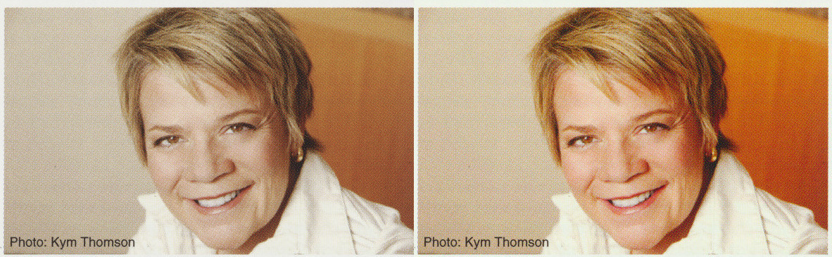
In my opinion, the left sample image looks slightly better. It’s a bit undersaturated, but the colors seem to be more neutral. The shadows have a red hue in the one on the right.
Indeed. GIMP doesn’t work right when I try to work in the scanner’s color space. Or at least, it works weirdly.
I’ve had problems with color management in GIMP before. For some reason my images look overly saturated when I set the monitor space correctly. Maybe it’s just buggy?
… that was the point, to show how different they look.
Yeah. But there’s a big difference between assigning a profile and converting to a profile and I hope you understand this difference.
pp. 2–3 is a page of black & white text. The clipped whites (and blacks too, actually) are on purpose.
Sorry to say, but it doesn’t look all that good.
You could either clip the highlights all the way until the background is white or don’t clip them at all - In this case I think the latter may be preferable as you can’t clip the other page’s backgrounds to white without messing up the photos. Not clipping them would keep the look consistent over all pages.
No, I don’t have any sharpening enabled. The cover was done at 1200 + an FFT-based descreen + downscaled. The others were just done at 300, I believe. Could you point out which nasty moiré pattern you’re seeing? I don’t notice it (at least at full-size).
Ah, right. I can see some slight descreening artefacts on the cover. You didn’t manage to get rid of the screen pattern completly (don’t worry about that - FFT descreening in GIMP sure has its limitations), but it looks much better than the Marin Alsop photo on page 4, which is the one with the nasty moire.
You’ll probably get a much smoother image just by scanning at a higher resolutioin and then downscaling manually.
Interestingly, I can’t seem to produce a moiré like this with my scanner. Maybe it scans at a higher resolution and then downsamples internally… 
Oh, that’s a good idea! I’ll have to give it a try, at least where it’s possible. Could be hard on the books as I’m not un-binding them. (Now, to go get a sheet of construction paper…)
Best Euro you’ll ever spend!