Thanks for the feedback, quick people!
I’ll give it a bit more time before I integrate it into a version 2.2, but I wanted to discuss some of the points that have been brought up. If you read my thinking and think ’no, I still think that’s dumb’, don’t hold back and let me know ![]()
Can you clarify what you mean?
If anyone missed it, my mockup has a more prominent ‘Official releases only’ button at the top now (I personally also use the “?all=1” script)
I have just thrown in everything I would wish to see, without consideration for database calls/loading times. Another reason to not get too attached. Let’s shoot for the stars for now!
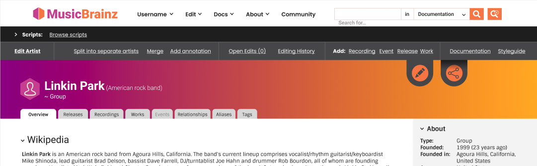
This is a big change that I expect to get a lot of feedback on (@ApeKattQuest_MonkeyPython also expressed dismay), but after spending some time with it I am a big fan. All editing tools are in that top bar. No need to check sidebars or tabs, it’s always in the same place, for all page types. A new editor shouldn’t have trouble finding any editor tools, as that’s where it will be.
Where a big ‘edit’ button isn’t in that section it’s more or less to entice a new user to get editing/sign up.
The Figma page has a mockup with the edit tab expanded, but I forgot that it’s not shown here. Here are your missing edit functions, with space for more without getting in the way of anything else. Dream scripts section included for now:
(more feedback welcome)
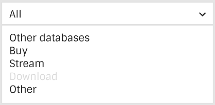
Maybe a filter would be useful (just some quick example categories in this pic)
These are my small concession to new users, most other things have been kept fairly functional and compact (at least I think so?)
‘Edit’ and ‘Share’ I’ve picked out as high value buttons for a more casual user to be drawn to. I can change them but I would really like at least an ‘edit’ button stand out in a pretty big way, at least if you’re not logged in ![]()
imo ideally we experienced users can live with a bit of empty space and some big buttons in that little top right corner, we own the rest : P
In a design/UI terms this kind of button is a ‘call to action’. Basically, it gets really high engagement from users, because they can click on something that performs an immediate and clear action. I don’t think this kind of thing is needed by the ‘core’ MB userbase, but for new visitors who aren’t interested in editing MB, but are interested in writing reviews, I think it will make a difference in whether some join in or not.
Yet another concession to the more casual user - I expect we’ll be going back and forth a bit on that stuff before we find a middle ground.
Collapsable is already in there (arrows next to the main types).
I don’t know about re-shuffling but it could be integrated into customize columns (perhaps renamed to ‘customize view’ or something like that)