Artist Page Redesign

Table rows would become less compact (I like compacity), but maybe it would be great to have those release group front covers showing up on artist page, like on Discogs (50px images)?

1 Like

Isn’t that already in the mockup? Or do you mean something a bit different

1 Like

I propose some UI tweaks I have cobbled together that help use existing space for better display of information.

I’ll introduce cover art next when I have time.

The Discover section is moved to the bottom and is visually enticing, similar to Last.FM’s like so:

1 Like

finally looking at the v1.4 version on my desktop, one thing is pretty clear. the design feels a bit too big. for reference, my resolution is 1920×1200. looking at it filling a maximized window, I can’t really see anything but the Wikipedia blurb and a couple albums:

making it a touch smaller would make the page more usable, like so:

maybe this is planned, and just not really shown well in the mockups, but I thought it was worth bringing up~ in fact, comparing the mockup to ListenBrainz’s current design, I imagine the side margins could be the same as there


I also like the idea of making the Discover section larger and part of the main column (especially if we can get artist pictures back somehow?)


also, adding (or rather keeping) pagination at the bottom of the page is a must in my opinion, like we currently have


one thing that looking at artist pages has brought to mind is adding an option for viewing discographies as an album grid, like how Discogs, Spotify, and most other music services do.

2 Likes

I would caution against too much customizability in the design. With each option you add, the number of combinations you have to consider in design and implementation increases exponentially, eventually leading to broken configurations.

2 Likes

UI Tweaks With Cover Scan Integration

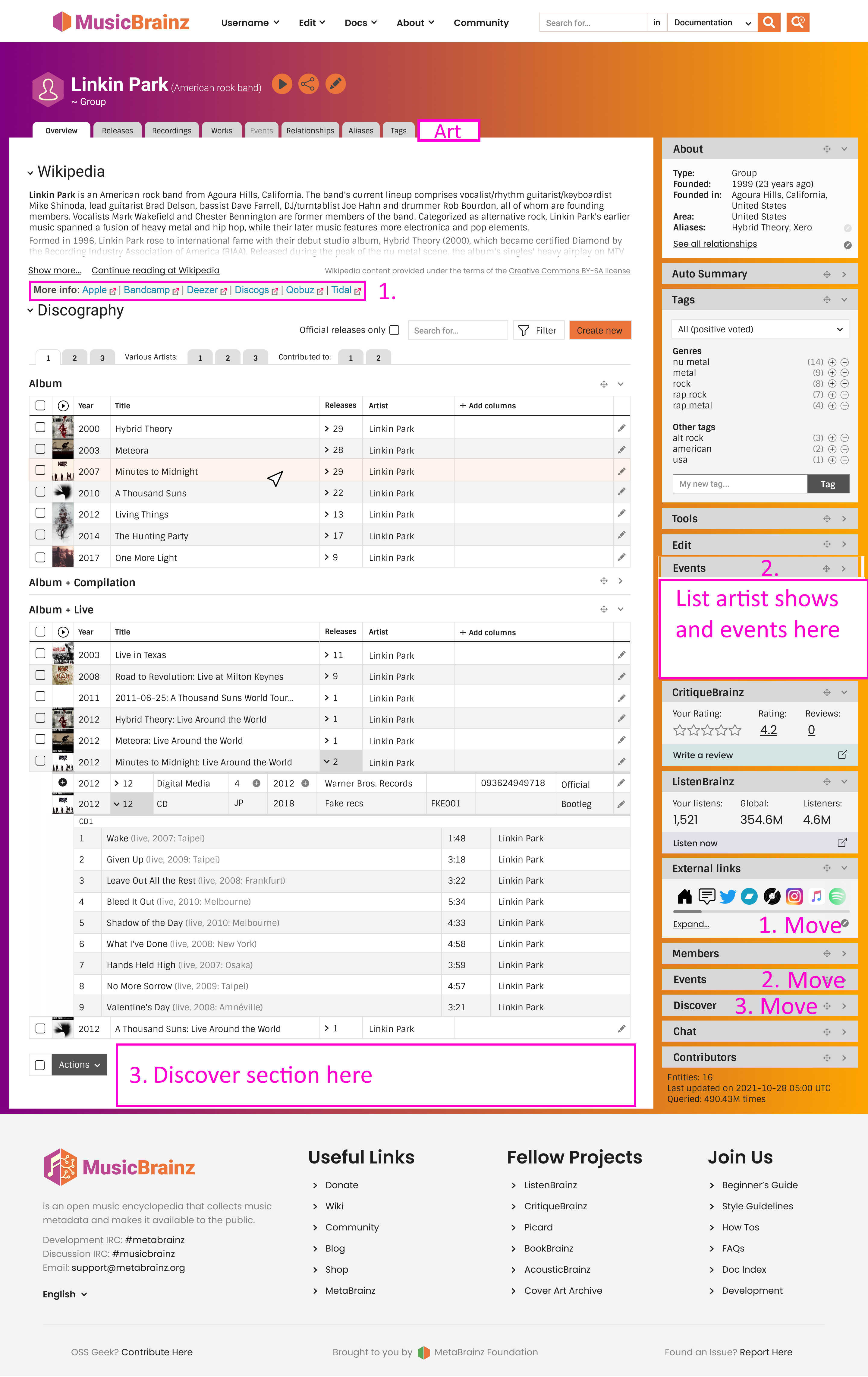
Artist page art tab and UI tweaks numbered.

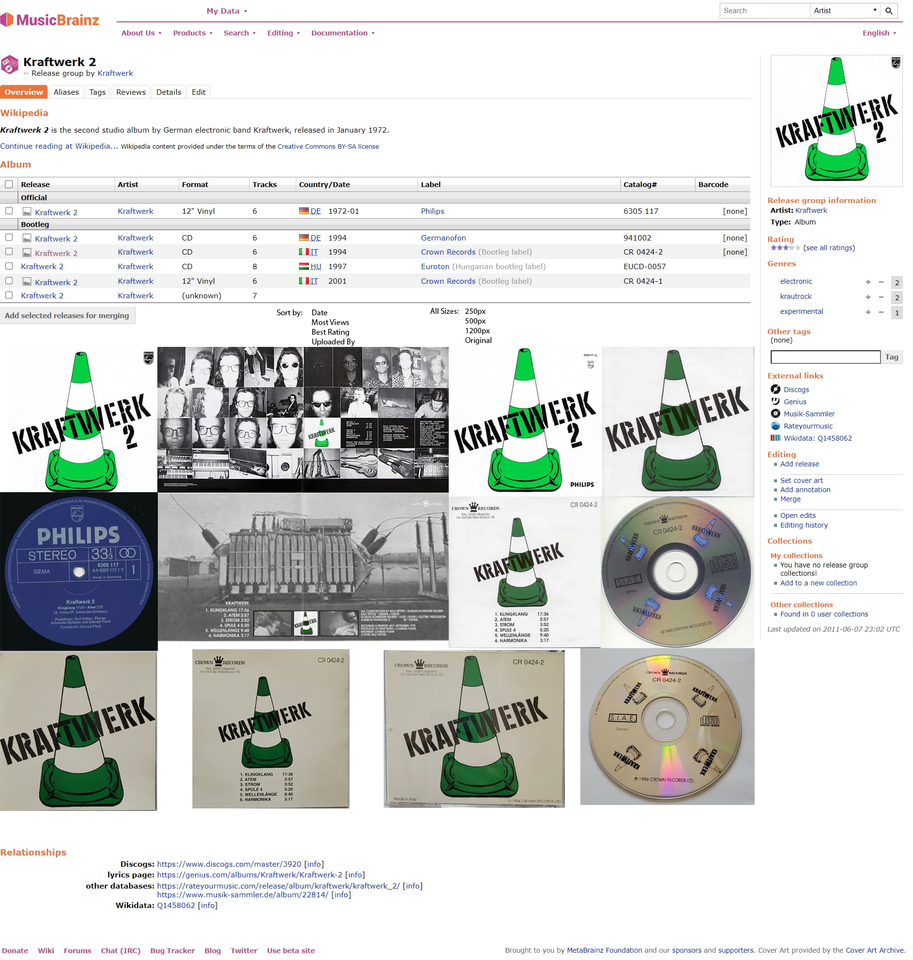
Release group page has all uploaded art covers displayed with filter examples. Users can filter to select best looking scans or most relevant to their preference. Cobbled together for information purposes.

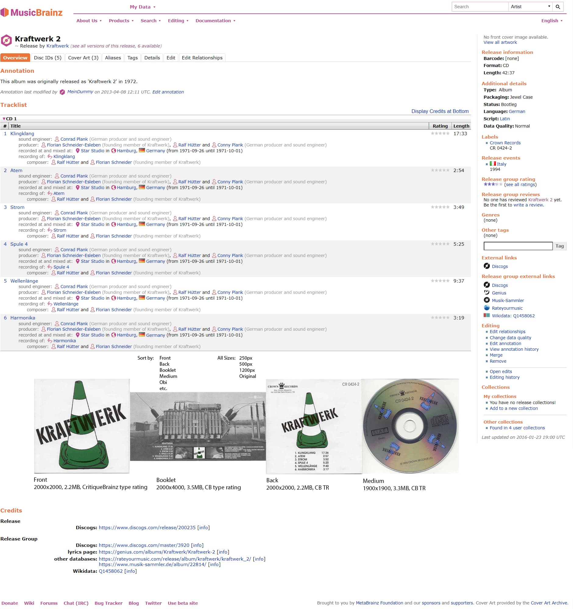
Release page has only relevant art covers for that edition displayed with filter examples. “Sort by” may include sorting options for: Front, Back, Booklet, Medium, Obi, Spine, Track, Other, Tray, Sticker, Poster, Liner, Watermark, Raw/Unedited, Matrix/Runout, Top, Bottom, image size.

1 Like

Mockup 1.5 (desktop):

Comments:

  • Put the frame of a 1920×1200 screen at the top, so it’s easier to visualise how it looks on-screen, and what’s above the fold (thanks UltimateRiff)
  • Further tweaking of the top ‘edit’ button (thanks multiple people)
  • More compact table height for the tracklisting (thanks Zas)
  • Testing putting discovery and members put to the bottom (thanks Intergalactic.fm)
  • Pagination at the bottom as well (thanks UltimateRiff)
  • Separated out ‘Artist Releases’, ‘Various Artists’, ‘Contributed to’ as well as paginated buttons a bit more clearly (thanks Zas)
  • New scripts widget (I think we need to offer people/editors a better pathway to exploring scripts, this could be it)

Grid view: (thanks UltimateRiff)

(all sidebar items collapsed)
Should this be kept very simple, the opposite of our pretty hefty table view? Or is there text we should include? Or just on rollover (shown on Meteora cover in mockup).

Quick side-step into release/release group cover art improvements (thanks Intergalactic.fm). Probably wont do more of these, finish artist pages first, but wanted to get some down while it’s fresh:

None of these take it as far as Intergalactic.fm was suggesting - just non intrusive ideas for now.

  • Let users scroll through release covers without having to open releases (in release group)

  • Let users scroll through all images without having to open cover art tab (in release)

  • Information icon that shows image size and dimensions on rollover (see ROpdebees existing ‘ MB: Display CAA image dimensions‘ script)

  • Easier method to add missing covers from release page, combined with a ’no cover’ toggle to avoid people incorrectly filling gaps

  • Fancy impossible dream version: mocks up a 3d model based on the packaging type + scans, that you can rotate and zoom in and out

1 Like

Responding to individual peeps (please see feedback incorporated into 1.5 mockups in previous post)

Thank you for the great feedback everyone, keep it coming!


Good idea, it’s in the mockup.

Because the ‘Discover’ section is completely new, and initially an example of the kinds of new things we could incorporate if we had collapsible widgets, I’m not sure how attached we should get to it. But generally speaking I don’t see why we couldn’t put generally ‘interesting places to go next’ items at the bottom of the page.


See comment above. re. artist pictures I’ve never heard anyone talk about bringing them back :frowning:

Side note, I thought this one in the process was quite interesting too, randomly pick out things people might not even know they are interested in (esp the ‘opposite to’ one, I really want it haha):


Re the Events part, the current expanded mockup is this:

image

I’d be hesitant to make it expanded by default because we don’t use it that much (it would usually be empty), and because I don’t think the hardcore editors will be fans of having it expanded.
That said if events are more visible they might get used more… luckily the order of the sidebar is something that can easily be changed later. So we don’t have to lock it in stone yet.

I haven’t moved the external links part to top because, as IvanDobsky said earlier, we don’t want to send people to other sites immediately. I think having them in the sidebar is still nice and visible without putting it above our data.


I realised I made a mistake and never properly mentioned to you that I’m really just mocking up the artist page at the moment! So I’m not tackling cover art in a big way yet. But happy to do a conceptual side-step (but I wont be mocking up the full release group or release pages for a while yet).

image
What would be in this tab in the artist page? Note that we don’t support artwork for artists just releases, and it probably wont change soon (we had legal troubles that forced us to remove the feature…)

Personally I think this is too much real estate for covers (not everyone will be interested), but I agree that users should be able to view covers easier.

I think two things in the recent mockups can help with this, without adding a whole new section, but integrating into what’s there: grid view and ‘show all’/’prev’ ’next’ buttons under the image

Again I think this is a lot to show on the default page. I think we can improve the dedicated cover art tab, and then improve how we encourage people to go there if they’re interested. I think people should be able to browse through the pics without having to go to the tab though.

re. showing image sizes, have you tried any of these scripts? The display cover art size one I always have installed, I think we could integrate that with some kind of rollover

1 Like

Yes, in theory, fully bracketing something as “don’t load by default” makes it possible to defer its loading. The problem is that most of the size of the app is caused by libraries, not code you write. Most widgets don’t contain non-trivial features that aren’t already used in the app.

If you bracket a music player this way, for example, this could allow holding out the music-playing libraries, which could be of substantial size. But deferring most any other widget you can think of probably has minimal benefit, because that widget is just remixing pieces that are already used somewhere else.

Withholding widgets showing external info (LB, CB) may improve load time depending on how “external” that data really is. The difference between LB / CB being inside the MB data model (one call for everything, or one call with just MB) or outside (ask the MB server, ask the LB server, ask the CB server) determines whether this would help load time, or just remove clutter for those who don’t care to see it.

Also, fully deferred loading - “chunking” - requires extra dev work and introduces many kinds of potential bugs.

Note that a cover grid view, while visually appealing, is probably not realistically possible with the technical infrastructure. Since all cover art has to be loaded from the slow Cover Art Archive servers, such a page would often take many seconds after the inital load to become useable.

Hmm, I already show cover art thumbnails on artist pages with a script, and it does ok?

Personally I would also be happy with waiting a bit for them to load. Some kind of - nice looking - indication that a cover art is loading would make it clear for users that it’s on its way. What I would want to avoid it a scenario where you’re unsure if it’s there/loading or not

Sorry, forgot to reply to this!

The main customizability I would like is collapsible and arrangable widgets on the side. I’ve seen it done enough on other sites that I’m hopeful it’s not too tricky. Since the widgets don’t interact with each other I’m hoping there’s no can of worms.

After that is being able to order tables by clicking on column headers, which I think is well overdue.

These next two I am not sure about:

Being able to drag and drop the order of release types, e.g. album, live, EP etc. I think this one could be trouble in combination with pagination and other mystery scenarios.

Customizing columns/tables. I have no idea if this one could be tricky. Feels safe but…

If I am handed a customisable page, I’d refine it to editing. Gone will be the “discovery” and “social” stuff. CriticBrainz, ListenBrainz, Ratings. And if Events is now going to be a future “xx going” thing it will also be dropped. The chunky Discover and Members at the bottom will also be turned off on my screen. Player will be gone too as I have no digital media accounts to link to. Let me strip a page down and I’ll make the most of it.

Even if it saves a few seconds of load time by not making those calls to get those details from the databases, it seems to make sense to me. A few seconds can add up over a long editing session. And from an environmental viewpoint why run database calls that are not required? Why calculate a list of “discover” artists when I am not going to see it?

I am not really talking about libraries and code being loaded, I know that will still be there. Just if we are going to be allowed to toggle what is displayed, then don’t load that data that I will not see. :slight_smile:

As to “dev work” - I assumed that is what this thread is about. I realise it all takes time and work. I do understand how much work goes into a page like this.

(Please don’t take the above as negative - it is supposed to just be feedback as to how this weird editor would look at the page. The whole customisable page idea is great :slight_smile:)

100% agreement on this, from this equally weird editor.

I’m also hoping those huge margins on the sides aren’t going to be a thing. If the goal is to make better use of screen space, why waste so much of it? The current design is great in this regard.

1 Like

There’s a maximim width that your eye will comfortable scan a paragraph of text at, before it starts to get fatigued. You’ll notice that Discourse for instance has margins too, for comfortable reading.

CB and LB limit the width already.

Definitely would be useful to have a wide MB page when it comes to certain column-heavy page types (e.g. release group), but I hate having to scan a whole page.

Does anyone else have any thoughts on this?

2 Likes

This is my current thoughts for a possible events widget:

image

Feedback welcome! Remember to feedback on anything you want to see changed or would use differently.

Edit: I just noticed that ‘cancelled’ needs to be a toggle, like ‘include cancelled’

If I feel that the paragraph is too wide to be comfortable, I’ll narrow the browser window. I’d rather make that choice myself. I object to these wide margins for CB and LB, I object to it on Discourse, I object to it at my bank’s website, and everywhere else I see it. In a couple of cases, where it was possible, I’ve overridden the margins using Stylus. The current MB website uses the full page width, and that was thankfully something I didn’t have to fight with when I was making my dark Stylus theme.

I guess this will give me something to do in Stylus in the future. :smirk:

For comfortable reading those colour banners are literally painful on the eyes. I agree with @Beckfield, please make full use of the screen width. It works well on a current MB page. Don’t waste over 20% of the screen.

Discourse is only one item on the page, so a narrow band in the middle makes sense. Agree, you don’t want to read wide sentences. MB is displaying multiple things across the page. Let the columns breath.

Your eye scanning will only be looking at one area at a time. For example - you are likely to scan down just the column of Album titles. You are not really reading a full width page. You scan down sections of the page.

When you come to a Releases or Recordings page, then you will really need that full width to show all the other multiple columns needed on the page.

Also making use of the width means your improved column on the right gets more space to breathe and be readable. Less squished.

Re: Events Widget - I recognised it from the setlist.fm feature. I can see some may like it. Personally I’m a weird one who doesn’t do “Social Networking” so it would be unused by me and hidden.

A maximum width for text paragraphs is essential for readability, and we have long paragraphs in many locations like annotations or Wikipedia excerpts.

I know I am not alone in using the MB website at a high browser zoom level (150%) to reduce the effect of long lines somewhat, and I have perfect vision and a large monitor.

Exactly. I almost made that point as well, but I was afraid I was going on too long.

On my ultra-wide monitor, I have the browser width set to where sites with reasonable margins (like the current MB site) are comfortable to read. I use browser zoom for two reasons - a) to increase font size (my eyes are aging), and b) to make sites with space-wasting margins use the full width of the browser.

1 Like