Part of my duties as Supporter Catalyst is the continuous work on the MetaBrainz World Domination Plan (MWDP). This plan began before my time (perhaps sans appropriate title) with feedback from the board of directors about editing the verbiage on our websites to provide further clarity, professionalism and consistency throughout the MetaBrainz Foundation websites. Currently, my priority is working on step one of the MWDP–verbiage updates on all websites starting with MeB.
4 days ago, MeB received a great GSoC proposal, that touches on an idea I had for a future portion of the MetaBrainz World Domination Plan. If you haven’t checked it out, I encourage you to do so: GSoC 2017 Adding Statistics and Graphs to ListenBrainz
In hopes of discussion, feedback, interest, collaboration, critiques, etc., here are my thoughts about an:
MetaBrainz World Domination Social Media Plan (MWDSMP)
Growing up, the posters in my room had the most epic graphics–they were at the time super ‘high tech.’ Visually they gave me an understanding of what the computers (often next to the graphics) in the posters could do–all the possibilities that we can’t physically hold in our hands, unlike a coffee mug. Remembering this made me think of our data, and wanting to make it more tangible, more accessible. The main purpose of continuing to grow the MeB ecosystem, but also to humblebrag the data and statistics our community works so hard on creating and maintaining.
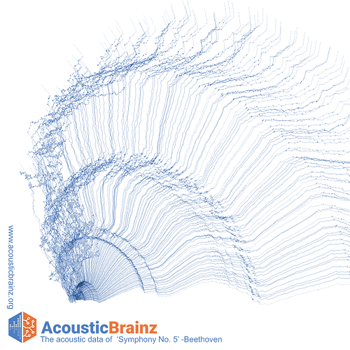
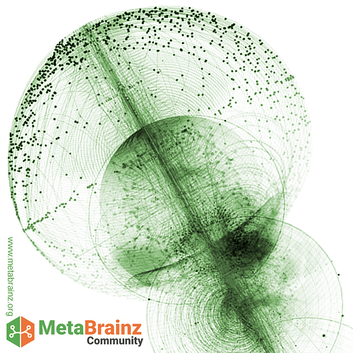
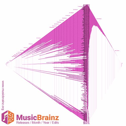
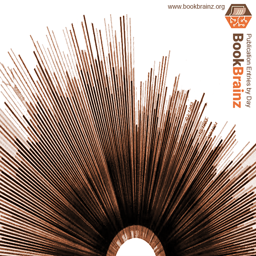
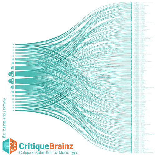
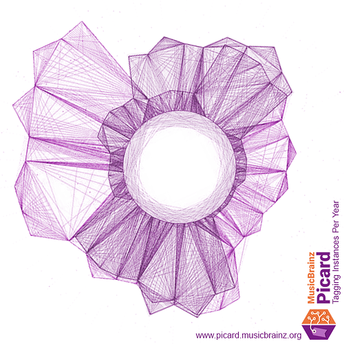
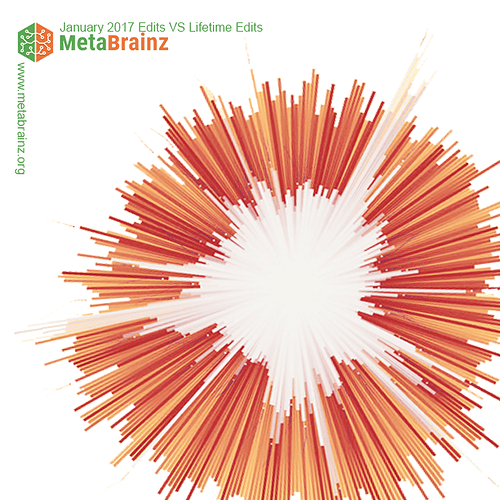
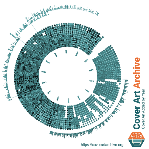
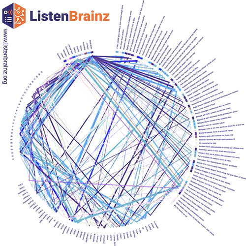
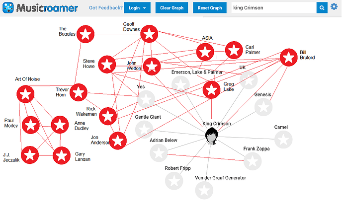
We could share something via social media, consistently (weekly/monthly) that was more visually appealing than 140 characters, and utilizes our data. I looked into some data visualizations and data art, and quickly made some mock-ups, as visuals, to help get the idea across for discussion. Perhaps each MeB project would have a ‘data art form’, and pending the data that art form would change weekly, creating ‘data art collections’ over time of various projects. Ideally for consistency, these data queries and art compilations would become automated, if it’s possible.
Disclaimer 1) None of these images use our data, and using our data is likely to alter the visual appearance of any of these data art forms but are used for to get the general idea across.
Disclaimer 2) I am personally bias about the AB design code, I’ve confirmed it is open source and will be using it to make some textiles from my favorite songs, pending what the acoustic data looks like. I will wear music! ![]()
Sources for Mock-ups:
1.AB mock-up: Matthias Dittrich |interaction design portfolio | Narratives 2.0 2.MeB Community mock-up: Tatiana Plakhova 3.MB mock-up: Ariana Montanez World Population Infographic 4.BB mock-up: Jer Thorp, Word Frequency 5.CB mock-up: Daniel A. Becker, Random Walk 6.Picard mock-up: Hysysk, ted lightwave julapy 7.MeB edits mock-up: https://c1.staticflickr.com/4/3396/3261847828_9e8a7160ae_b.jpg 8.CAA mock-up: https://c1.staticflickr.com/7/6060/6281853518_8fb1442127_b.jpg 9.LB mock-up: The Guardian, A Week at The Guardian
