Hi everyone.
Thanks for the valuable feedback. We have been working on incorporating your feedback and have come up with some improved mockup:

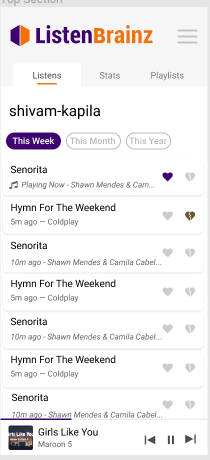
Here is the mobile view of the same:
-
We have removed the trash icon for the “delete a listen” feature and will go forward with building mass selection and deletion feature in the future.
-
To implement “Click to view metadata” and “Checkbox selection” features we thought of using card views for the listens list.
-
The alignment of “Previous” and “Next” buttons has been fixed.
-
An orange highlight line has been added to highlight the active section in the sidebar.
Kindly have a look and if you have more feedback kindly post it here.
Wish you a good day!