Hi everyone. Hope you are doing well.
I am ecstatic to share with you all that I will be working this summer with the ListenBrainz team on the project “Add ‘love/hate a recording’ and ‘delete a listen’ support to ListenBrainz”.
Our goal is to make ListenBrainz more user-friendly. I aim to do the following tasks as a step towards this goal:
-
Add feedback (aka love/hate) feature for the recordings so we can learn more about your music tastes and then use that data in upcoming recommendation tools
-
Add a delete listen feature so that you can get rid of the duplicates or remove listens you’re embarrassed about from your history.
-
An all-new ListenBrainz with revamped UI & UX.
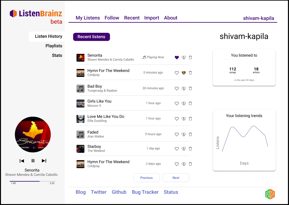
The new Dashboard
I have prepared mockups for what I aim to build in the project. The My Listens section will be transformed into a dashboard which will look as below:
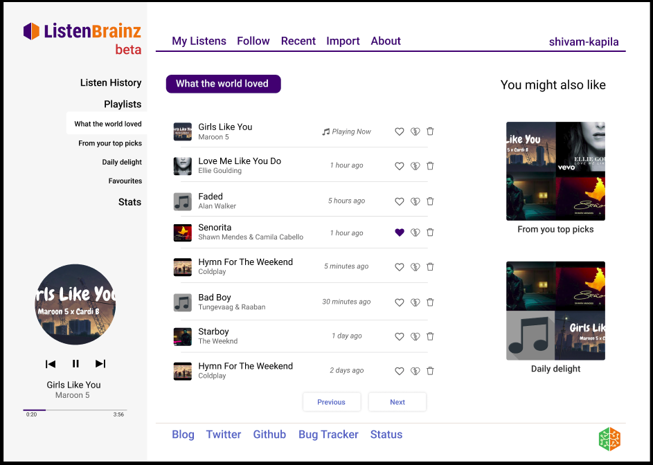
Stats and Music Recommendations
With the team working actively on “Stats and Music Recommendations”, we will soon have awesome playlists and interesting stats in place. The playlist section will look similar to the new My Listens page. The mockup is attached below:
I would like to get the community’s feedback on the revamped UI about what you like, what would you want more in place, what doesn’t look so good and so on.
If you are interested to explore the UI and UX you can have in-depth experience at the following Figma here. I have always created a YouTube playlist to walk you through the mockups. You can have a look here.
Kindly let me know your feedback so that I can contribute towards this project better and effectively we make ListenBrainz awesome. Thanks for the read  .
.