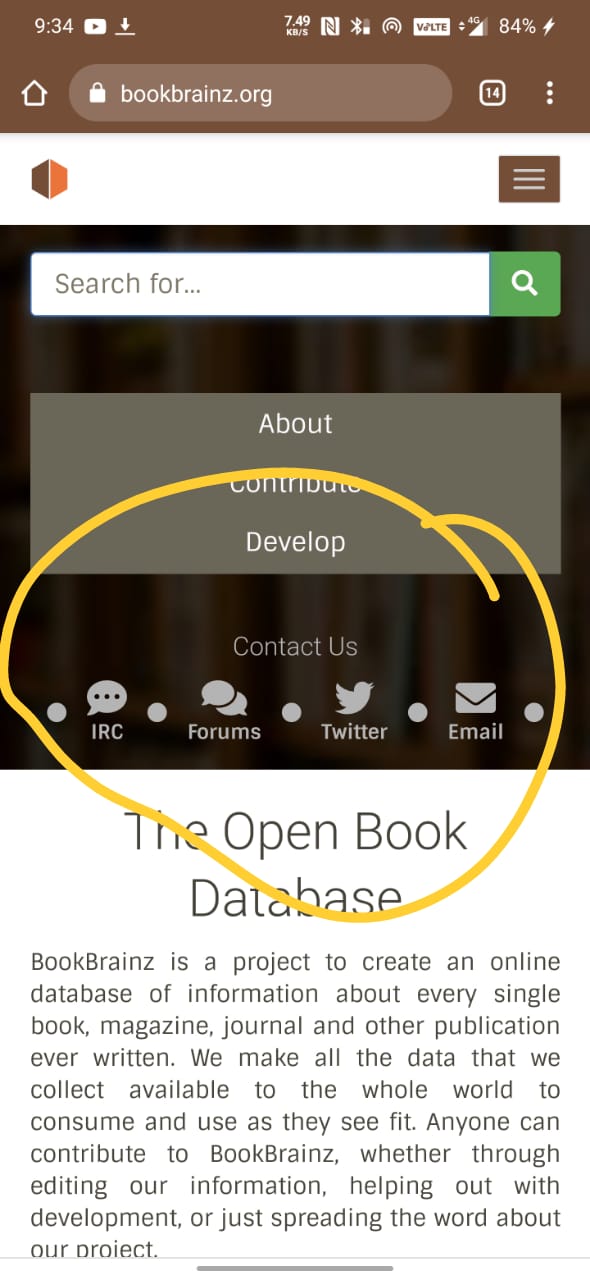
Footer for a website is a well stable place that stores static information and quick access links .
it’s a general user pattern to scroll down to the bottom to access informations
like Contact us Section containing links to -
- github, forums , twitter and other handles
- a physical address
However , right now i didn’t see any of these there! Infact this Contact us section is placed at the top of the page .
which somewhat is creating a less demanding UI and access pattern for a user.
Also in current implementation of footer, components like copyright texts , sponsors logo , and other necessary info has not be displayed in a proper way !
keeping in mind the current design pattern and importance of footer in the website , i would like to redesign footer to a more responsive ,intuitive ,useful, more user interactive version of it.
@mr_monkey
before putting foot in work i think it would be nice to get myself familiar with current design pattern like what colors we should use, font sizes, margin and other design aspects that our website follows.
Also let me know the else possibilities.
Does it really need changing?
1 Like
I do agree that at the very least the contact information would be a good addition to the footer!
I think it’s an easy enough self-contained project to get started with and get familiar with the codebase, and it could indeed be improved, so go for it !
current design pattern
I think you’ll find that there isn’t much in terms of followable design patterns.
As for styling, you can have a look at the Bootstrap theme that is used across the Metabrainz websites: Lobes - for MusicBrainz - A Bootstrap 3 Theme
Do keep in mind it has not been followed to the letter or implemented as-is, but it should give you an idea of what’s going on 
@mr_monkey
Thank you for the green flag, its really highly encouraging to start the work and make a real positive change there.
I have already started to explore the codebase and i find it really amusing .
I will first go with designing a prototype for the footer and then after your confirmation i will head to the coding part.
@mr_monkey
Here is the prototype and i would like to explain it a bit …
-
firstly those social media icons will change color on hovering,
-
Here i also added a back to top button so that users can navigate to top quickly.
Also ,we can always modify colors if needed.
And if you want to add something guide me on that
1 Like
It does look good. Well done.
1 Like
@mr_monkey
it would be great to hear suggestions to get started for coding part.
1 Like
Sorry, it’s taking me a while to get to it, but I’ll definitely respond in the coming days  Thanks for your patience!
All righty, sorry it took me so long to respond !
I do like the idea of redesigning the footer a bit, and I do think you’re on the right track.
I’ll break my feedback in 2 parts:
- Colors:
- That orange color is shared between all the MetaBrainz projects, so we should be using the brown color more, which is the color specific to BookBrainz. That doesn’t mean we don’t want to use the orange at all, just reserving it for accents.
- Similarly, I think variations of orange on brown background (and inverse depending on hover) will work well for the social icons
- Composition:
- I like the social icons on top like that, it looks quite nice !
- The alignment of the central text make sit a bit uneven; perhaps a centered alignment could work, or aligned to the left-side of the footer
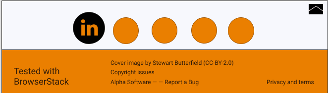
- Which brings me to another point: you can remove the “tested with browserstack part” (which we don’t use anymore), giving you a bit more space to play with.
- I was a bit surprised to see the “back to top” icon at the top of the footer like that, I think at least with current colors it stands out a bit too much.
Apart from that, I think you’re ready to start prototyping in code !
Nicely done !
2 Likes
Thank you @mr_monkey for your valuable feedback. I will start working on the changes right away : )
2 Likes
@mr_monkey I have done the initial commit.
Please review the PR.
Link to PR
I extremely apologize for the delay.