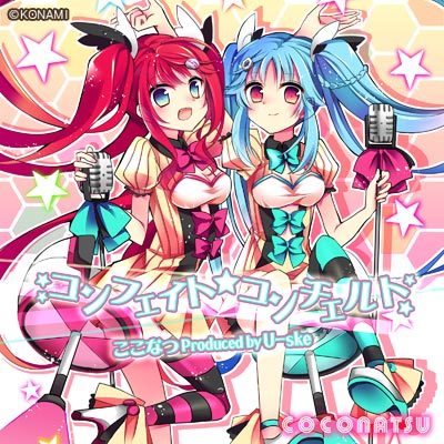
So recently there was edit # 38248004, wherein a release had a track title コンフェイト*コンチェルト and another editor changed the * to *. For a long time it’s been an unwritten rule that for a Japanese release you use the exact same characters that appear in text on a release. In this case the release packaging shows a centered asterisk (http://www.konamistyle.jp/item/image/73300/10/51); due to the image’s size and compression level, it is difficult to tell if it uses a standard fullwidth asterisk or a different character. I’m unconvinced that it’s an ASCII asterisk since ASCII asterisks sit high in text strings. That other editor seems to want to use * for the sake of convenience, and normally we don’t do that (Style/Miscellaneous explicitly discourages forcing ASCII punctuation). My question to you all is this: which one should be used?
I agree with @hiro666 that Style/Misc doesn’t seem to apply.
As I understand it, that guideline is talking about “correct punctuation” as recommended by the Unicode committee and accepted typographical standards.
The other argument, that we try to match the appearance of Japanese titles as closely as possible? I dunno. I’ve got no opinion on that. Is that really the unwritten rule? I’m curious to hear other opinions.
If the goal is to match the appearance, it looks more like a middle dot or bullet to me, based on that fuzzy picture.
Guessing based on image search:
… I would GUESS that the artists intent was… uhm… “using*because he couldn’t find a bigger star on his keyboard” (and other people seem to have accepted it / picked it up, too)?
If that is really the case, then that should probably trump … uhm… the argument for “*” ?
( On the other side, a " * " actually has 5 points in most fonts… so… shrug maybe just do whatever ![]() )
)
*(U+FF0A) is a duplicate character
- * is defined for compatibility between the Unicode and traditional CJK character encodings. In the latest Japanese character encoding (JIS X 0213), * is deleted and not defined (There is no rules converting between Unicode and JIS X 0213).
- http://wiki.musicbrainz.org/Internationalization#Unicode_issues
- https://en.wikipedia.org/wiki/Halfwidth_and_fullwidth_forms , https://ja.wikipedia.org/wiki/全角と半角
The Unicode Standard does not define glyph images
- If * or * is rendered as superscript, it is a problem of a display environment (fonts or a OS).
- *(U+002A) is often used as a bullet point when listing items. in this situation, we expect * is aligned with other characters.
- I have heard some OpenType fonts have “fwid” features that *(U+002A) is rendered as fullwidth glyph.
IMO, * should not be used without reasonable cause, and * is renderd in high postision in someones environment is not resonable cause.
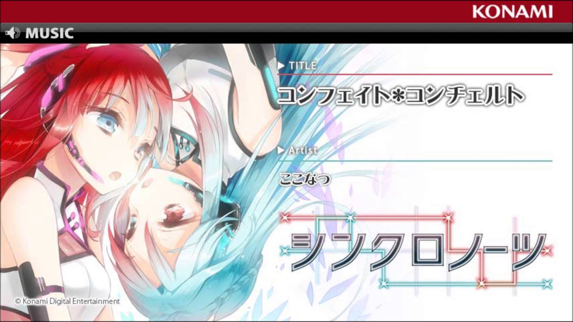
First images shows コンフェイト★コンチェルト and second shows コンフェイト✽コンチェルト but that edited release image is too small for me to check… I’m in for mimicking a tracklist in visual aspects as close as possible.
OHP for LC2269 uses コンフェイト*コンチェルト (and uses some other half width characters, it’s not like if they were not able to if they want) and links to an official Youtube page using コンフェイト*コンチェルト as well in its text… while showing an image that looks like コンフェイト✽コンチェルト to me.
But again, what counts more to me is the release back cover and it is too small but as official pages tend to use something consistently, until I can reach a bigger image, I would probably tend to use that.
HibiscusKazenekoさんは日本語が理解できるようなので、日本語で書かせていただきます。
私はUnicodeやJISなどの一般的なルールに基づいて編集しましたが、HibiscusKazenekoさんは自分の環境で自分の感覚に合わない表示がされるという理由で私の編集を排除したわけです。
これは私にとっては非常に非協調的と考えます。
また、HibiscusKazenekoさんがUnicodeやJISに基づくルールは無視するべきと考えているなら、そう書いていただきたいです。なにも話が進まないので。