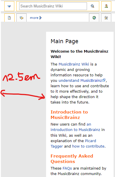
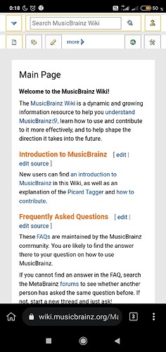
The monobook skin version used on MB’s MediaWiki wiki has a bug on mobile.
The #content element has a margin-left: 12.5em that should be removed when screen width is narrow like on mobile:
On desktop, it leaves room for the left sidebar.
But on mobile, there is no sidebar, there is a pop-over menu instead.
It is simple to fix and it would allow mobile phones to browse wiki.musicbrainz.org in a legible way.
I would like to share my fix to everyone’s smartphone but I didn’t find the stylesheet where I could contribute the simple fix in MetaBrainz Foundation · GitHub repositories.
Apparently one has to edit MediaWiki:Common.css - MusicBrainz Wiki but I don’t have rights. ![]()
Update
There is a user stylesheet workaround, further down this page, until this is fixed within the wiki itself.

