Greetings, Everyone!
I have been working to bring about a few changes to the way we present things in the ListenBrainz Web Interface.
A few changes and additions where I would like your suggestion:
-
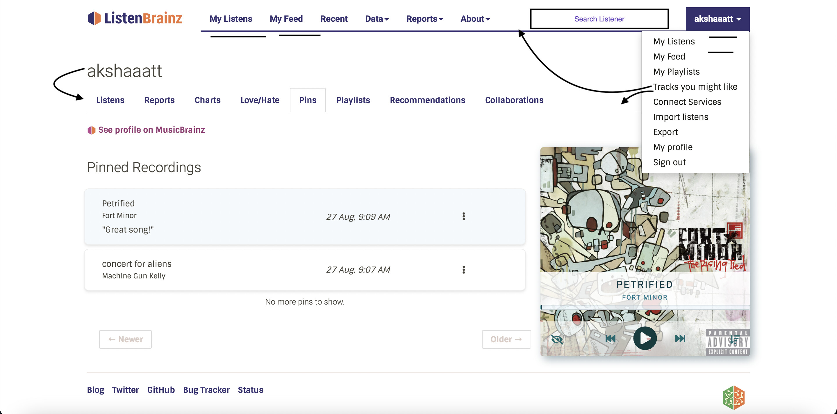
My ListensandMy Feedhave been duplicated and we should maintain them in one place. I personally really like them directly available on the navbar. The profile dropdown can be reduced in size maybe. -
The username shown covers some part of the vertical space, which can be moved to the mentioned position with the other options and make the web app feel much better. If not, we should add more buttons or features to cover the white space in the existing position.
-
Tracks you might likeis one of the best available features and I personally missed out on it for a few days because it wasn’t showcased on the navbar properly. Either, we need to move the button to the top and out of the dropdown, else we need to add it to the user’s nav directly for access when the user moves on to my listens. Your opinion could decide what we do here. -
I feel ListenBrainz is an amazing means to connect with like-minded people who share similar music tastes. We definitely need a search bar to help us find fellow listeners. Currently, we can go to the top url in the browser and make a url modification to point to user/
usernamewith the base url. However, this is not intuitive for general users and makes it hard to understand the functionalities at first glance. If this is a low priority, we can currently just add a means for convenient url modification and whatever query you type in the box, we find the user for you and head you to their profile. Later on, we can add means to show you a list of relevant users based on the query. I will add a UI related to how this feature would be useful later on in the upcoming weeks.
Please let us know your opinions. Looking forward to hearing from you. Thanks!


