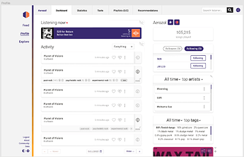
We’ve been working on a ListenBrainz redesign, and we’re ready for some early feedback!
We want to hear all your thoughts. But be aware that not all feedback here will be implemented. Although there’s heaps of overlap, current MeB/forum users are not the only target audience for LB, which includes a broader, less technical, audience.
Some other things to keep in mind:
-
It’s still in progress.
Pages are not final, and some are simply placeholders. -
Mocked up features might not happen soon, or at all.
These are aspirational mockups which, once agreed on, will be broken up into elements to be prioritized by our busy devs.
Use the figma project link above to view the mockup. Leave comments for specific elements by clicking the comment bubble at the top left, and see existing discussions and thoughts by clicking that bubble as well. Leave overall impressions in this forum thread.
By clicking ‘Layers > Pages’ on the left, you can view more pages of design process and design details.
Overall comments
The look of the main LB content is new and modern already, so the big focus has been bringing the look of the nav in line with the proposed MB redesign. Hopefully this combination keeps a ‘family’ feel, while keeping the rounded and light LB feel that we already have.
This layout can look obvious in hindsight, but breaking the navigation down into clear and manageable sections was a bit of work.
The bigger sites were referenced (Spotify, social media sites, etc) for the sidebar and nav, as something most users, including the non-tech savvy, will be familiar with. (Don’t panic! This is completely different to how MB design would be approached, with the mere mention of ‘social media’ causing the MB users sphincter to tighten into a vice-like grip ![]() )
)
Not really much more to say that isn’t already in the figma and its comments… but I’m excited about some of the opportunities this has process has clarified! ‘Explore’ is shaping into a inviting, fun, and playful area. Meanwhile the personal and global feeds have the opportunity to be the go-to place to find new releases, check out current trends (top releases, trending genres, etc), and keep up with music friends. We’re a long way away from seeing this stuff, but hopefully this redesign has the same effect on you - the overview and browsing of our current features becomes clearer, and all the possibilities become easier to picture and get excited about!

