Kia ora (hello), the ListenBrainz team has been busy!
We have some new menu/nav stuff we want to show off, and to get your feedback on.
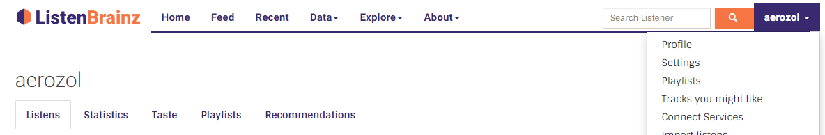
Current:
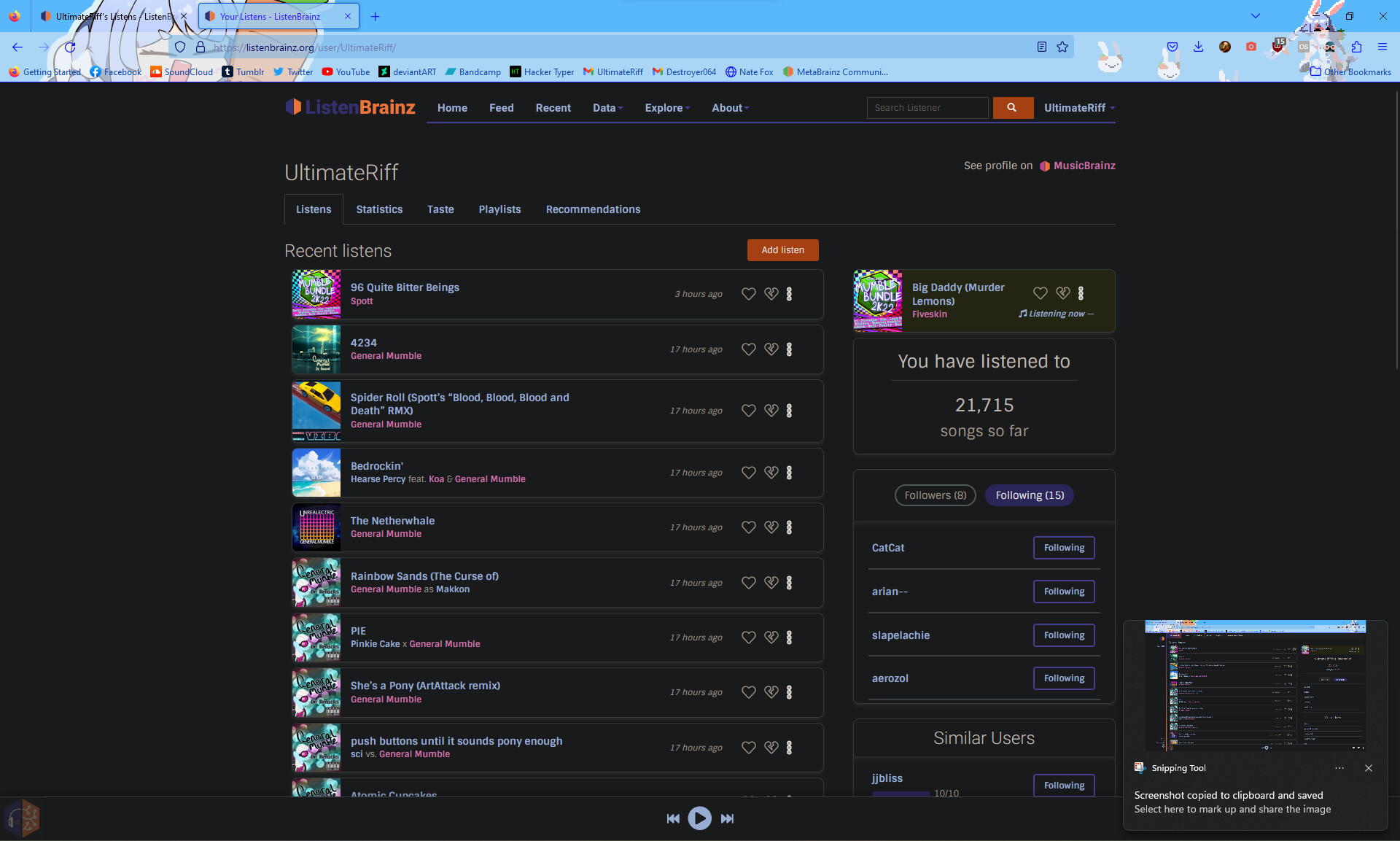
The LB menus are a bit of a mess. We have a top nav bar, with drop downs, a profile drop down, and a secondary nav on some pages. It’s not always clear where to look for something, or where a new feature/page should go.
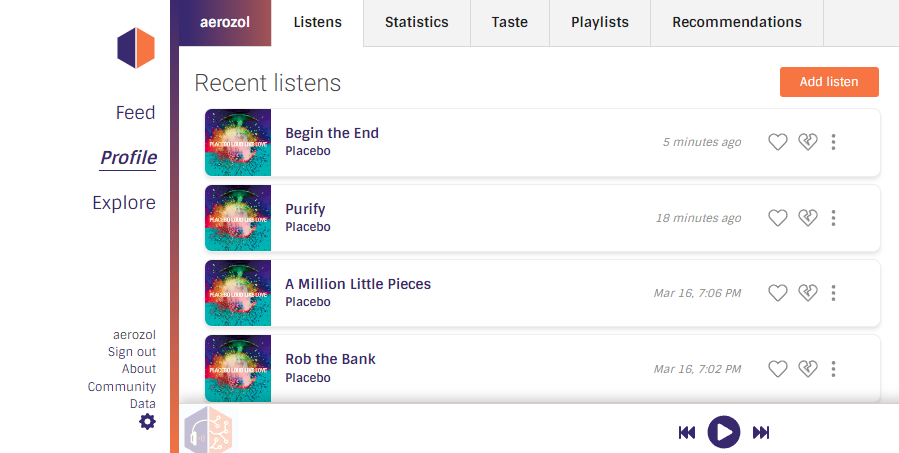
Test:
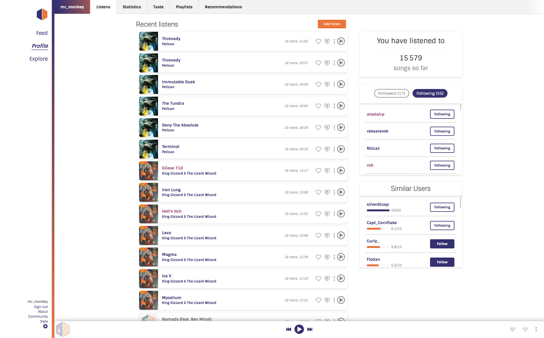
The redesign tries to tidy this up into a logical order.
Three key categories in the sidebar: Profile (user profiles/user data), Feed (feature light at the moment, but has potential for expansion), Explore (fun tools and stuff!)
A subnav that contains subpages of the key category you’re in.
All of the other ‘descriptive’ or setting pages moved into two pages at the bottom of the sidebar: About & Settings
Profile page + subnav:
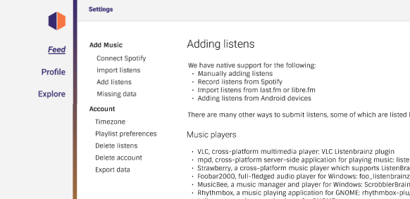
Settings page (this and About has its own simple subnav/contents menu):
We’re hoping this will let your nan and grandpops find their way around a bit easier, and makes our life easier too - new features and pages should slot in nicely (currently it’s a bit of “just add another menu item somewhere”)
Let us know what you think, ngā mihi nui! (thank you!)
6 Likes
Overall I like this, especially for browsing on my laptop and desktop screens. It makes the navigation indeed more coherent.
Is there a concept for how the navigation will work on smaller screens? Current LB is quite usable on mobile (with a few quirks), but I’m not sure if and how the new new navigation structure fits there.
Yes! I forgot to mention this 
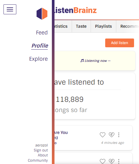
Mobile / < 900px:
>
The subnav can be dragged/swiped across
p.s. The search bar will go into the main menu (not pictured in the test implementation yet)
1 Like
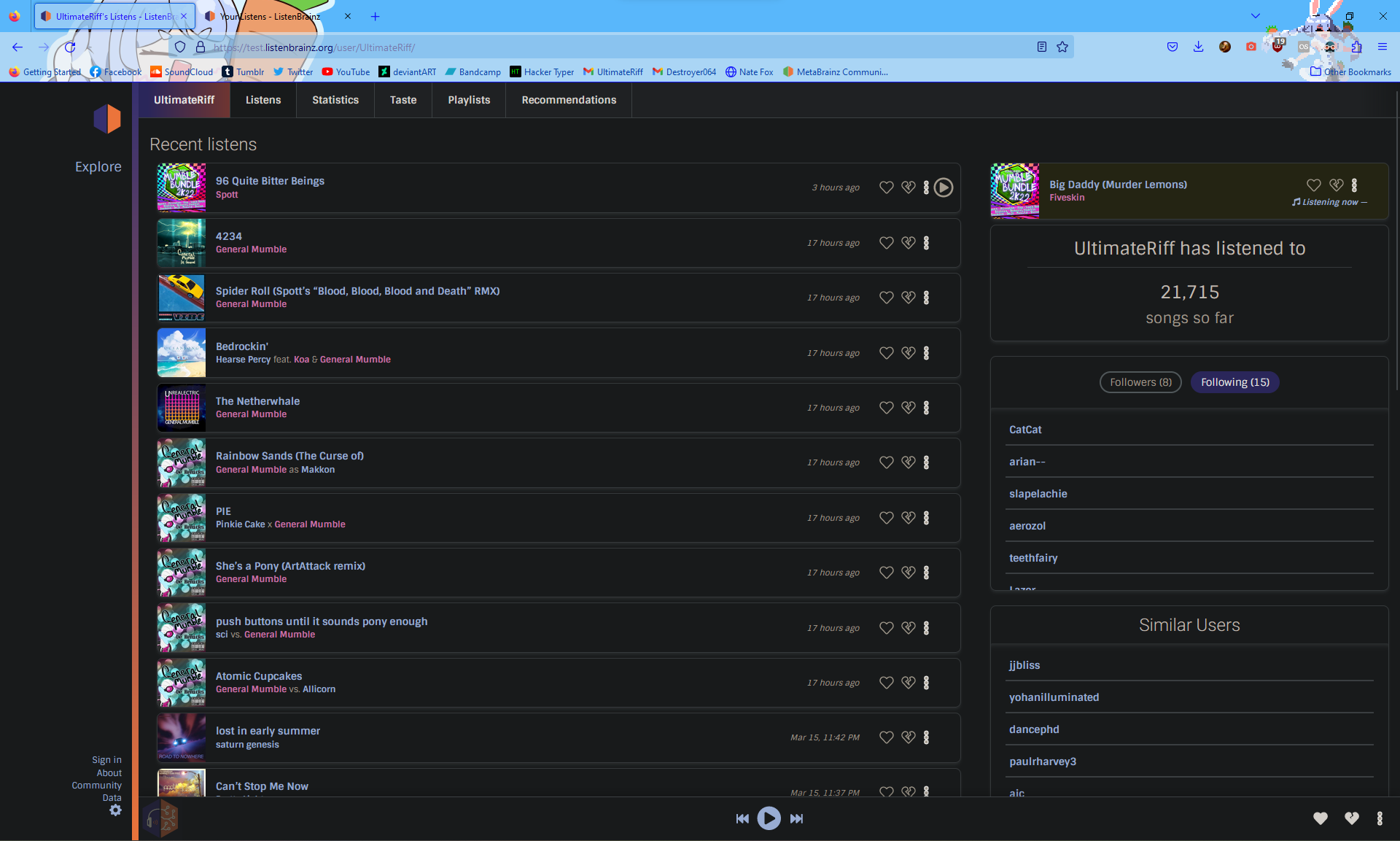
overall, I do like the new design. however, I don’t know that I like how it stretches out the layout on larger screens. at 1920×1200 it suffers from a similar issue I’ve got with the current MusicBrainz design, the individual rows are hard to follow across. it’s slightly better on ListenBrainz, since the rows are a bit taller, but still…
for reference, screenshots of the new and old, window maximized. note I’ve got a dark mode plugin, that’s why it looks strange
1 Like
That is a good point - @mr_monkey we should set a max width for the main panel. Otherwise a bunch of stuff will be inconsistent and possibly break anyway (e.g. some things will stretch, some wont).
If you weren’t going to already! @UltimateRiff is cheating by looking at your work in progress on the test server 
1 Like