I wonder why it has a toggle at all. Shouldn’t the browser detect that by itself?
an odd thing I just came across, there’s a track on my listens feed that show the link icon, but seems to already be linked?
I don’t know if this is because the track in question is only on a compilation or maybe something else…
while we’re talking about the redesign, I wonder if the “New playlist” button could be moved to the top instead of the bottom of the playlist list. it could be a full-size card like it currently is, or perhaps a button above the playlist list
Are the browsers which don’t support it even supported by ListenBrainz?
Which browser actually supports configuring this per-site (without the use of separate plugins)? Firefox currently doesn’t. Chrome on mobile doesn’t either. Don’t know about Chrome desktop, it might support it.
Dark mode is a system-wide setting (usually). It does not make sense to have the browser use it per site.
Of course it makes sense. Just because I have my OS UI set to dark mode does not mean I want the entire web to be in eternal darkness ![]() That’s why ListenBrainz will need this toggle.
That’s why ListenBrainz will need this toggle.
The discussion above was solely about whether LB needs a toggle to change between light and dark mode. And I’d argue that as long as browsers don’t widely support toggling this per site (without installing extensions or enabling experimental hidden options) than yes this user preference inside LB is needed.
There are a couple issues with the navigation drawer.
The navigation drawer has blank space at the bottom when scrolling due to the disappearing address bar in Chrome:
Compare with a fixed address bar:
The navigation drawer can’t be dismissed by tapping outside of it (and page scrolls instead)
Bottom links in the navigation drawer extend beyond text and can cause unintended navigation or log out:
I’ve also noticed a couple other issues that have persisted in the redesign, I won’t bother showcasing them here.
Yep, I noticed the same thing and I’m currently fixing it in Improve ListenCard cover art fallback by MonkeyDo · Pull Request #2447 · metabrainz/listenbrainz-server · GitHub
Hello again everybody!
I’ve updated beta.listenbrainz.org with your comments and feedback (some of it outside of this forum).
The “Profile” top-level section was renamed “Dashboard”, and the “Listens” tab in that section renamed to “Profile”. We’re open to your feedback on this.
@ulkigpulkig We decided to go for text-only links at the bottom of the side nav; we will probably revisit this once we implement a dark mode but we will be more careful not to mix icon-only and text-only links, which was indeed confusing.
However I think we are keeping the second sign in link visible in the stats page when logged out. Making it static text instead does not seem like an improvement.
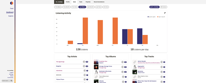
@Maxr1998 I kept working on the stats page which should now look better on mobile. However the issue with the world map starting very zoomed in on mobile remains (tapping on the map will resize it; not sure what is going on there).
As i mentioned previously I will be doing another pass to improve this page (including looking at the top artists again) and sort out this weird issue.
@chaban I’ve fixed the issues you reported in the side navbar. I could somewhat replicate the issue with the disappearing address bar when scrolling; however for me, once I stop scrolling the navbar adjusts to take the full height. As far as I know that is the browser’s behavior, only updating screen width as the end of scroll. However @aerozol suggested a good hack fix to extend the sidenav background and hide the page underneath.
@outsidecontext We’ve revisited how the website looks on very wide screens.
The maximum content width is now 1400px (from 1200px).
From a screen width of 1950px and over, the secondary nav bar (the tabs at the top) is aligned with the content. Let us know if that makes your experience better:
I just remembered an older ticket of mine, and I wonder if it’s within the scope of this redesign…
Well, it’s your decision, after all … ![]() thank you for considering it, at least.
thank you for considering it, at least.
Not quite in scope for right now, although trust me when I say I’ve wanted to improve this page for a couple of years now…
We’ll do separate passes for each of the pages to improve them, they all need some love.
Another quick update:
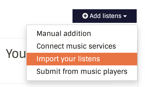
@lazybookwyrm I’ve modified the “add listens” button as suggested by @aerozol to add quicker access to more options from your home page.
Does that improve your workflow to sync with LastFM?

Can confirm that the graphs are fixed even on a very slim screen, thanks a lot!
The “Dashboard” name fits much better, but I’m not sure about the profile tab. I believe “Listens” more accurately represents what this screen is about. A user’s profile would be more focused on their general listen behaviour instead of recent listens.
I concur~ the Listens page doesn’t feel like a profile page to me. in my mind, a profile would be more an overview, maybe have some stats, a bio, and a place to put links. we could maybe automagically add a user’s other MetaBrainz links (BookBrainz, MusicBrainz, etc.)
Looks great!
Related to that, if I trigger a LastFM sync on the beta site, it seems to import correctly, but none of the imports show up in my recent listens. Scrobbling an additional song, then importing that song on the main site refreshes the recent listen feed to show all the missing listens.
Thanks a lot, I think this works well. There are a few quirks still left:
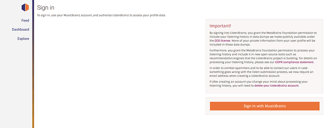
On sign in screen the first paragraph is left aligned, while the login box is centered as the rest of the content:
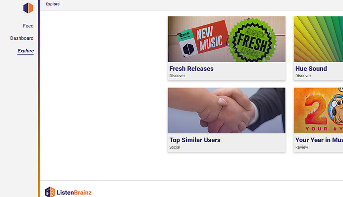
On the explore view the headline is also left aligned. I think just like the secondary nav it should be aligned with the content.
Talking of that page I hope that the (I guess AI generated) image of two people’s hands melting together is a placeholder and will get replaced ![]()
That tool is mainly used to find bots/sockpuppets, so the imagery is no accident.
We can change it if people really hate it, but I find it really funny tbh ![]()
I had previously not really payed attention to the explore page and only had it open quickly without looking at the images intentionally, and then I did not notice. But now that I browsed the site more carefully that’s something that just jumped on me. And the image is really awkward. These AI troubles with generating believable hands are really funny indeed. But while I get your idea here I think that’s something no visitor unfamiliar with the explanation will understand. In that case the image just looks bad and awkward and like someone did not take care when selecting the images.


