I have to chuckle a bit about this. Much of the (often heated) discussion surrounding “acceptable” cover art stems from personal preference. If two editors such as yourself and @mmirG, both knowledgeable in the area of graphic arts and digital image processing (I believe), can’t agree then what chance is there for the rest of us to come to a consensus on a definition of “acceptable” cover art? (Said with tongue firmly planted in cheek. ![]() )
)
4 Likes
Nice! But funny. It looks a little different from mine - and I was able to match your scan pretty rather well by creating a profile based on it. I wonder what these are supposed to look like…
What do your covers look like with the current scanner settings? Did you manage to get rid of the clipping there as well?
1 Like
I think the clipping is corrected there as well. Here is a sample scan of the back cover of a booklet. Looks a lot better than the original scans did.
I may still need to do a bit of playing around with it, because mine still looks a bit washed out in the A13 to A19 blocks compared with yours. Still a great improvement from before. Thanks for your help with this.
Every point discussed here has come up in the past, it’s good to see it come up again 
My thoughts:
- I don’t think images in the CAA can be too big, as they can always be made smaller (but not the other way round…). However 500x500 as the largest auto-resized size does not leave any middle ground for those who want big art, but not archival art. A larger auto resize (or two) would be really good. It would also encourage people to upload higher quality art to reach the ‘max’ auto size, be it 1000x1000, or 2500x2500 or whatever, without having to open the original to get an idea of how big the picture is.
- It is MB’s policy that if the data is an improvement, even if it’s not perfect, we vote yes. These images are an improvement, and don’t break any rules, even though I would prefer them cropped (note: I have spent a few hours cropping rdswifts uploads in the past so I know what’s involved, but quality scans are still appreciated). If he wants to do the wider community a favour and crop them then that would be awesome, but again, not required.
- A ‘work needed’ or ‘raw’ toggle has been suggested in the past, and I’m actually pretty happy that such an extreme example has come to light to perhaps push it through. I think it would encourage more people to scan images, and others to take up editing images.
5 Likes
I’m probably used to people with sun exposure.
Is it likely that Mick Jagger hung out at the beach a lot?
I don’t think I’ve seen lips that red that wasn’t from lipstick, lol. But maybe it’s my screen.
1 Like
Now that you point that out I think I’m expecting these red lips and tongue when I think “Rolling Stones”.
But that isn’t a realistic expectation is it?
1 Like
My understanding is that the latest change with CAA is that they will be providing 1200px “thumbnails” as well as the current 250px and 500px images. I believe this will be supported in the 2.0 version of Picard, with the 1200px option on the MusicBrainz website to follow. Of course it will take some time to convert all of the existing files, but I believe that too is well under way.
As I said earlier, I’m not totally against providing a cropped version of the images, but I’d like some consensus as to the specs because I’m not going to provide multiple versions to try to accommodate a bunch of different preferences. Failing that, people are going to be stuck with uploads matching my preferences at the time. ![]()
4 Likes
How about?
- 600 DPI
- no borders (and no extra stuff)
- no changes
- no effects (sharpen, anti-printed-dots, etc.)
4 Likes
I think the issue at hand is that people want the images cropped, not about the finer settings. So whatever you’re doing now… but cropped ![]()
If you want some input on other specs specifically I’m sure people will have their feedback though!
1 Like
If cropped can mean that we are missing some parts of the borders, maybe we should rather say trimmed or at least cropped as least as possible so that the surrounding is removed but without loosing too much of the cover sides/borders (like loosing 2mm max).
3 Likes
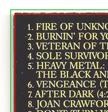
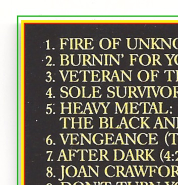
So if I’m understanding you correctly, the tagging image would be cropped to the red line, while the archive image would be cropped to the green line?
3 Likes
That does look a lot better. There’s still some slight clipping in the highlights, but it’s quite an improvement. Here’s what the clipping looks like. (I believe Gimp‘s levels tool doesn’t have clipping indicators?)
I’ll try to run coca on wine (what an unfortunate pairing of software names :D) to see if I can make a profile that matches the one I made with Rough Profiler…
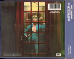
The second cover is cropped quite badly, yes. I guess the scan may have been skewed and the editor didn’t bother fixing it, so he had to crop away a lot. Or someone just made a bad choice. If I were cropping this image I would try to shift the frame further to the left. the placement of the text certainly allows for this.
Regarding the red lips: Neither image seems to have a color profile attached, so we can only guess what the images were supposed to look like. Also, this was supposed to be the same release, but it isn’t. Check the position of the text:
It’s probably one of the Virgin reissues from the 1990’s. These do seem to have more saturated colors in general.
5 Likes
What I understand from this statement is that
the discogs image
is not even the direct basis for
the MB image with the red lips.
And that the MB image with the red lips apparently/probably comes from a different Release.
Have I got that right?
:format(jpeg):mode_rgb():quality(90)/discogs-images/R-4262219-1413707145-4186.jpeg.jpg)
EDIT: Very cool mastery of graphics you display too.
Yes.
Aligning the graphics like this is quite easy. Photoshop can do it automatically. 
When I take the time to scan (rare), I upload a version, very slightly bigger than red line.
3 Likes
I would trim/crop the fringed edge only, the part under the yellow line. The part under the red line would remain untouched:
3 Likes
I am not super consistent with my (few) scans.
Sometimes I use your yellow line but I may also include the edges, with paper scratches, staples, rounded or emboss edge, underneath paper and all.
I just try to keep margins to the strict minimum.
I think it’s for the first front image that we should not include any margins.

https://musicbrainz.org/edit/29601121 with thick edges and cellophane

https://musicbrainz.org/edit/41449835 (first front) with rounded edges
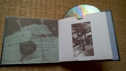
https://musicbrainz.org/edit/41449843 full overview photo for disambiguation purpose

https://musicbrainz.org/edit/30124875 (first front) with visible underneath page (cf. top left)

https://musicbrainz.org/edit/20070018 (first front) with left rounded edge and staples
https://musicbrainz.org/edit/36842417 with some margin in order not to cut spine’s (scratched) edges
1 Like
As a general point, I’d hope that whatever guidelines we end up with are phrased as preferences and not requirements, and that they won’t discourage anyone from uploading cover art or cause it to be downvoted for not complying. For me, cover art serves two useful purposes:
- to help identify a release;
- to provide information about the release (title, performer, label, etc) that can be entered (or corrected) separately.
Something is always better than nothing. The only criterion for acceptance should be that it’s a scan of the thing it says it is.
11 Likes
I’d like the contributor to also let others know whether it is a partial or complete scan. I’d also like the contributors to say whether the scan has been “photo-shopped” or not.
I’m thinking back to some of the scans I contributed where I didn’t understand the effects of cropping/photoshopping the CA to make it look prettier and didn’t record the changes I had made away from the original CA image.
4 Likes