I don’t use the Wikipedia nor MB start pages so I would not say it does not do well.
I use online encyclopedias just like I use paper dictionaries, I search them directly*, I don’t read their table of content more than once, after buying them.
My point is that for someone who might be interested in this encylopedic usage, but is not an experienced user, the homepage does not do a good job of introducing the kind of information that is available in MB.
Would be a dream to have the “Did you know?”, i really enjoy reading them on Wikipedia.
(But would require a smart IA or a way to input them, CritiqueBrainz?)
The homepage would be better if it successfully prepared naive users to not expect that adding analog information to a predefined-fields database would be an intuitive experience and that their current IT skills will likely be sufficient.
A strobing red<->green background, a loud emergency siren and an overlayed box that flashes alternatively “You will fail 50 times” & “Your expectations are the problem here” might be off-putting to some new users so I feel something slightly more subtle would probably be better.
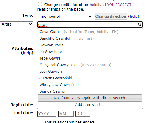
Site users don’t necessarily have to be editors and, due to the issues of the missing hierachy in the area and genre information, even experienced users can’t get a full list of artists based on specific inputs, for instance.
Not to mention the complexity of the advanced query syntax for non-techies or the limited functionalities of the user interface, which doesn’t even allow to sort the search results alphabetically, by year and so on.
@aerozol I would love to get in touch with you. The work regarding this will start in early September, which isn’t far off now. You have been of constant help and I would love your suggestions at each step as I move forward. Please consider joining the #musicbrainz channel on irc.libera.chat. Thank you!
If we’re also spitballing more general wishes for a website redesign, I would again come back to the search form I mentioned earlier.
Remove the confusing choice between three different search types.
Choosing between the search types requires technical knowledge that should ideally only be relevant to the people running the Musicbrainz servers. Especially “Direct database search” feels like a holdover from the time before we had fast indexing. Having the advanced search options should be the default, IMO.
Add a UI for the advanced search filters.
They are potentially very powerful for finding what one is looking for, but the currently used syntax is extremely undiscovered and barely usable for people who are not already programmers.
Yes! I always forget those are there, and when I do remember, they’re sometimes difficult to get my head around, especially for advanced advanced searches…
I also second more prominent links to the forum as well as the other projects (BB, AB, etc.). I feel like I scoured the website for a forum a couple months ago, and I couldn’t find it anywhere. Ended up just happening to notice the link tucked away at the bottom of the page in that tiny font.
I’m sure you’re probably talking about the search bar at the top of the page, not the search bar when you’re adding relationships and whatnot.
I’ve actually thought of a couple other improvements.
Better Genre/Tag Display and Usability
I think it’d be good to have these visible in more places and be easier to add.
For example, I’d love a way to see each tracks recording tags from the release page, maybe even a way to add them without having to go to each individual recording page. It’d be real handy for, for instance, a “Music From” soundtrack album, where all 20 or so tracks might be a different genre/subgenre.
In fact, it might even be nice to see what an artist’s recordings and releases are tagged as somewhere on the artist’s page while we’re at it.
Featured Releases/Entities
Yes, this is an idea from Wikipedia, but I really think it’d be a good addition to the homepage. I don’t know if it should be a “Featured for the Month” type of thing, or maybe just a random pick from a list of High Quality releases, (maybe after they’ve gone through some sort of nomination and/or voting process).
At the very least, having such a list easily accessible (and approved by several editors) could give newer or inexperienced editors a good example to follow, especially if we include other, possibly less used entities, like Events, Works, Places, and Series.
Better Collections
I feel there’s some missed potential here.
For one, default sort. Personally, while I’ve been going through my music folder tagging everything, I occasionally go to my “CDs I Own” collection, to add one in Picard. Once I get there though, I always sort by Album Artist. It is occasionally interesting to see them listed by year, but that feels like such a weird default to me…
Also, more views. I’d love to see my collections as a grid, with cover art and everything. Maybe you could even select a default view? Can’t think of any other good views at the moment…
Just a couple ideas I had while editing the last couple days…
I also forgot there was discussion about a mobile-compatible site, dark mode, larger fonts, and especially a dashboard, all of which I’d very much look forward to~
Thanks, @UltimateRiff, sounds great!
The first and the third points are really good and I feel we should definitely look into them soon.
Regarding the second point, I had a discussion with the team regarding this a while back and we came up with the conclusion that we shouldn’t come up with such a feature because that would become a certain criterion for displaying releases/entities which we do not want to appreciate since that could be unfair to other releases.