What: I’ve been tasked with sorting out a proper banner for our social media uses and ask that you have your voice be heard by voting for one of the following!
*Disclaimer: these are mock ups and are not precise. They are simply concepts to be perfected after one is chosen for use.
Why: Cohesive branding + Professionalism = More Chocolate
Where: Twitter/Facebook/etc…
How:
Needs to use our MetaBrainz color palette (our colors + white)
Needs look professional, clean, intelligent and bold…like us.
Needs to feel cohesive with our websites, logos and branding
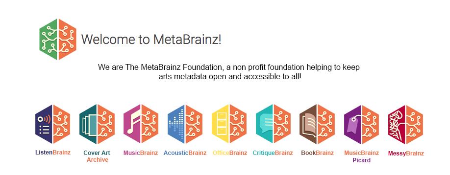
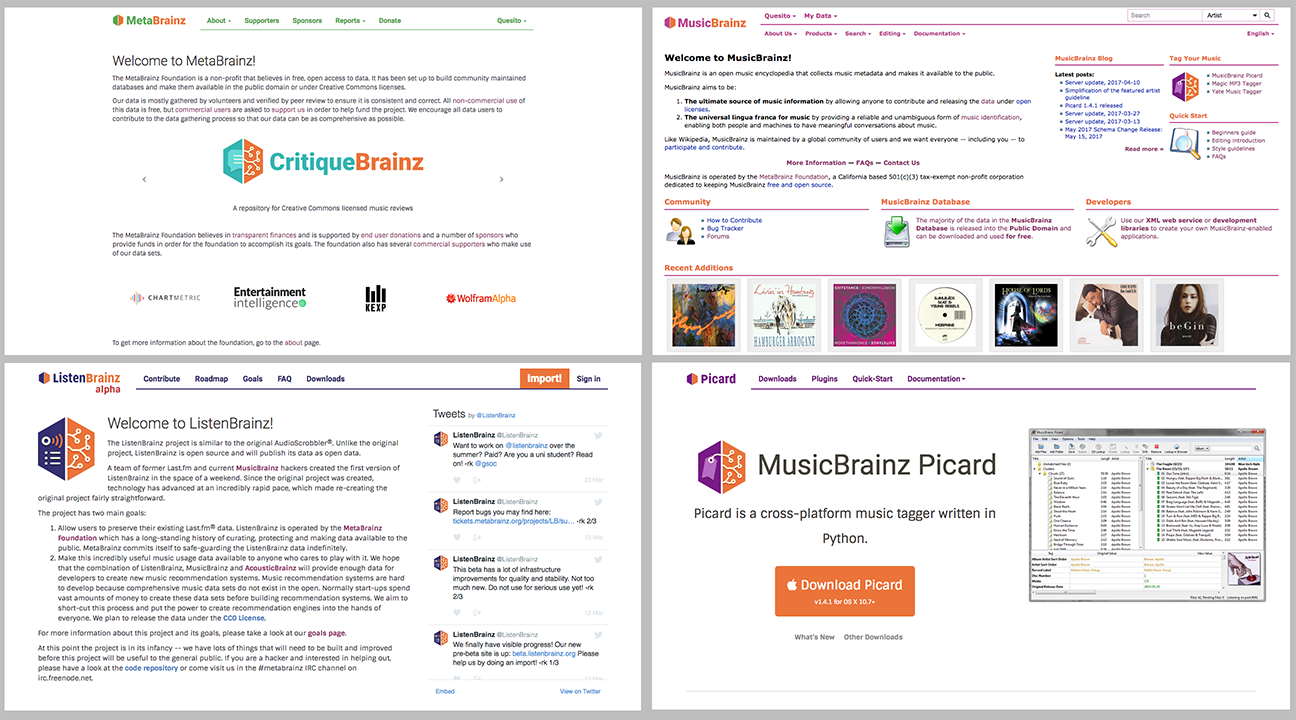
Our Logos and a few of our Websites, for reference:
I personally think that with the hexagon outline you move too far away from the original idea of the grid, that is that all of these MeB projects are an interconnected family. The image inside of the hexagon is what it’s about, the hexagon itself is just a random shape. You are right about greyscale not being used in MeB branding anywhere else, I hadn’t thought of that.
I prefer the rotated colourful design, but the mural is also pretty cool. I think the mural would look better if you need a relatively high banner or image, because then the grid becomes a bit overbearing. The grid looks best at the height it is in mbrote.png, as a banner for Twitter.
Of course there are more comments in the Jira ticket. And I think this option is great:
I really appreciated your comments in the ticket, err above too! From your comments, I created a secondary hexagon duo color outline to reference all our projects and left the plain orange as a simpler option. I left the greyscale out as an option, as we didn’t have many qualifiers prior to the ones written above–and it is true, we don’t use greyscale anywhere. I also left out the mural option, as you point to dimensional issues with it–it also only pertains to MetaBrainz, and might not be as versatile as a general graphic.
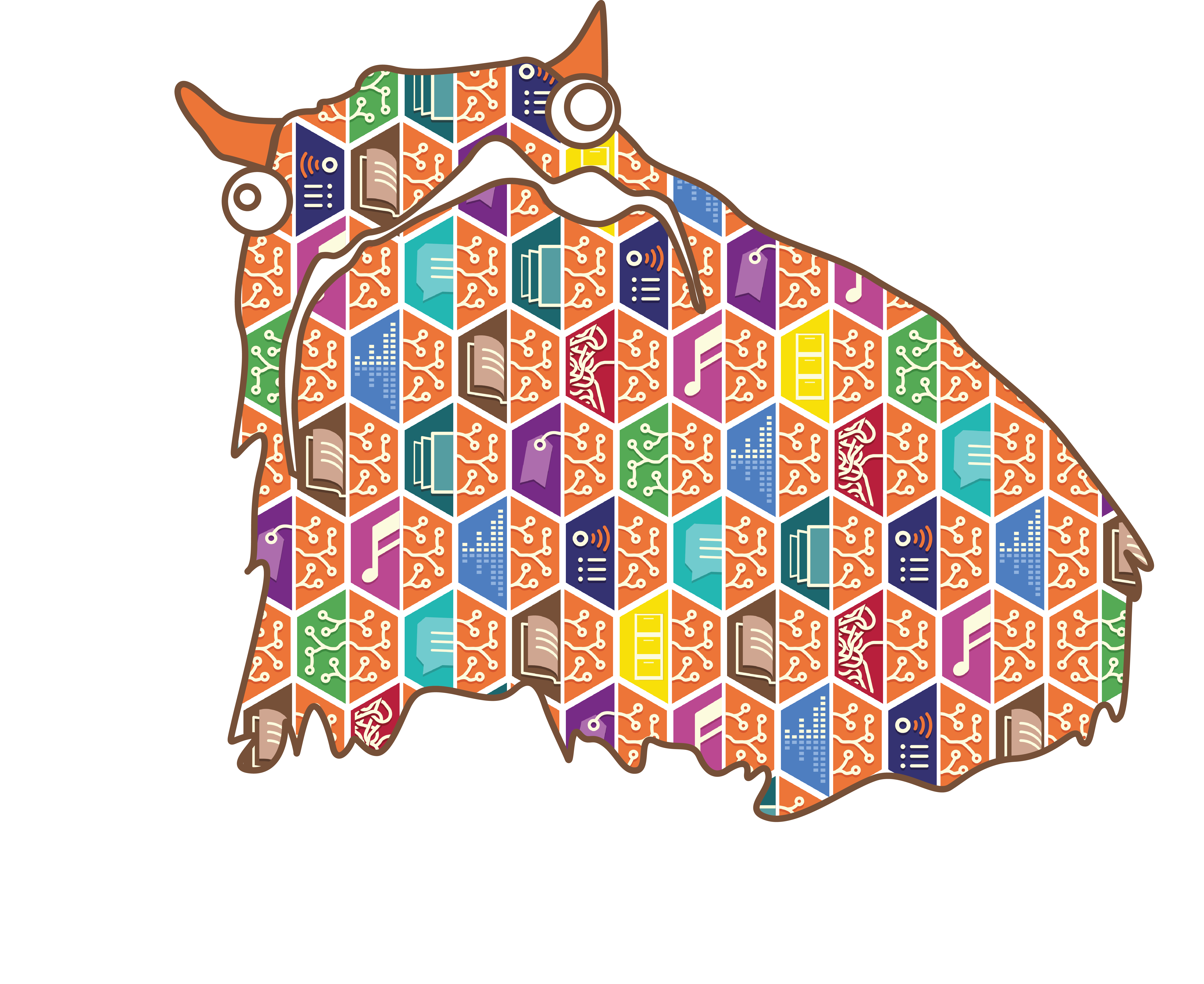
Señor alot of brainz, is darn adorable…but I agree it might not be ideal for a banner…we must use him for something!
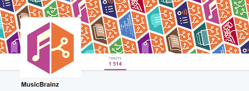
I do see what @mfmeulenbelt means about the image rather than the shape being what’s important, but the Banner 4 here looks too busy and catches the eye too strongly. Given these particular options, then, I go for Banner 3, but that in turn would be beaten (in my mind) by otringal’s original faded-color logos.
And the error pages would be a great home for the alot.
Any particular reason you included not more of the options from the ticket? I think there are a few nice ideas which are different from what is here, e.g. I like banner10 a lot.
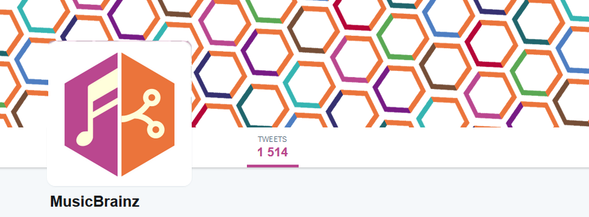
I like and voted for Banner 4 because it seems to be for Twitter and the banner only appears when we are at the top of the page and there it will look very good.
I also like Banner 3 but it has less personality.
It would be good if it was on a site where it is always on screen.
But for Twitter where the banner is only on screen at the top of the page, I prefer 4.
@WovenTales the fading of the graphic I did as an early concept, however after looking at MeB websites and logos, etc, I couldn’t find any of MeB graphic that uses fading (same with the greyscale). @mfmeulenbelt comments really made me think further about the branding aspect of this graphic. It seems visually–at least from what I see–MeB and it’s projects are all bright, bold, simple and clean, so for cohesiveness I thought it might be good for us to stay within those descriptors. @outsidecontext it was this connection of trying to tie everything together that I made the decision that any graphic that didn’t fit within a these few parameters (that exist for our webs/logos) would no longer be an option. I altered Banner10 to Banner 5 to fit within the parameters–because I too like the concept.
Please continue to let me know further thoughts–perhaps the ‘winner’ is yet to be discovered or there is something I have not considered!
I agree with what has been said, I scrolled down and thought: where are the rest?!
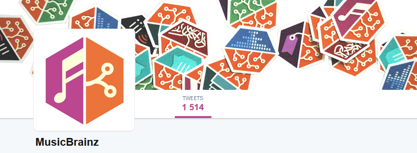
I also wish I could multiple choose, of these (few!) I’d go with 3 or 5, but for 5 to work there needs to be done something about the transparency of the background of the twitter account avatar(main logo), it looks like a big white block and kinda ugly.
I liked the banner10 on the old jiraticket.
I third (fourth?) the idea for the Alot on the error page <3
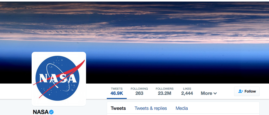
Hey @CatQuest! Unfortunately I can’t do much about the big ugly white block–unless I fake the transparency and make sure the two images are aligned perfectly. I leave the image of the NASA twitter account as an example of the white box issue…Banner10 would suffer the same fate of being visually interrupted by the white box. Did you vote on any of the above or do you feel none of these fit the bill? Let me know–it’s still a work in progress
@Quesito: I think maybe it’s the combination of the background of the banner and the icon being white, it confuses the eyes, because to my eyes, that nasa thing works fine somehow…
Which I guess brings me back to that: all the ideas that are missing, such as the original banner10
To answer your question: no I 'aven’t voted for anything because I feel strongly that not enough of the options from the jira ticket are present, it feels too much like a pre-culling of ideas and "you can only choose between these"
I see that it says "*Disclaimer: these are mock ups and are not precise. They are simply concepts to be perfected after one is chosen for use. " but from that, the “general ideas” ones should be taken and tried, or, as many variants as possible to get “close to what we want” (also see multiple choice/ranking)
I do agree the faded/grayscale ones are too different from what we usually go with, but the thing about the white background is that it doesn’t need to be like that, instead, the yellow table thing sorta fits with loads of metafores about MusicBrainz/MetaBrainz. When I see it, I think about our organization, about chocolate, meetings, summits and down to earth, kitchen table arguments. I think about the initial paper and post-it idea behind NGS (nadelner bambus), I think about the new office and the journalists, I think about people sitting around a proper kitchen table, drinking beers and coffee, coding and talking, discussing and making music metadata awesome.
Yeah, related to what @CatQuest says, one of the reasons I originally wanted a picture of the stickers spread out on a table or some such was to move the *Brainz somewhat into the physical world as well. All the other images are nice, but they’re all also entirely computer generated. Which is great! We love computer generated things! But it might also be nice with a bit of variety, showing that we exist outside of the machine too.
@CatQuest I enjoyed reading how you think about our organization, you put it such an vivid and lifelike image in my mind around a kitchen counter discussing. It is a lovely description of our community, and I agree-we deserve and image that voices this. Also thank you for linking to the nadelner bambus–it is something I hadn’t read before. I apologize for making you feel that this was a pre-culling of ideas, that was not my intention. I simply tried to use the decent amount of branding knowledge I have and a few guidelines to move the ideas forward.
@Freso Yes, most are computer generated graphics, mostly due to versatility of the design, to work with many different social media sites image parameters (since we do not currently have a staff graphic designer). A photo also takes time to perfect, as we also don’t have a professional photographer on staff.
I took over this task to help another MeB-er out, and I have spent a good amount of time on the issue of our social media banner. In the end, we need one, and it needs to look professional and bright and bold like us, and it needs to be an image that can fill various different image parameters.
It is also a social media banner…it is not a permanent tattoo. We can make one now, make a different one for summer and perhaps a special one for the summit! So here’s what I purpose: A quarterly social media banner contest. (the contest idea is from @CatQuest on IRC). So in June we have a contest with the winner’s banner going up on July 1st for 3 months, and then we continue each quarter (as long as interest continues). This could also build graphics for us to use in various ways for the foundation.
I will do my best photography work to try to take a better photo of the logo stickers scattered on a wooden table top–hopefully with good natural sunlight, in order to fulfill that vision for the future.
*any professional photographers this is your moment to raise your hand!
We can continue with this vote–and use the winner in the meanwhile.
Is this solution a seemingly positive path to continue on?
I 100% agree with jesus2099. Even though many people commented on banner 4 as looking “too busy”, I still think it looks much more “thematic” and “involved” than the currently front-running banner 3 which just feels “too bland” to me, I guess because there is just too much white in it for my taste. I wonder how would some kind of combination of the 2 look like
I like 4 as well, but it’s a bit busy for use as a background banner. If some whitespace is added between the hexagons and/or they are made a bit transparent (i.e. faded out towards white), that would likely be my preferred option.
5 is nice as well, but it’s a bit too messy, and doesn’t give equal visibility to all brainz.
Now the latter is not bad in and of itself. In fact, it might make sense to have a slightly blurred jumble of brainz in the back, with the brainz most directly related to the main brainz for the page being slightly more foreground.
For example, MusicBrainz might have critiquebrainz, listenbrainz and acoustcbrainz; critiquebrainz might have musicbrainz and bookbrainz, …
I agree @culinko the space between 3 and 4 needs to be explored! Hopefully in the next round (banner contest starting in June) we will have more options and perhaps a few the solve for this!